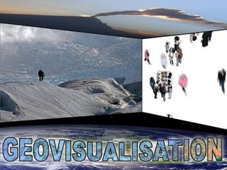
Geovisualisation
•Transferir como PPTX, PDF•
0 gostou•493 visualizações

A few hints and tips for improving presentations. To see the "push left transition" in action you will have to download the powerpoint.

Recomendados
Mais conteúdo relacionado
Destaque
Destaque (20)
Mais de Alan Doherty
Mais de Alan Doherty (20)
Último
Último (20)
Notas do Editor
- It is always worth putting a little bit of extra work into the title slide. Some teachers / presenters start with the “house” template every time. Can you imagine? Hopefully this slide has got you curious. As you’ll see it is a representation of the walls, floor and ceiling of a classroom. The images are full of geography at every scale. Hopefully you want to see what is coming next.
- Classrooms haven’t changed much over the last hundred years. They are either prison cells or launching pads. Our job – everyday and every period – is to make the walls disappear. Only one of my lessons was ever based on their classroom situation. The lesson was on defensible space and it eventually migrated to their position in the family car, followed by their bedrooms, and finished up in a field, pitching a tent at a music festival. Geography teaching is all about exercising our students’ geographical imaginations.
- So here are some tricks and tips to enable this flight of imagination.
- How? (do we manage this). Well…(If you use this visual shorthand for “how?” consistently. The kids will eventually get the joke and join in. There is nothing wrong with informed laughter or using stereotypes as long as all concerned recognize them as such.)
- Graphics includes images, diagrams, maps, graphs, sketches and “doodles”.
- At the heart of every excellent geographical presentation there will be a set of thought provoking images and / or graphics. If there is any doubt about copyright issues, don’t store the images in the school. Invest in a portable hard drive or a big memory stick! All GeoJuice and Earth-E images on Flickr can be used for educational purposes and can therefore be stored on your intranet etc. If you discover appropriate images and don’t want to store them, then tag them so that you can easily find them again. (Remember to keep a list of your tags!) Three of the above images really get the kids going. Collect them and enhance your resources.
- Only scan something in from a textbook or newspaper as a last resort. Use primary colours for presentation graphs. If the graphic is very detailed, print it out and make it a handout or document. Horses for courses.Know the limits of the delivery technology. Complex diagrams don’t work on PowerPoint so deliver the data by a more appropriate medium.
- I wish all the speakers / teachers I’ve listened to had done this. If the graph or diagram can’t be read then print it out.
- n.b. Everyone should be a geographer!Check out the Guardian Datastore on Flickr. http://www.flickr.com/groups/guardiandatastore/The Guardian encourages readers to mashup the data and stats that they supply and share their visualisations. Perfect! I’ve put some of my better efforts up but I still owe them for I’ve collected some crackers from this group.You will also find some of my efforts, such as this slide, athttp://www.flickr.com/photos/geojuice/sets/72157605095147095/
- Every picture tells a story? You bet.
- Space to think perhaps? Breathing space, I call it.
- It poured that day but a little bit of imagination …. Goes a long way.
- Maybe too late? If it is, start with the training videos available on the web or specialist magazine articles.
- Everything is here – if you look closely enough.
- Sketching and doodling aids comprehension and the retention and recall of content. Listening skills can be enhanced and creativity increased. (And some people just think it’s being rude. Now texting and tweeting…. That’s rude!)
- Sunni Brown is another one of my heroines. She is a great teacher. I haven’t seen a whiteboard / blackboard as good as this since Donald Steele was alive. His predecessor at Bathgate Academy was Eric Slater who was also a great “doodler”. Eric was much more abstract in style. If you weren’t in his class when he was drawing, then you often couldn’t read the board! Eddie Broadley also taught me a lot about graphical visualisation (aye, doodling). In fact, he is still a big doodler! But the best proponent of the art of doodling that I ever witnessed in action was Malcolm MacAskill. Maybe Robert McAllistairand Norman Thomson could match him for landscape interpretations, but no one else came close for “geocartoons”.
- You don’t have to be a great artist to produce interesting graphics. It does help if you are neat though. So use a grid pattern to keep your work up to scratch.
- Just like that!
- T!P The stamp filter in Photoshop will turn photos into line drawings – as long as you have plenty of pixels to workwith. Work at say, 4000x3000 and then reduce the result down to 960x720. If you are starting with a small image then a plug-in such as Topaz Simplify is probably a better bet.
- The two best sources for “GeoNews” images are the Boston Globe’s “Big Picture” series and the Guardian’s environment galleries. Both provide images large enough to use full frame in presentations. Other sources are following suit – mainly due to the advent of the iPad. Always acknowledge your sources. Teachers cannot expect their students to acknowledge their sources if they don’t do it themselves!
- So a slow transition to the left will do the trick. Hopefully you are already thinking about other applications of this simple, yet effective technique.
- Provides a great surface for drawing on as well.
- We finish at the start – where else?
- So, it’s just eye candy? No it’s not. Look again. “A Society in Transition”? Saito Kaoru is a contemporary Japanese artist who produces these wonderful mezzotints. The woman is made up as a court lady of the 16th or 17th century. The pose displays the back of her neck in the manner most admired in the Ukiyoe prints of the 18th and 19th centuries. The swallowtail and chrysanthemum are important traditional icons. And the earring? Completely contemporary. If the audience don’t get the relevance, then gently tease the meaning of transition out of them.
- The obvious.
- The subtle.