What is datavisualization?
•
27 gostaram•2,825 visualizações

Presentation of the datavisualization field versus Business Intelligence market

Recomendados
Recomendados
Mais conteúdo relacionado
Destaque
Destaque (17)
Semelhante a What is datavisualization?
Semelhante a What is datavisualization? (20)
Último
Último (20)
What is datavisualization?
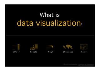
- 1. What is ! data visualization*! What?! People! Why?! Showcase! How?! * What is data visualization - Presentation by stephanenardin! http://www.datavisualization.fr!
- 2. What?! Data visualization! From Wikipedia, the free encyclopedia! Data visualization is the study of the visual representation of data, meaning « information which has been abstracted in some schematic form, including attributes or variables for the units of information ».! According to Friedman (2008) the "main goal of data visualization is to communicate information clearly and effectively through graphical means. It doesn’t mean that data visualization needs to look boring to be functional or extremely sophisticated to look beautiful. To convey ideas effectively, both aesthetic form and functionality need to go hand in hand, providing insights into a rather sparse and complex data set by communicating its key- aspects in a more intuitive way. Yet designers often fail to achieve a balance between design and function, creating gorgeous data visualizations which fail to serve their main purpose — to communicate information. Indeed, Fernanda Viegas and Martin M. Wattenberg have suggested that an ideal visualization should not merely communicate clearly, but stimulate viewer engagement and attention.! Data visualization is closely related to Information graphics, Information visualization, Scientific visualization and Statistical graphics. In the new millennium data visualization has become active area of research, teaching and development. According to Post et al. (2002) it has united the field of scientific and information visualization ».! KPI Library has developed the “Periodic Table of Visualization Methods”, an interactive chart displaying various different data visualization methods. It details 6 types of data visualization methods: data, information, concept, strategy, metaphor and compound.!
- 3. It is a science!
- 4. data visualization is the use of computer support interactive visual representations of abstract data! to amplify cognition* * Colin Ware - Readings in Information Visualization: Using Vision to Think!
- 5. computer support! visual representations! data! cognition! 1,2 million Po!
- 6. famous people! Jacques Bertin I Edward Tufte I William S. Cleveland I Colin Ware I Stefen Few I Stuart K. Card I Fernanda Viegas I David Mc Candless!
- 7. Data visualization contributors & dates! J.Bertin FR! S.K Card us ! F.Viegas us! M.Stefaner DE ! E.Tufte us! S.Few us! The visual display OECD! Sémiologie Using Vision Show me the of quantative Many eyes! Better Life graphique! to Think! numbers ! information! Index! 1974! 1983! 1999! 2004! 2007! 2011! First and widest « The leonardo da vinci applying human Datavisualization On line free Aesthetic with intent to provide a of data »! factors in human– vs. Business visualization data visualization! theoretical foundation New York Times! computer Intelligence: Visual tool! to Information interaction! BI! Visualization!
- 8. Edward Tufte http://www.edwardtufte.com! Edward Rolf Tufte is an American statistician and professor emeritus of political science, statistics, and computer science at Yale University. He is noted for his writings on information design and as a pioneer in the field of data visualization.! 1942! Data Ink Ratio! Born in 1942, Kansas City, Missouri! 1964! BS. and MS. in statistics, Stanford University! 1983! Book: The Visual Display of Quantitative Information ! « The century's best book on statistical graphics » COMPUTING REVIEWS! « The most important contribution to the study of the graph » JOURNAL OF THE AMERICAN STATISTICAL ASSOCIATION! « One of the best books you will ever see » DATAMATION! 2003! Articles: Power Point is Evil & The Cognitive Style of PowerPoint! Work within Information design! - Key concepts: Charjunks, the lie factor, the data-ink ratio and the data density of a graphic! - Inventor of the sparkline graphic! - Consulting on data analysis and display design: NASA, Apple, The New York Times, IBM, Consumer Reports, Bose, Fidelity Investments, Centers for Disease Control and Prevention, Google, Hewlett-Packard, Newsweek, NBC News, etc.! Quote! « Power point sucks » Edward Tufte 2010!
- 9. ‘Above else show the data’ ! ! ! ! ! ! ! ! ! ! Edward Tufte 1983 !
- 10. Stefen Few http://www.perceptualedge.com! With 25 years of experience as an innovator, consultant, and educator in the fields of business intelligence and information design, Stefen Few is now a leading expert in data visualization for data sense-making and communication.! 2004! Visual Design! Book: Show Me The Numbers: Designing Tables And Graphs To Enlighten ! « A must read...for anyone working in the field of business intelligence » David Wells - The Data Warehousing Institute (TDWI)! « If you need to visualize complex information, this book will show you how » Jakob Nielsen, Principal, Nielsen Norman Group! 2006! Book: Information Dashboard Design: The Effective Visual Communication of Data! 2009! Book: Now You See It: Simple Visualization Techniques for Quantitative Analysis! Work within Business Intelligence! - Key concepts: Visual Business Intelligence, Visual Design! - Inventor of the bullet graph graphic! - Consulting : Cisco Systems, Microsoft, Apple, eBay, Tableau Software, Spotfire, SAS Institute, Cognos, QlikTech, Salesforce.com, NASA, Oxford University, Kraft Foods, Rio Tinto, Capital Group, T-Mobile, etc. ! Quote! « His work and design practices for BI dashboard design are clear and to the point » Claudia Imhoff, President, Intelligent Solutions!
- 11. Why?! vs. Business Intelligence! Business Intelligence (BI) & Data visualization (DV) scope! issues! goals! 2010 BI market! B I s t a ke s D V b e n e fi t s DV BI 1 2 3 4 5
- 12. Volume of the market! Customer performance *! 10,522 Mrd $! 1. SAP! 2. Oracle! 75 %! 3. SAS! 4. IBM! 5. Microsoft! 6. Others! 2010! * BI Platform Success Score and Business Benefits Score! Magic quadrant! Challengers! Leaders! BI MARKET! 2011 trends **! Number of tweets #! Information Sept’11! Microsoft! builders! Oracle! DATA VISUALIZATION! Microstrategy! Tableau! SAS! IBM! BI ANALYTICS! Spotfire! Qlickview! Ability to execute >! SAP! MOBILE BI! LogiXML! Board international! Targit! BIG DATA! Salient! Bitam! Corda! Arcplan! COUD BI! Actuate! Jaspersoft! AGILE BI! Panorama! Niche players! Visionaries! 0! 1 000! 2 000! 3 000! 4 000! Completeness of vision >! ** BI trends analysis based on Twitter !
- 13. 2010 Business Intelligence review! Volume of the market *! 2010! 2010! 2009! 2009! 2009-2010! n°! Company! Revenue (Mrd $)! Market Share! Revenue (Mrd $)! Market Share ! Growth! 1! SAP! 2 413,1! 22,9 %! 2 066,2! 22,3 %! 16,8 %! 2! Oracle! 1 645,8! 15,6 %! 1 350,5! 14,6 %! 21,9 %! 3! SAS Institute! 1 386,5! 13,2 %! 1 324,6! 14,3 %! 4,7 %! 4! IBM! 1 222! 11,6 %! 1 135,6! 12,2 %! 7,6 %! 5! Microsoft! 913,7! 8,7 %! 739,5! 8,0 %! 23,6 %! 6! Other Vendors! 2 940,6! 27,9 %! 2 661,5! 28,7 %! 10,5 %! #! Total! 10 521,8! 100 %! 9 277,9! 100 %! 13,4 %! * Magic Quadrant for Business Intelligence Platforms!
- 14. 2010 Business Intelligence review! Customer performance - BI Platform Success Score and Business Benefits Score *! * BI Platforms User Survey, 2011: Customers Rate Their BI Platform Vendors!
- 15. 2010 Business Intelligence review! Gartner Magic Quadrant! Challengers! Leaders! Size of the yellow bubble represents the % of the market share ! Information Microsoft! builders! Oracle! Microstrategy! SAS! IBM! Tableau! Qlickview! Spotfire! SAP! Ability to execute >! LogiXML! Board International! Targit! Salient! Bitam! Corda! Arcplan! Actuate! Panorama! Jaspersoft! Niche players! Visionaries! Completeness of vision >!
- 16. 2010 Business Intelligence review! 2011 Trends *! Number of tweets #! Sept’11! DATA VISUALIZATION! BI ANALYTICS! MOBILE BI! BIG DATA! CLOUD BI! AGILE BI! 0! 1 000! 2 000! 3 000! 4 000! * Source Twitter - Data extracted with Topsy Analytics – Period Sept ‘11!
- 17. Excel! Data! Quality! Organization! Governance! 70 % ! business people unsatisfied! Business enhancement! Executives satisfaction! Infra.! Cost! Only 10% of organizations have 7/10 of executives do not get successfully used BI to enhance the right information to make Project! Design! their business *! business decisions *! duration! issues! stakes! * KPMG ‘Never catch a falling knife’ survey! goals! benefits! Analyze & communicate ! Data sense! information ! making! clearly and effectively! through! Communication! effectiveness! graphical means!
- 18. Business Intelligence issues! Excel! Data! Quality! Organization! Governance! Infra.! Cost! Design! Project! duration!
- 19. Business Intelligence stakes! Business! Executives! enhancement! satisfaction! Only 10% of organizations have successfully used 7/10 of executives do not get the right BI to enhance their business *! information to make business decisions *! * KPMG ‘NEVER CATCH A FALLING KNIFE’ SURVEY!
- 20. Data visualization goals! Analyze & communicate ! information ! clearly and effectively! through! graphical means!
- 21. Data visualization benefits! Data sense! making! Communication! effectiveness!
- 22. The Guardian! Time magazine! Dashboards! Visual Analysis! data journalism! El Pais! New York Times! Business intelligence! analytics! Tools! showcase! charts! David Mc Candless ! Nicholas Feltron! designers! Moritz Stefaner ! OECD! Linkedin! Visual.ly! organization! GE! Governments!
- 23. Map of the visual displays! Business Intelligence! Charts! Dashboard! Visual Analysis! 1. Treemap! 1. Stocks! 6. World Energy! 2. Bullet graph! 2. Customer support! 7. Tale of 100 Entrepreneurs! 3. Word Cloud! 3. Sales! Tools! 8. Qlikview! 4. Operations! 9. Spotfire! 4. Text analysis! 5. Human Ressources! 10. Tableau Software! 5. Network Diagram! 6. Sparklines! New York Times! OECD! Better life index! Organization! 7. MicroCharts! 1. Mapping America: Every City, Every Block! 8. Motion Chart! Data Journalism! 2. Where to live to avoid a natural disaster! Global emissions! The Guardian! 3. A map of olympic medals! 9. Bubble World Map! Linkedin! Governments! 10. Matrix Chart! Inmaps! US crimespotting! Moritz Stefaner! David Mc Candless! Nicholas Felton! Designers! The Billion dollar gram! The Feltron Report! 1. Nobel prize winners ! ! ! 2. Content Landscape! 3. Visiosphere!
- 24. How?! vs. Business Intelligence!
- 25. DATA! DESIGN! TOOLS! MEANINGFULL! VISUAL! BI! EFFECTIVE! VISUALIZATION !
- 26. Meaningfull data are • comprehensive! • contextualized! • reliable! • structured and unstructured !
- 27. Use visual design to • avoid chart junking! • reach graphic excellence! • focus on data! • support visual thinking !
- 28. BI tools provide • access to data ! • advanced visualization components ! • interactive data analysis! • secure environment!
- 29. Interested ?!