
Recomendados
Mais conteúdo relacionado
Último
Último (20)
Destaque
Destaque (20)
Fonts
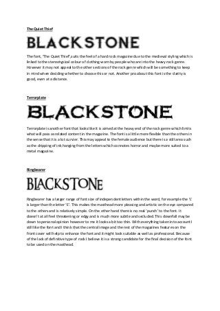
- 1. The Quiet Thief The font, ‘The Quiet Thief’,suits the feel of a hard rock magazine due to the medieval styling which is linked to the stereotypical colour of clothing worn by people who are into the heavy rock genre. However it may not appeal to the other sections of the rock genre which will be something to keep in mind when deciding whether to choose this or not. Another pro about this font is the clarity is good, even at a distance. Terrorplate Terrorplate is another font that looks like it is aimed at the heavy end of the rock genre which limits what will pass as related content in the magazine. The font is a little more flexible than the others in the sense that it is a lot curvier. This may appeal to the female audience but there is a still area such as the dripping of ink hanging from the letters which connotes horror and maybe more suited to a metal magazine. Ringbearer Ringbearer has a larger range of font size of independent letters within the word, for example the ‘L’ is larger than the letter ‘E’. This makes the masthead more pleasing and artistic on the eye compared to the others and is relatively simple. On the other hand there is no real ‘punch’ to the font. It doesn’t at all feel threatening or edgy and is much more subtle and secluded. This downfall may be down to personal opinion however to me it looks a bit too thin. With everything taken into account I still like the font and I think that the central image and the rest of the magazines features on the front cover will help to enhance the font and it might look suitable as well as professional. Because of the lack of definitive type of rock I believe it is a strong candidate for the final decision of the font to be used on the masthead.
- 2. Northwood High Northwood High is of a similar style to the previous font (Ringbearer) but has a couple of differences, some subtle others not so much that make it worthy of a possible candidate for the font to be used for the masthead. Once again this font is rather thin compared to the others but not so subtle. The dagger-like edges on the letters ‘B’, ‘N’ and ‘E’ stand out. This changes the feel completely, by this I mean that the font does feel threatening, it does feel edgy and that is why I found the font striking and worthy of a possible choice. Capture it Beware of the dog Arial Black BLACKSTONE CHARLEMANGE STDC