
Recomendados
Mais conteúdo relacionado
Destaque
Destaque (20)
Fc analysis 1 blog
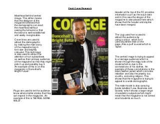
- 1. Front Cover Research Masthead behind central image. This either means that the designer of the magazine believed that the demographic can read the masthead without seeing the full word or that the brand is well established and easily recognisable. Cover lines are used to attract the demographic by making the main story of the magazine big in font size and brightly coloured. This technique is also used to attract the attention of non subscribers as well as their primary audience of the magazine so that they might pick it up and possibly buy it. An example of this is on this magazine is ‘Dancehall’s Bright Future’. Type to enter text The pug used her is used to attract the audience by using a colour which isn’t used anywhere else on the page. Also a puff is used which is ‘Splat’. Plugs are used to let the audience know what smaller stories that they can expect in the magazine. An example of this is ‘NERGIL GONE WILD!’. Header at the top of the FC provides information such as the issue date and in this case the slogan of the magazine is also placed here which shows that the header and skyline have been merged. The central image is trying to appeal to a teenage audience which is shown through the edgy look of the model which is due to the connotations of his clothes. An example of these connotations is the black leather jacket which connotes rebellion and also the jewelry is a crucifix, connoting religion. This shows that the magazine is trying to appeal to a wide demographic. The male model is also carrying books labelled ‘Law, Business and Society’ which shows a large range of academic subjects which might mean that the magazine is not aimed at art students so much.