
Recomendados
Mais conteúdo relacionado
Destaque
Destaque (13)
Mais de ablizz
Mais de ablizz (20)
Último
Último (20)
Scottmedia Project Presentation Scott
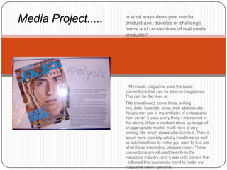
- 1. Media Project..... In what ways does your media product use, develop or challenge forms and conventions of real media products? My music magazine uses the basic conventions that can be seen in magazines. This can be the likes of, Title (masthead), cover lines, selling line, date, barcode, price, web address etc. As you can see in my analysis of a magazine front cover, it uses every thing I mentioned in the above, it has a medium close up image of an appropriate model. It will have a very striking title which draws attention to it. Then it would have possibly catchy headlines as well as sub headlines to make you want to find out what these interesting phrases mean. These conventions are all used heavily in the magazine industry, and it was only correct that I followed this successful trend to make my magazine seem genuine.
- 2. Media Project..... How does your media product represent particular social groups? My genre is the festival, to specify on types of music this really does range from everything you can get. To people who are interested in this, they would easily recognise a picture of this scene from something different. The title would relate to my customer as they understand that the festivals ‘main stage’ contains the best acts, and they would adopt the feeling of this being the best around. The colours that should be used to promote the feeling of the festival would be relatively bright colour, and to be quite packed to make it feel busy and happy. Also the language that should be used within this should be very informal, if it was formal it would feel very organised, which is what a festival is, but that makes it seem more upper class which is not something that has anything to do with this scene.
- 3. Media Project..... What kind of media institution might distribute your media product and why? This question is quite tricky for my magazine, you could argue the point for it having a niche or mass market. It could be niche as I am selecting a specific thing. However I would say that it is appealing to a mass market. It is about Festivals, millions of people a year go to festivals, surely if they want to know who is where and they see this magazine on the shelf they would buy it. It would not be a local magazine as there are not many festivals in a single area, so it would be a national magazine, this would then mean that it would be in mainstream commerce. Someone like ‘Bauer’ or ‘NatMags’ would publish this sort of thing as it is done on a larger scale than the sort of thing that ‘art house’ would promote.
- 4. Media Project..... Who would be the audience for your media product? The people that we are aiming at is aka my target audience, I stated that my audience is people that go to Festivals and those who are interested with that scene. With my magazine front cover I feel that I have half met how it should be presented to them. It is quite in your face and has a loud feeling to it which some festivals bring. However it seems to be a little dull in comparison to a festival. However with the double page spread I feel it really does have the feeling of summer and festivals. It seem very bright and happy which is my view on festivals so I feel for that page it would be appealing to the target audience I am trying to meet. Usually when choosing the audience you would also specify where you would be targeting the magazine within the social class scale, I would
- 5. Media Project..... How did you attract/Address the audience? The audience would be very interested in this magazine if it communicated with the reader in a way that was formal enough to sound decent and fitting, but to be seemingly common enough to feel like it is all fun. The language used then would be happy and quick paced, short sentences used to keep the attention, not dragging things on and explaining them in essays to bore the reader. The fonts would also have to share the feeling of being fun and exciting not dull etc. If you used a type like this “French Castilla” it makes it seem very formal and book like, it is wanted to be a short and sharp magazine, so you would want to make it very simple to read and therefore be more attractive to the audience. Who don’t want to be bogged down with very small fonts that you have to squint to read.
- 6. Media Project..... What have you learnt about technologies from the process of constructing this product? Before I started doing this project, I had not really used a digital camera as much, or tried it out to its maximum capabilities. When taking my pictures I used different setting to come out with a higher resolution picture and tried different colour schemes. The software I used during this was mainly Photoshop and your basic Microsoft office products, I had use d them before but Photoshop was brand new to me. I played around for hour trying different things and finding it extremely hard to navigate, however I eventually understood and got the hang of this software and can use it in the future when it is needed or could be used to perhaps enhance something. I obviously have used the internet a lot, however I was not fully aware of how much here is about, I was doing much research on there and found so many pieces of others work that I could look at to compare my efforts to that it made me realise what had to be done so found it very useful.
- 7. Media Project..... Looking back at your preliminary task, what do you feel you have learnt in the progression from it to the full product? When I made my first magazine, this being the school one, it was my first attempt of using this software. In my eyes it looks a little bit poster like compared to a front cover, this is due to it having a big block of colour at the bottom rather than keeping the background like magazines do. When I did my final one I wanted a small part of colour to write sub-headlines in, to make this look more professional I blurred it so that it faded out rather than a straight line. When I realised how to use most of the Photoshop tools, I was able to write more and edit my document more, this allowed me to add commonly used things like a barcode, price, date etc which were not on my school one. If I was making another one I would make the picture closer and make it feel a little more closer as if we’re getting closer to the subject, I would have it to one of the side leaving the other for the