
Recomendados
Recomendados
Mais conteúdo relacionado
Destaque
Destaque (20)
Respect Music Magazine Analysis
- 1. Respect Magazine Cover Analysis
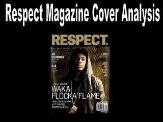
- 2. Masthead: The masthead is located at the very top and is stretched across the whole of the top, making it clear that “Respect” is the title of the magazine. The gold colour stands out against the black background and is easily noticeable and recognisable from far away which is important. Also the full stop at the end adds more of a blunt statement which is made noticeable by making the full stop quite big. Selling line: This cover doesn’t appear to have a selling line however they do have many sub-titles that would attract readers to buy the magazine such as “B.o.B Change the Game” which will attract readers. Cover line: The cover line “Waka Flocka Flame” attracts readers because it is so bold and takes up the main bottom half of the cover, the white font stands out against the darker background and also alliteration is used to sound catchy and appealing.
- 3. Main image: The main image is of rap artist Waka Flocka, and this is quite obvious because he is the cover artist and his name is layered on top of the image. From far away fans of him will notice his name and be drawn closer to then see his face and be attracted to buy the magazine. Colour scheme: The colour scheme for this magazine is very dark and neutral with mainly black, white and gold being used which can be related to the glamour of the hip-hop life. This could be because many hip-hop listeners aren’t attracted by bright loud colours. Button: There is no button on this issue because I feel it would defer away from the simplistic yet effective layout of the magazine.