Mobile Email Design: Scalable vs Responsive
•
4 gostaram•1,310 visualizações

With more than 50% of all emails being opened on mobile devices, it's vital to ensure that your email campaigns are mobile-friendly. In this presentation, Yesmail Interactive highlights the principles behind mobile-responsive and mobile-scalable email design, and how marketers can design bulletproof mobile-friendly email marketing

Recomendados
Mais conteúdo relacionado
Destaque
Destaque (19)
Semelhante a Mobile Email Design: Scalable vs Responsive
Semelhante a Mobile Email Design: Scalable vs Responsive (20)
Mais de Yes Lifecycle Marketing
Mais de Yes Lifecycle Marketing (20)
Mobile Email Design: Scalable vs Responsive
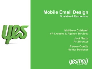
- 1. Mobile Email Design Scalable & Responsive Matthew Caldwell VP Creative & Agency Services Jack Satta Art Director Alyson Coutts Senior Designer
- 2. Agenda 1. Scalable vs Responsive design 2. Which ones right for you? Pros vs. Cons 3. Responsive design in depth Yesmail Confidential 2
- 4. Scalable Email Design A email layout, that when reduced to half it’s size (on the phone) is still 100% readable and 100% finger-tip clickable. Scalable designs utilize: • A single layout for both large and small screens • A grid system for alignment and proportion • A single-column stacked layout, typically • Large scale design elements: – Font size of 14 points or larger – Big, clickable buttons Yesmail Confidential 4
- 5. Scalable Example 1 Yesmail Confidential 5
- 6. Scalable Example 2 Yesmail Confidential 6
- 7. Scalable Example 3 Yesmail Confidential 7
- 9. What is Responsive Email Design? An email that uses CSS3 @media techniques to render two different layouts (PC + mobile) depending on where the email is opened (PC or mobile). Responsive designs typically: • Works mainly on iPhone and some Android inboxes (not gmail app) • Requires 2 designs, extensive coding • Does not work in all mobile environments Yesmail Confidential 9
- 10. Responsive Example 1 Yesmail Confidential 10
- 11. Responsive Example 2 Yesmail Confidential 11
- 12. Responsive Example 3 Yesmail Confidential 12
- 13. Responsive Example 4 Yesmail Confidential 13
- 14. Scalable vs. Responsive? Which option is right for me?
- 15. Scalable Pro Con ✔ Works Everywhere ✗Not “true” mobile design ✔ One design ✔ Easy to code ✔ Readable & Clickable in both environments Yesmail Confidential 15
- 16. Responsive Pro Con ✔True Mobile-first design ✗Works mainly in iPhone and some Androids ✗Requires 2 designs ✗Coding is complex Yesmail Confidential 16
- 17. Where do they work? Scalable Responsive ✔ Everywhere 24/7 ✔ iPhone ✔ Android default Inbox ✗ Android Gmail App ✗ Windows Mobile ✗ Blackberry Yesmail Confidential 17
- 18. Responsive design in depth
- 19. Responsive Design What can be done? Change width of email Resize images Reformat copy – fonts, colors, sizes, alignment Turn off images Turn off copy Cannot be done: • Turn on code Yesmail Confidential 19
- 20. Responsive Design How does it work? Actual CSS Code: @media only screen and (max-device-width: 480px) { mobile specific CSS } - if your screen width is 480 pixels or less - then load a different set of styles Yesmail Confidential 20
- 21. Responsive Design What can be done? Image off and switch Yesmail Confidential 21
- 22. Responsive Design What can be done? Navigation -1 row into 2 Yesmail Confidential 22
- 23. Responsive Design What can be done? 3 columns to 1 Yesmail Confidential 23
- 24. Responsive Design What can be done? • 2 columns to 1 • Image resized • Font color change • Button resized Yesmail Confidential 24
- 25. Responsive Design What about iPad & tablets? - iPad & tablet screens are quite large (768 x 1024) - For tablets, we recommend the full size version Yesmail Confidential 25
- 26. Responsive Design Performance? - The jury is still out, it’s still early - Several responsive campaigns had same opens and clicks as their running average - However one campaign saw 12% increase in click through for mobile openers - The invite to this webinar saw a 28% increase in mobile-clicks compared to our average mobile-click rate Yesmail Confidential 26
- 27. Responsive vs. Scalable Which one do I use? • BOTH • Scalable layout that turns responsive • Follow best practices like large scale, single- column, HTML-copy, and bulletproof buttons • Then modify it so it can also be responsive Yesmail Confidential 27
- 28. Responsive Design How do I get my emails responsive? - Not “automatic” - Not done by mailing system but by code of html - Requires that you review / redesign pc version - The PC design creates the responsive design but resizing, reformatting and turning items off Yesmail Confidential 28
- 29. Summary • Scalable and responsive are both good options • Scalable design is easier, but not truly mobile • Responsive is truly mobile, but does not work everywhere and takes extra time to code • Use both! PC version designed to be scalable with a responsive layout • Responsive = reformat, resize, turn off objects • Your PC layout is closely tied to your responsive Yesmail Confidential 29
- 30. Want more guidance? Check out the accompanying webinar for more detailed explanations and the Q&A session: http://www.yesmail.com/resources/webinar/mobile- email-design-differences-between-responsive-and- mobile-scalable-email Yesmail Confidential 30
- 31. Thanks Matthew Caldwell VP Creative & Agency Services matt.caldwell@yesmail.com