Beginners Guide to TikTok for Search - Rachel Pearson - We are Tilt __ Bright...
Presentation1 media3
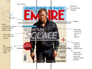
1. Date of Issue
Masthead
The title of the
magazine.
Strap line.
Website
Banner
When there is writing
in within a block in
differing colour.
Main Cover Line
This is the title of
the film.
Pug
It is a block of
writing within a
colour, like a
sticker.
Main Image
Is about the
main film or
story
released.
Graphics
These are
additional
pictures used.
Cover Lines
Are the latest
stories the
magazine would
be about.
2.
C
O
N
V
E
N
T
I
O
N
S
One of the main tasks I had to carry out was to research on the
conventions of the Empire magazine which gives the magazine its own
identity and how we are aware of them through the way they present
their magazine. Their presentational conventions are very powerful and
these can be presented by their style of Masthead, sell Cover Line,
Strap Line, Cover Lines, Main Cover Line, Main Image and pugs which I
have already annotated on a magazine of Empire to show where and
what all these key conventions are on the magazine.
First of all a Sell Cover Line is basically in place to grab all public eyes
and audience as this is usually in CAPITAL and BOLD letters, and this
punch line is placed right above everything else on top. On this
magazine it is “James Bond is back!” this also tells the genre of the
magazine therefore those who love James Bond films or action films are
highly likely to be attracted to this Sell Cover Line. However it is
essential that the magazine doesn’t give everything away as they want
consumers to become customers! And buy the magazine in order for
them to make profit.
Mastheads tend to be one of the most significant simply because it’s
how we identify the magazine when we go to buy it. The Masthead is
also presented in capitals simply says “Empire” at the top, Takes up the
entire top section therefore it’s easy to see. The style and convention is
always that a mid shot is used of the image to cover up the middle
letters.
3. C
O
N
V
E
N
T
I
O
N
S
Other distinctive convention Empire uses is the Date of Issue which is simply the date
the specific magazine is released. This can be because customers may want to know
when that specific magazine was bought due to its relations to a specific film or to even
know when the next film is going to be out. This Date of Issue is usually placed on top
of the letter ‘M’ on the masthead; this is one of the conventions.
Another convention this magazine includes is a strap line that is usually placed beneath
the masthead which is ‘The World’s biggest Movie Magazine’ which is in capital fonts. This
is seen to be very influential as they clearly state that they are the best out of all when it
comes magazines in the movie business.
One of the most important conventions on this magazine is without a doubt the main
image. The entire purpose of the main image is to attract the customer’s attention and is
the biggest selling point of a magazine as the main image is usually about what film they
will be talking about in the magazine, for example if it’s the James Bond magazine I’m
using, that specific magazine would attract all James Bond lovers out there. This main
image is always placed in the middle of the magazine and tends to go over the letter ‘P’
the fact that it goes over the masthead itself, which is the Empire, not to forget is brand
of its own and is a huge company shows that the main image is even more significant
than the masthead itself. This also helps the image to stand out. In my opinion, which I’ve
already given before, this method simply reflects on how powerful the use of a main
image can be and I think it’s not only representing the superiority of the main image but
also creativity is shown as some people would find covering letters off the masthead is
wrong however Empire is creative in their representation and I am fascinated in the way
Empire has made this as one of their conventions, it’s simply looks amazing.
4.
C
O
N
V
E
N
T
I
O
N
S
The cover line placed in this magazine is usually placed on the sides
and is small compared to the masthead itself which is a very traditional
way of imagining cover lines anyway. Empire uses this specific
convention to promote other films as this is very important for them
to do in order to give more out more information to customers. And
also basically acknowledging that cover lines tend to tackle the
problem against having empty spaces on the magazine therefore it has
a fundamental purpose of its own. In my opinion this enables the
magazine to give out more information and look informative instead of
it looking dull and empty therefore it is also another important
element to include on a magazine cover, also I love the way how the
cover lines scream out a certain phrase to catch attention such as
‘Body of lies’ in this case on the James Bond Magazine, this is also in
capitals to grab attention. This little image placed on the side is one of
the cover line’s placed on the magazine.
Another little convention Empire use in each of their magazines is
something called Pug, as mentioned before which looks like a little
sticker placed on the magazine. On this magazine it is placed on the
left side near the main image, its purpose is to advertise a film; in this
case it’s James Bond.
5.
Now that I have already explained
what the conventions of this
magazine are, I must also
introduce you to something what
the Empire magazines which are
called the Rule of Third. This rule
comes up nearly each time. The
Rule of Third is simply when the
main image is meant to be a midshot of a movie character placed
in the middle of the magazine and
his head must cover some of the
letter above, as seen with the
James Bond issue. The body of the
character must also be placed in
the middle of the central box, and
this works correctly with
magazine placed here. And last
but not least the lower fraction of
the body must be lower middle
box; this would be consistent in
all other Empire magazines too.
This is usually a tack the editors
undertake as it is essential for all
other conventions to work on
the magazine therefore this rule
helps them work out how the
magazine would look with all the
conventions placed in there.
6.
Though I have just discussed all the
trademark features of an Empire
magazine, Empire has previously
broken their own conventions
therefore also broken the Rule of
Third. This Issue clearly shows that
the main image is not a mid-shot of
a character therefore it is different.
Though the style of how a main
image is set has changed, other
structures are still the same on the
magazine such as the placement of
the masthead, cover line, etc.
Personally I absolutely love the way
how they managed to change the
character shot selection from a
mid-shot to a close-up because this
gives more detail to the cover and
the face is placed behind the
masthead, this change is very big for
an Empire magazine as only a
limited amount of magazines would
actually include this way of having a
cover. Also not to forget this
technique is more used by Sight and
Sound than Empire, personally I
approve both ways of presenting a
cover with different types of shots.
7. Masthead
The title of the
magazine.
Date of Issue
Strap line
Main Image
Main Cover Line
This is the title of the film.
Pug
It is a block
of writing
within a
colour, like
a sticker.
Cover lines
8.
C
O
N
V
E
N
T
I
O
N
S
In the last slide we seen all the conventions of the Sight and Sound
magazine and this showed us that it is fairly familiar to Empire as it has
features like a main image and masthead. However one of the main
things to point out are the differences from the Empire which makes
Sight and Sound its own magazine through it convention and this is
simply shown on where they have placed their conventions.
On the magazine of Sight and Sound we can clearly see the masthead is
placed at the top left of the cover which is one of the conventions this
magazine company applies. It always on the top left, text in black within
a yellow box. If I was to be constructing my own version of a Sight and
Sound magazine then it would be essential to have the masthead on the
top left of the cover.
Also similarly to Empire, Sight and Sound also has a Date of Issue which
is placed on top right which obviously lets us know when this specific
issue was released.
However differently, Sight and Sound only place their cover lines to the
left of the cover and not both sides in comparison to Empire. Also the
font size of the text seems to be shorter therefore this means that it
has more words, this is also different in comparison to Empire. It has a
superior use of vocabulary therefore it would also attract analytical
readers and reviewers.
The main cover like is placed on the left of the magazine which says
‘Gary Oldman is smiley in tinker tailor soldier spy’ which relates to the
main image, this is used in Empire too.
9. C
O
N
V
E
N
T
I
O
N
S
The main image is always a close ups as its one of the conventions
of the magazine, Empire occasionally applies this too. Sight and
Sound always uses close ups of characters. Another presentational
scheme Sight and Sound use is that thy place the main image behind
the masthead, this is also occasional with Empire, it can be said that
Empire stole this idea from their competitors (Sight and Sound).
11. C
O
N
V
E
N
T
I
O
N
S
Total Films uses the same layout and conventions as Empire, very
similar and identical as it has all stuff like masthead, main image,
cover lines, etc. Also very importantly, the main image goes in front
of the masthead and this is how ideally Empire present their
magazines therefore it can be said that Total Films magazine
company have copied their competitors, also the Date of Issue is
placed which is on both of the other magazines.
13. C
O
N
V
E
N
T
I
O
N
S
As I’ve mentioned before this is different in comparison to the
magazine covers as Empire, Total Film and Sight and Sound. Instantly
we see it isn’t an ‘All in your face’ type cover, it is more neat and
empty as in the way it is presented. I personally do not prefer this as it
doesn’t look as attractive and informative as other magazines, it
doesn’t grab the audience's attention straight away, however the way
the main image is presented is very interesting as in the way it is a
sketched type image and not like a picture. The sketched image
presentation reflects on the magazine as a whole as it is analytical and
the sketched image connotes this.
It is very different as it only has a masthead and a main image, and the
masthead is placed right at the top in circle, and the image goes
behind the masthead. This a very simple convention used Little White
Lies.