Unveiling the Soundscape Music for Psychedelic Experiences
Product evaluation
1. Product Evaluation
Original ideas compared to new
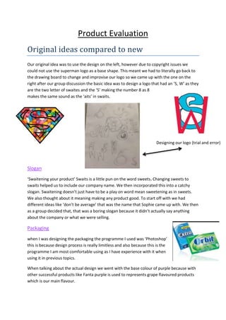
Our original idea was to use the design on the left, however due to copyright issues we
could not use the superman logo as a base shape. This meant we had to literally go back to
the drawing board to change and improvise our logo so we came up with the one on the
right after our group discussion the basic idea was to design a logo that had an ‘S, W’ as they
are the two letter of swaites and the ‘S’ making the number 8 as 8
makes the same sound as the ‘aits’ in swaits.
Slogan
‘Swaitening your product’ Swaits is a little pun on the word sweets. Changing sweets to
swaits helped us to include our company name. We then incorporated this into a catchy
slogan. Swaitening doesn’t just have to be a play on word mean sweetening as in sweets.
We also thought about it meaning making any product good. To start off with we had
different ideas like ‘don’t be average’ that was the name that Sophie came up with. We then
as a group decided that, that was a boring slogan because it didn’t actually say anything
about the company or what we were selling.
Packaging
when I was designing the packaging the programme I used was ‘Photoshop’
this is because design process is really limitless and also because this is the
programme I am most comfortable using as I have experience with it when
using it in previous topics.
When talking about the actual design we went with the base colour of purple because with
other successful products like Fanta purple is used to represents grape flavoured products
which is our main flavour.
Designing our logo (trial and error)
2. Package features
The ice in the background – I came up with this idea because ice is fresh (our product name)
and pure and clean and these are the qualities we wanted our gum to have so it will provide
fresh breath and a clean mouth.
Our logo - bottom left – we used this consistently throughout our adverts and packaging,
this is to raise brand awareness and let consumers and customers know about our
company’s unique ‘fresh’ ideas.
Fruit (grapes) - I added this into our design because I think it look good as there is still an ice
texture over it also this is helpful for us because no competitors have done this yet, the
simple idea that makes it clear what flavour it is when being viewed off of a shelf.
White font – we decided to use white font on this particular packet because it stands out
well we had a few problems when designing as we were originally going to use black or blue
font and research shows blue is the easiest colour to read, however we had to choose a
colour that was apparent on our dark background.
The image on the left is our original design idea, we originally chose this shape because we
were going to make a box packaging for our gum containing strips however we decided to
stray away from this to the image on the right because we wanted our gum to be the
traditional size and size this is because its provides easy access when on the go instead of
having to open a fiddly paper wrapper, this was then mentioned in our pitch as a benefit of
our gum.
3. Advertising
When creating promotion for our gum, my group each created one advert each.
Aaron Cogdell created a bus stop advert this is because it has a
large target audience because when people are waiting for a bus
they will be sat staring at the advert as it catches your attention
we hoped this will encourage people to buy our gum.
Personally I think this advert was a good contribution to the group
and looks professional.
I created the billboard advert, I chose a billboard because you are able to display a very
large advert so even people who aren’t driving and are just walking across the road can see
and read it, however the main reason I chose it was because it is next to
a set of traffic light this means hundreds of people every day will be
waiting at the traffic lights so will have time to read the advert.
Sophie created the internet adverts one was for ‘Dave’ the television
channel as in reaches the top end of our target age range we know this
because the channel plays more mature adult like shows which are most
likely going to we watched by adults.
She also created an advert for the ‘MTV’ website appealing to our younger age range like
teenagers this means we have more promotion and cover all of our 13-30 target age range.
The reason we chose to use the internet is because you can advertise to a global target
audience and people in any country can see our advert when going on either website this is
alternative to our other adverts because our first two adverts are more direct, what I mean
by this is that you actually have to drive/walk to the location of our other adverts whereas
online you don’t.
4. Design
Possible improvements for next time
If I were to do this topic again I would choose a more complicated, for example a cereal bar
or water because gum is a very popular product thousands of packets sold every day and I
think the competitors are more obvious making it easier to do our coursework, however the
reason we chose it was because we are children and know what other children want to see
and what they like.
Conclusion
Overall I think me and my group have done a good job on this project because we have had
positive feedback from teachers saying how detailed our presentation was meaning we met
the criteria for the mark scheme. Also we had unique Ideas of which were put together to
make our final idea for our advert which payed off, During this topic I found it very
enjoyable this is because we had a lot of freedom and were allowed to use cameras which
motivated and excited everyone and made them wanted to work harder which was a bonus
as I already had an equal group that share the work load.
This is the tool that allowed me to move
and position things on our packet so was
one of the most important tools.
This is the font tool that allowed me
to design the text for our packaging.
This tool allowed me to remove
the background from my logo.