
Recomendados
Mais conteúdo relacionado
Destaque
Destaque (14)
Último
Último (20)
Image rationale reasons I used these pics
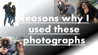
- 1. Reasons why I used these photographs
- 2. Main Image - Cover I constructed the models to pose in a particular way that reflects the correct genre of music magazine. The faces of the models are shown clearly, there is a model of both gender which is important when trying to attract a mixed gender audience. Also the props used (headphones and a baseball hat) in this image is appropriate as well as the style of dressing. The fact that the models are wearing black and dark colours and jackets gives of the impression of an association with the “hood” and an informal genre which is Hip Hop and R&B. As a result of these reasons I chose this image as the main cover image on the front cover.
- 3. Contents and Double page images This is a bright image of the models, it is clear and visually interesting. It doesn’t contain too much light neither is it not enough. I took a font of shot of the models staring into the camera, this is a good show of the models as it clearly shows both their faces front on. I chose to use this image as I believe it mirrors the iconography of Hip Hop and R&B. Big coats with goods up, headphones around the neck and hand posed in the common way a Hip Hop and R&B artist would pose. I chose the images on the right to feature on the contents and double page as they show both characters clearly. The first image has a good sense of light that makes the models appear brighter. The way the models are posed is another reason why I chose this image, this is an informal pose that reflects the Hip Hop and R&B artists. This pose will also entice the SoundWave reader as they’ll probably be used to see this pose by artists.