To Bore No More: Designing & Delivering Presentations That Engage Your Audience
•
59 gostaram•11,450 visualizações

This slide show supports a workshop presented in March 2010 at the Fulfilling the Promise Conference in Oconomowoc, WI. While this was a 75 minute workshop, it can easily be expanded to 2 hours, half day or full day presentations. PLEASE NOTE: This presentation was originally titled "Bore No More." Five months AFTER this presentation was delivered and uploaded, the phrase "Bore No More" was trademarked by Jonathan Petz of Powell, OH. The title has been changed in order to comply with federal trademark rules.

Recomendados
Recomendados
Mais conteúdo relacionado
Mais procurados
Mais procurados (20)
Destaque
Destaque (20)
Semelhante a To Bore No More: Designing & Delivering Presentations That Engage Your Audience
Semelhante a To Bore No More: Designing & Delivering Presentations That Engage Your Audience (20)
Mais de Sarah Halstead
Mais de Sarah Halstead (7)
Último
Último (20)
To Bore No More: Designing & Delivering Presentations That Engage Your Audience
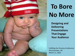
- 1. To Bore No More Fulfilling the Promise Conference Oconomowoc, WI March 11, 2010 Designing and Delivering Presentations That Engage Your Audience
- 4. ... with one of these ...
- 5. ... and afterwards did this?
- 8. •Social media •Technology • Bandwidth • Research T RB SM Shifting Gears
- 11. Time Money
- 12. What have I gotten myself into?
- 14. 14 Questions to answer: 1) How long? 2) Who is the audience? 3) What environment?
- 15. Ready Set PLAN!
- 16. One to Many Workshop Source: David Wilcox
- 17. The Networked Workshop Source: David Wilcox
- 18. Vacationers
- 19. Prisoners
- 20. Wannabe’s
- 21. Understand the Social Rules
- 25. Big Picture Main Points THEN Key Ideas With Details
- 28. During the preparation stage, if youʼre struggling with an idea, if youʼre stuck, then go for a walk, a run, just move...
- 29. How to put the POWER back in PowerPoint
- 30. 30 Left -Brained Slides • People can’t listen and read effectively at the same time. • Watching presenters read directly from their slides is really, really boring. • Slide after slide of bulleted text puts people to sleep. • Garr Reynolds calls this “Death By Powerpoint.”
- 31. This on bullet points! is your brain
- 43. „People will forget what you said, people will forget what you did, but people will never forget how you made them feel.“ - Mary Angelou„People will forget what you said, people will forget what you did, but people will never forget how you made them feel.“ - Mary Angelou “People will forget what you said, people will forget what you did, but people will never forget how you made them feel.” - Mary Angelou „People will forget what you said, people will forget what you did, but people will never forget how you made them feel.“ - Mary Angelou„People will forget what you said, people will forget what you did, but people will never forget how you made them feel.“ - Mary Angelou
- 44. A World of Difference
- 46. ILLITERATE
- 47. Where to find images? Source: Google Images
- 48. Creative Commons Source: flickrcc website
- 49. Use Pix in Unusual ways 1 Use pictures in unusual ways
- 50. Use pix in unusual ways
- 51. Fonts are like chips Fonts are like chips …
- 52. Which type fits best? Times New Roman American Typewriter Tahoma Arial Verdana Gill Sans Footlight MT Light
- 53. Which type fits best? Times New Roman American Typewriter Tahoma Arial Verdana Gill Sans Footlight MT Light
- 55. Size MattersE H N D F N P T X Z U Z D T F D F N P T H P H U N T D Z N P X T Z F H P T D Z X C Z N
- 56. Icebreakers Engage and Increase Learner Buy-in
- 57. After 10 minutes, audience attention steadily drops.
- 58. 58 Tell Stories Photo: Steve Mellon/Post-Gazette
- 59. The Role of Family and Community in Mentoring Alienated Youth in the American Midwest • Blended family • Economically depressed • Accompanied by other challenged and homeless adults • Person of color • Struggles with addiction…
- 60. Talk to your neighbor Source: The World Cafe
- 63. We’re wired to notice patterns
- 66. “That’s a GREAT question!”
- 67. Tips and Tricks
- 69. Use a remote control to change the slides.
- 70. More Tools for YOU
- 71. Remember the magic keys
- 73. Goodies/toys
- 74. A view from the back of the room
- 75. Practice!
- 76. The Small Stuff —It’s Worth Sweating
- 77. What Is Your Energy Synergy? Points to remember: What is your magnetic personality ____________? You may wish you could just wave your magic wand, but there is a ____________ involved. •____________ing •____________ing •____________ing •____________ing Handouts
- 79. Review
- 80. Ready, Set, PLAN! Timing Is Everything Tips and Tricks
- 81. Ready, Set, PLAN! Know your audience Design your message to engage brains and memory Erase old habits and put the power back in PowerPoint Guide your viewer’s attention
- 82. Timing Is Everything Icebreakers Use stories Talk to your neighbor to help process Use energizers when needed Use patterns to help with memory
- 83. Tips and Tricks Helpful words to SAY Use a remote Magic keys to unlock power Freebies and toys Practice Sweat the small stuff (including handouts)
- 84. To review this anytime, go to www.slideshare.net
- 85. References & Photo Sources Books to enhance your presentations: • Presentation Zen by Garr Reynolds • Why Bad Presentations Happen to Good Causes by Andy Goodman & Cause Communications • Brain Rules by John Medina • The Presentation Secrets of Steve Jobs: How to be Insanely Great in Front of Any Audience by Carmine Gallo • Beyond Bullet Points by Cliff Atkinson • Visual Literacy: Learn to See, See to Learn by Lynell Burkmark • The Big Book of IceBreakers by Edie West • Made To Stick by Chip Health and Dan Health Special thanks to the following for their inspiration and shared resources: • Don McMillan, comedian, “Life After Death By PowerPoint” , http://www.youtube.com/watch?v=ayxfblOyUBY&feature=related • Scott H. Young, “18 Tips for Killer Presentations”, http://www.lifehack.org/articles/communication/18-tips-for-killer- presentations.html • Projector People, “Tips for Presenters”, http://www.projectorpeople.com/resources/presenter-tips.asp#point28 • Kevin Kearns, Kearn’s Advantage, “Top 7 Tips to Becoming a Dynamic Presenter”, http://top7business.com/?id=869 • Alexei Kapterev, “Death By PowerPoint and How To Fight It” http://www.slideshare.net/thecroaker/death-by-powerpoint • LaDonna Coy, Learning for Change Inc., “Energizing Presentations”, http://www.slideshare.net/ladcoy/energizing- powerpoint • Michelle Lentz, “ Cool Tools: Legally Using Web 2.0 Tools to Spice Up Your Training”, http://www.slideshare.net/writetech/cool-tools-legally-using-web-20-tools-to-spice-up-your-training-presentation • Stan Skrabut, “Improving Your Powerpoint Presentations” , http://www.slideshare.net/skrabut/improving-your-power- point-presentations-by-stan-skrabut • Gail Zack Anderson, “Using Icebreakers” www.applauseinc.net Photo sources: • www.istockphoto.com • www.brainrules.net/mediakit • http://www.michaelclancy.com/ • www.flickr.com (Creative Commons) • http://images.google.com (advanced search)
- 86. This presentation is licensed under CREATIVE COMMONS. This means you can use it, or parts thereof, as long as appropriate attribution is given and your resulting product is made available under this same license. The license prohibits using this presentation for commercial purposes. A list of citations and links is included for your reference and use. Please cite all photos to the original source. Suggested Attribution: Source: Sarah Halstead, Portage County Literacy Council, Inc. Presentation and handouts are available on Slideshare Feel free to contact me through Slideshare:http://www.slideshare.net/SarahHalstead or Linked In http://www.linkedin.com/in/sarahhalstead
Notas do Editor
- Before we get started I want to let you all know that you will have access to this entire Powerpoint presentation and my speaking notes, so just sit back and relax, without having to jot down every detail. If you want to write down some things because you find that you learn better that way, feel free to use the handout form I provided, or add things you want to the “REMEMBER THIS” or “DO THIS” to the post-it notes on the tables.
- My background: Preacher’s kid Pulpit voice/newscasters I’m the little girl in the photo not paying attention. My father is a minister so from as far back as I can remember I’ve been listening to people give talks or presentations. Being a P.K. (preacher’s kid) allowed me to be a little more critical of things and I found that it really irritated me when I heard someone speaking with a “pulpit voice.” I have a friend who is a newscaster and the sing-song-y delivery that often is used by people who read the news also annoys me. Over the years I’ve witnessed many presentations —some good, some bad .
- hold up transparency - “we used these” ...
- Then along came the wonder of powerpoint and our world changed.
- Anyone here working from a dial-up modem? DSL ..etc Remember when you thought 20 MB hard drive was all the space you’d ever need? How many of us have some kind of wireless device, PDA, cell phone, MP3 player like an iPod, Kindle, etc.
- A lot of things are changing now. We’re experiencing a shift and we can do more things, differently than before and in many cases better.
- Unfortunately we still see a lot of THIS (pause).
- Which leads to THIS … (pause)
- Which costs THIS . And that’s exactly why we’re all here today. We’d all like to waste less time and money sitting in presentations that miss the mark. We’d rather not take back stacks of paper that we must later sort through to find the tidbits of helpful information we got from a presentation. We want to be able to remember the content more than 15 minutes after we walk out the door. ***Ask group what kinds of presentations they will do in the next year: one-on-one, parent classes, Rotary clubs, conferences, grant reviews, church groups, schools, etc.
- If you are putting together a presentation for the first time, or are nervous about speaking to a crowd, you might feel like this. “ The human brain starts working the moment you are born and never stops until you stand up to speak in public.” - Anonymous But to day I’m going to share with you some of the techniques that presentation superstars are using to wake up their audiences and get their messages across.
- OK, you can do this. But you’ll need to know where you’re going. Have a plan , and k eep it simple , REALLY simple. You must be able to summarize it quickly and clearly so your audience can too .
- Whenever I am asked to give a presentation there are three questions I ask before I agree to do it : How long do you want me to talk? (5 minutes, an hour, an afternoon, a day, a week) How many people will attend? (size of crowd, their interests/background) What is the environment? (hotel meeting room , classroom, loading dock of the UPS building, church, restaurant,….) Knowing the answers to these help me know what sort of presentation to plan.
- OK, so now you know, but it’s not time to race ahead just yet. Now it is time to PLAN. You may have a few more questions that need to be a nswer ed before you can dig in to the project.
- Let’s assume your presentation is a workshop. Traditionally this is what we’ve done in the past. Consider the dynamic … expert to group. This is often the “teaching” environment. Sit down, be quiet, and I’ll tell you what you need to know.
- The social learning approach takes advantage of being together by networking the workshop (the room). This is “facilitation” vs. “teaching.” You’ll probably know before the presentation which one you’ll be able to do. But who will be in the audience?
- Vacationers: they want to take a break from work So: add fun activities and group discussion
- Prisoners: they don’t want to be there but training was mandated So: acknowledge that they had no choice, but keep stressing benefits of learning the material or skills
- Wannabe’s: they think they know more than you do So: be sure to acknowledge what they do know and correct them where they might be wrong and be careful to keep things on track
- It is important to be aware of the correct social rules in your setting. What language is acceptable? Humor can be a wonderful tool, but you must make sure that it “fits” the situation. Share “African Elephant” story I use in Tutor Training on reading. We who have taught, or love children who have been taught, know that this is funny! From the diary of Kindergarten Teacher: My five-year-old students are learning to read. Yesterday one of them pointed to a picture in a zoo book and said, “Look at this! It’s a frickin’ elephant!” I took a deep breath, then asked...”What did you call it?” “It’s a frickin’ elephant! It says so on the picture!”
- And so it does... (pause before going to next slide)
- You may be tempted to turn on the computer and and start working on your presentatio n at this point . But the b es t advice is to stay away from the computer for the early development stage.
- Garr Reynolds suggests -- Going analog, that is step away from digital tools, break out the markers or sticky notes or the newsprint Now you can develop in ways that lets you easily identify the whole and the parts
- In the end, you want to structure your presentation around meaning, and the big picture. Then support key ideas with details. But for me it often starts out the opposite way, with lots of little ideas and tidbits swirling through my head.
- Some start out with markers and newsprint or the huge Post-It notes and create a mind map. You can jot down all the things you might include and step back and see what patterns there are. Then group the ideas/concepts into some logical flow.
- You can transfer these thoughts onto sticky notes and begin to sequence them, adding some sketches for visual ideas. This presentation started in my head years ago. I was training a staff member in how to make her parent education workshop better and realized that it does not come naturally to everyone. And after sitting through some workshops that completely failed to keep my attention, despite the fact that they might have had some good content I began thinking that someone should offer a training on this topic. Over the past few months I jotted down random notes and collected them. Videos I saw, websites I found helpful, books I read, and little inspirations all got added to a note page. Then I transferred each thought to a post it note. Then I arranged them on my door (they stuck best there) and grouped the ideas. I could move things around and found that some ideas ended up in better places than where I first thought they’d go. I was able to see my main categories more clearly.
- We need to use what we know about how our bodies work, to work WITH them. Exercise boosts brain power So, t o improve your thinking skills, MOVE Exercise gets blood going to the brain, bringing it glucose and oxygen Now you may be tempted to skip all this and just open a blank powerpoint presentation. And since some of you are thinking this, let’s take a look at some common powerpoint mistakes.
- You won’t always use PowerPoint, but the likelihood is great that you will eventually, so we need to address some issues with it. How can we make PowerPoint a better learning tool? Right now, most PowerPoint slides look something like this *next slide*
- (Read the first three bullets….”OK, that’s enough, I think you’ve lived through way too much of that already.”) Characteristics of traditional PowerPoint Presentations are ineffective, not because presenters lack intelligence or creativity, but because they have learned bad habits and lack of awareness and knowledge about what makes for a great presentation and what does not. Typical slide presentation of today consists of speaker presenting streams of information to slides with general titles, clip art, and bulleted list after bulleted list. Heavily focused on transferring data. Talk to your neighbor for a few minutes and tell them what irritates you most that speakers do when giving presentations. (give them a few minutes, then ask for an example or two). (**Before the presentation, ask a member of the audience to help you. Give them a card with the following quote printed on it and tell them that at some point in the talk you will ask a question about this and you want them to give this answer. It is OK for them to simply read it from the card.) How many of you had already gotten to the end of this slide before I stopped? (most will admit this) Why do you think that is? “ Most people read between 259 to 400 words per minute, but on average we speak 105 words per minute. ” Briefly explain that you asked this person to help you answer the question and that they had the answer printed on a card. Mention that you will talk about this a bit later on.
- There’s a reason why we don’t put bullet points on the screen. We can cover the same “content” through an image or graphic and it helps your brain so it doesn’t have to work so hard to extract the message.
- We simply don’t pay attention when we are bored. Here are some things we know about how our brains work best: No multi-tasking.... seriously, your brain is not wired for it, no matter how good you claim to be at it. We are better at seeing patterns, abstracting meaning, than recording details . Tapping people’s emotions helps them learn and remember.
- We can use what research has told us about the way our brains work to design presentations that enhance learning.
- According to John Medina, “The brain doesn’t pay attention to boring things.” When the brain detects an emotionally charged event, dopamine is released into the system… dopamine greatly aids memory and information processing. It’s like a mental post-it note that tells your brain, “remember this.”
- Create an emotionally charged event ahead of time. Identify the one thing you want your audience to remember and to talk about long after your presentation is over. For my literacy council’s marketing, I want people to realize the importance of literacy—that it is a costly and widespread issue in our community, yet largely unnoticed. A holy shit reaction happens when I tell them we could fill our local college stadium with all the people in our county who lack basic prose literacy skills, or when I tell them that the annual cost attributed to low health literacy in my county is more than $1,000 for every single person living there. So it costs a family of four $4,000+ every year. Let me show you an example of an emotionally charged event and how it affects memory.
- It’s more likely that people will remember what you said if they have an image in their heads to go with your message. If I simply told you that 2,996 people died during the attack on our country on 9/11 , it would not have the same impact as if I show you this photo and tell you that this person was one of them. It is visually powerful and immediately evokes emotion.
- Basically, if we overwhelm individuals, we are not helping them learn. PowerPoint presentations that show lots of bullets or paragraphs of information, and where an individual either narrates the slides or talks about something entirely different, basically overwhelms the individuals in the audience. Individuals cannot break it down fast enough to make any meaningful learning. It just exhausts them to the point where they're frustrated and no learning takes place.
- “ Death by PPT” is what Garr Reynolds calls the mind-numbing boredom induced by traditional, left-brained PowerPoint presentations that are heavy on data and bulletpoints and light on compelling visuals and good design. Death-by-PowerPoint is so common that it’s just considered “normal.” Around the year 2000, people in business and education started to rebel against “Death By PowerPoint.” In 2001 Marketing Guru and bestselling author Seth Godin wrote a 10 page e-book called “Really Bad Powerpoint” that he sold on Amazon. It was the best selling ebook of the year. Wired magazine ran an article titled “Powerpoint is Evil.” Researchers at major universities started to study what happens in your brain when viewing traditional PowerPoint slides. U. of New South Wales study found that: It is more difficult to process information if it is coming at you both verbally and in written form at the same time. Since people cannot read and listen well at the same time, Prof. John Sweller suggested, “The use of the PPT presentation has been a disaster. It should be ditched.” That’s fairly unlikely to happen, given our cultural dependence on slideware. Is there an answer to death by PowerPoint?
- Sure there is. You need to guide your viewer’s attention. You're able to control it and walk them through your presentation bit by bit so they capture the main points of your slides. You do this in a variety of ways; by visually controlling which are the main points. I don't know if you've noticed that as we’re walking through the slides some slides are visually more important than others. I’m here to guide you through this presentation; I do this by controlling the visuals and the verbal messages that are presented.
- One idea per slide is easy to digest. You don't want to overwhelm the individual with too many bullets. Even though the items may be related you're pushing too much information and you're asking them process too much. Some people believe we should have fewer slides; actually, you want more slides. When we get done with this PowerPoint presentation, I can let you know how many slides that we've gone through. Basically, if I’m looking at a 75 minute presentation, I want one idea per slide per minute. In the end, we’re talking about 76 to 80 slides.
- We should keep in mind to: Design right-brained slides. Right-brained slides: are visually-based, not text-based follow principles of good design focus on communication, helping people truly understand a concept, not transferring data from my head to yours. Results of brain research tell us this type of slide will: ▪ get and keep attention ▪ trigger thoughts and feelings ▪ improve memory and recall ▪ create motivation to act
- Fact: we have better recall for visual information We are incredible at remembering pictures HEAR a piece of information and later you’ll REMEMBER 10% of it Add a picture and you’ll remember 65% Pictures beat text. Our brains have to process words as we read them, but a photo will more quickly register. Vision is our donimant sense, using more than half of our brain resources We learn best through pictures compared to text or spoken words Try to communicate with more pictures So, T oss your current PPT slides ! In his 2008 book, “Brain Rules,” developmental molecular biologist John Medina offers research that explains why pictures are so much more effective than text-based slides. This is his Rule #10: Vision trumps all other senses. We learn and remember best through pictures, not through written or spoken words.
- Photographs make an emotional connection with your audience. They tell stories. They can help you get your point across faster This quote is worth repeating so I’ll read it. This photo was taken during surgery performed on a 21 week-old fetus to treat spina bifida. Baby Samuel’s life was greatly improved. He and his parents testified before the U.S. Senate Subcommittee on Science, Technology, and Space about the photo and their experience with in utero surgery. Not quite four years old, Samuel was asked what the doctors did that day and he replied, “They fixed my boo-boo.” This photo has been called “The Hand of Hope.” It is the added emotions associated with this photo that makes it memorable.
- This is a photo of my Hmong students who want to learn English and become United States citizens. Story of what a difference it made to have the globe. When studying for the Citizenship test, we looked at a US map. One man asked what the lines (longitude and latitude) were on the page. When I described them the translator told me that they though the world was flat. After getting the globe, they understood so much more—why it was daytime in Wisconsin when it was nighttime in Laos, why it is warmer closer to the equator, how the seasons change and the moon…. It was a huge AHA moment. By the way, two of these students passed their citizenship test last week.
- The graphic you choose should be as simple as possible; you don't want to overwhelm your viewers with a really complex image. The image will get stored into memory and ties the information together. In this case, we’re using a simple knot. The image ties to the verbal and ties it all together.
- I wanted to educate people that we prefer not to use the old term of “illiterate” to describe a person’s skills. Rather than a two-sided coin of “literate” vs. “illiterate” there is a whole spectrum of levels of literacy. This image gets the message across clearly and with some humor.
- While there isn’t a yellow pages for finding images, there is the Internet! At the end of this presentation there is a list of places to obtain images, both free and for fee, for you to choose from. You can also find them on the notes of this presentation online.
- This web-based resource goes through the flickr photos that are marked creative commons - that is, those you can use for free if you follow the creative commons copyright. Do you use creative commons? There is a great video that explains Creative Commons and you will find the link to it in the notes from this presentation online. Due to time constraints I have not included it today, but you can watch it later is you’d like to learn more. http://www.youtube.com/watch?v=1e2WMlL6jlI&feature=player_embedded# licensing information: http://www.creativecommons.org search for photos: http://search.creativecommons.org , http://search.yahoo.com/cc , http://ocw.mit.edu , http://www.flickr.com , http://www.compflight.com , http://www.morguefile.com , http://www.stockvault.net , http://images.google.com/hosted/life Also http://images.google.com with advanced image search options showing usage rights.
- This picture by itself is cute, right? What does the image remind you of?
- It gets more interesting when we add a little flavor to it. Use concepts and pictures in unexpected ways. One presenter used this image for a presentation among a group of people the audience all knew – they knew they’d made an emotional connection when the group burst out laughing.
- Fonts are like chips - sometimes there’s just too many choices. So often we go with our usual or just rely on the default.
- What do you notice about these fonts? Where do they seem similar and where are they different?
- There are serif and sans serif fonts. Those with the little “feet” called “serifs” are the ones it is best to avoid in presentations e.g., Times New Roman, American Typewriter and Footlight) these are better for print media. The others (Gill Sans, Tahoma, Arial, and Verdana) are all sans serif, with smooth edges and easier to read on the screen.
- OK, so this is one time when size does matter. So what about fonts? How big do we need to make them in order for people to see?
- The “E” at the top of the chart is 96 pt, the largest point size in PPT. How low can you read the letters from where you sit? 96 - 80 - 60 - 48 In the box are the norm. 40, 36, 32, 28, and 24. Keep in mind that projecting an image onto a screen and the distance you are from it will also affect this. So rather than just use a specific rule of thumb on the smallest font size to use, try to use large sizes whenever possible and keep the written comments from being too lengthy.
- When a group of people will be in a learning environment where they don’t know each other but will need to interact, then icebreakers can be quite helpful. Optional information to share: People need to feel comfortable in order for learning to be effective. People need to know who is in the classroom with them before they can feel safe . People are busy and often distracted and need to have their attention directed toward the topic. People are often worried about performance in classroom settings and need to be put at ease about the process. People learn by doing well as seeing and hearing, and icebreakers can provide that. Icebreakers can also add an emotional component to the learning event. Talk with your neighbor about some particularly good icebreakers you’ve either used with a group or done as a participant. If time allows, discuss. There are many good books with ideas for i cebreakers . I have a copy of a good booklet created by some ladies with UW-Extension Family Living Programs that I can send to you if you contact me later.
- TIMING IS EVERYTHING People start to fade after 10 minutes. Get them back by telling stories, examples and targeting their emotions So do something emotionally relevant at each 10-minute mark to regain attention. Dr. Medina suggests changing gears every 10 minutes in your presentation (lecture, etc.). Tell a relevant story, show a relevant video, do a relevant activity, etc. Remember the first question I ask before agreeing to do a presentation: How long do you want me to talk? Knowing that tells me how I need to structure the talk. Elevator speech Intro. What matters to them. Memorable. 5 minutes all above plus mission, servies/programs, 10 minutes personal story, hook, visuals, More than 10 minutes need their participation, or laughter 20 to 30 minutes need to pace, summarize, activity Over 90 minutes plan breaks
- Tell stories. This photo is from a story that appeared in the Pittsburgh Post-Gazette. Caption: While addressing the 2008 National Symposium on Handgun Violence at Duquesne University, Tom Mauser displays the shoes of his son, Daniel, who was killed at Columbine High School. Mr. Hauser wears the shoes on special occasions. Two weeks before he was killed in the Columbine High School shootings, Daniel Mauser asked his father a question that Tom Mauser now considers fundamental to the debate on guns and handgun violence in America: "Dad, did you know there are loopholes in the Brady [Handgun Violence Prevention] Act?“ At the time, Mr. Mauser said, he didn't know much about handgun access laws, much less the Brady Bill, which was enacted in 1993 to create a background check system on gun purchases. But since the April 1999 shootings that claimed the lives of 13 people at the Colorado high school, Mr. Mauser has become an advocate of stronger gun access laws and was one of the leaders of a ballot initiative to close the "gun show loophole" in Colorado. That loophole allowed private individuals at gun shows to buy and sell firearms without going through background checks. Speaking to about 700 people at the symposium on guns, gun violence and the right to bear arms, Mr. Mauser said he became an outspoken advocate of gun control "because I never imagined I would have my child murdered by another student at school.“ I looked at those shoes and realized that my son has some very similar shoes of the same brand. My son is 18 and his shoes are all worn out and dirty. As I looked at these I was reminded what a blessing it was that my son got to wear out those shoes. Mr. Mauser’s son didn’t have that chance. A good rule of thumb when deciding what stories to tell is to choose those that make you feel something. Consider whether the story will also reach your audience in the same way.
- Stories must be heartfelt, real. Contrast that with this story: The Role of Family and Community in Mentoring Alienated Youth in the American Midwest: One day, an at-risk youth from a blended family in the economically depressed farm belt is rendered unconscious during an extreme weather event. When she awakens, she undertakes a long hazardous journey to a distant, mineral-based metropolitan center. Along the way, she is accompanied by three variousl y challenged adn apparently homeless adults while also being pursued by a malevolent person of color—in this case, green. Just before she reaches her destination, she briefly struggles with opium addiction, but fortunately that peoblem is cured by snow. ....point here is that this is sometimes what “storytelling” sounds like in presentations. Gotta ’ have passion, gotta ’ be genuinely important. Try not to use strange language, acroymns, etc.
- A few times today I’ve asked you to stop and “Talk to your neighbor.” People need an opportunity to talk and process information. Small group vs. Large group. Depending upon timing you may be able to allow small groups to share with the whole larger group an idea or two from their discussions. If you have a very large group using this technique is a good way to allow interaction that otherwise doesn’t work (in an audience of 400 who wants to speak up with a comment?) Too often we don’t give people a chance to learn from each other. There is expertise in the room. Also, if someone needs to gripe about something doing this lets them get it out of their system. Without the opportunity it just festers during the whole talk until they walk out of the room complaining about the whole experience.
- Movement, Laughter, something unexpected, all these things can help. Keep in mind the comfort level of the audience and things like their mobility and available space. If you notice MEGO (My Eyes Glaze Over), it’s time for one! Have one or two waiting for use whenever necessary when you have a longer presentation.
- One more thing about attention , we’re wired to notice patterns. If we want to make it easier for our audience to remember, emphasize the patterns.
- At first those letters won’t make sense, but eventually you’ll recognize some chunks you’ve seen before
- The brain pa ys attention to PATTERNS. Put your information into some pattern that can be easily remembered.
- This not only buys you a little time, but it acknowledges the participant. Try to paraphrase the question or concern too for the audience so you can be sure you understand them. People in the back of the room may not be able to hear what someone in the front facing you just said. Another great way to encourage questions is to tell everyone early on about the Chinese Proverb: A Chinese proverb says that “ He who asks a question is a fool for five minutes; he who does not ask a question remains a fool forever.“ Follow up with-- What question do you want to ask today? Keep the overall presentation time in mind. Is there time for more questions? Do you need to limit question time to get through the material?
- These are not the general ideas that you all learned in speech class (speak clearly, not too fast, project your voice, etc.) but some interesting tips and tricks picked up over the years. Maybe you’ve used some of these, and perhaps there are some new ideas you’ll want to remember.
- “ No significant learning takes place without a significant relationship.” If you will be spending more than a half day together, take the time to begin to build the relationship by saying, “I’m glad you are here today.” Be courteous – “Thank you for bringing that up.” If you have the opportunity to connect prior to a seminar, you can learn via email what questions they are bringing to the workshop.
- Use a remote control to change the slides. You don't want to go back to your computer each time and switch slides, or have someone sitting near the computer and you keep telling them next slide. You want to be able to control what's going on and that's where the presenter mode helps. The fact that you know what the next slide is helps you mentally. You're already ready to talk about that slide and you can just give a fluid presentation.
- Index cards – to put answers to questions on ahead of time. Give them to individuals and ask them to answer the question when it corresponds to what is on their cards. They will have to listen to know when it is their turn, and they end up looking like an expert with the answer! A deck of cards – to divide people into groups a variety of ways (by suit, by number, by color, etc.) Chocolate – it can help with low blood sugar times (that awful after pasta lunch workshop).
- Here are some fun tricks you can do just by knowing which buttons to push. If you press the “B” key while your PowerPoint or Keynote slide is showing, the screen will go blank. This is useful if you need to digress or move off the topic presented on the slide. By having the slide blank, all the attention can now be placed back on you. When you are ready to move on, just press the “B” key again and the image reappears. Pressing the “W” key makes the screen turn white, but audiences often think something will show up on a white screen, so they are more distracted. Draw on the screen during a presentation Sometimes it can be valuable to be able to draw on the screen during your presentation to illustrate a particular point or item. This can be done in the following way. Press the Ctrl-P (like PEN) key combination to display a pen on the screen. Then, using the left mouse button, draw on the slide as you wish. To erase what you have drawn, press the E key (like ERASE). To hide pen, press the A key (like AWAY) or the Ctrl-H key combination. One more important thing to remember: Frequent PowerPoint users are aware that with a high-impact presentation, file size can be a burden. PowerPoint has compression elements that can help dramatically reduce the size of your image files. To reduce file size in PowerPoint 2002: Open desired presentation. Choose "View" drop down to "Toolbars" then "Picture." On the "Picture" toolbar, click "Compress Pictures." To compress all images in presentation click "All Pictures In Document." Under "Change Resolution," select desired use "Web/Screen" or "Print." Additionally you can select the "Delete Cropped Areas" check box. Click "OK." In 2007, click on any photo and the Picture Tools tab will appear. Click on that tab, then “Compress Pictures” and you can compress either one or all the photos in your slideshow.
- If web pages are an important part of your presentation, don't rely on a network connection to display them. Slow connection speeds and temporary outages happen all the time, and there is no reason for them to impede your presentation. Simply download the pages ahead of time. Here's one way to do it: Open your browser to the page you want to download. Open the browser window to full screen. Press "Ctrl" and "Print Screen" at the same time. Open your presentation and create a new slide. Select "Edit" and "Paste" from the top toolbar (or press "ctrl" and "v" at the same time).
- Manipulatives are great, especially for people who like to fiddle with things or doodle. Small, inexpensive trinkets allow people to feel like a kid again and have some fun. I try to work some into most workshops I do. Here is an old photo of some my staff after we celebrated our successes during a staff meeting with lots of smiley face goodies that I got at the dollar store. On your tables there are some trinkets that you are welcome to take home with you today. In what way are these objects like good presenters? Slinky: is flexible, doesn’t get bent out of shape Silly Putty: bounces right back, sometimes used to reflect back good things Deck of Cards: has a lot of heart, may be a Jack of all trades Ice pack: keeps his/her cool Bubbles: is lighthearted Yo-yo: guides you through the ups and downs of a presentation Eraser: erases the mistakes of bad presentations Pen with pointed finger: makes good points Highlighters: highlights important content Please and Thank you post-it’s: uses good manners Squishy thing: doesn’t break under pressure You don’t have to spend a lot of money on these things. All the items here were purchased at a dollar store. Just be a little creative.
- Instead of always staying at the front of the room, move to the back. The teacher mode will keep students alert.
- Run through your script and practice the presentation. Write the script large enough to see. If there is no one to practice it with, talk to an empty chair, but do it OUT LOUD. Go through your presentation while you are driving down a boring stretch of highway so you can hear the words you plan to say. As you talk, be aware of when you’ve been lecturing too long. Good presenters have a sort of accordion presentation—one you can make shorter or stretch longer as needed in various parts. You don’t want to get to the time 5 minutes before the workshop ends only to realize that you have over 40 more slides to get through.
- To make you most comfortable during your presentation, check the following: Room Setup (classroom for notetaking, rounds for small group discussion, theater or herringbone for larger groups , etc. ) Light and sound (if you must dim the lights, know how, will you need a microphone ? ) Have a backup plan (bring a copy of your ppt on a flashdrive or CD, can you do your presentation without any A/V?) Intro (write a brief bio if needed or do your own) Evaluation (do one if it isn’t provided; feedback is good) Food (are you after lunch, early am, need for sugar/caffeine ? ) Handouts (see next slide)
- You might have guessed that if my PowerPoint slides are not the usual cookie cutter variety, that neither are my handouts. Here is an example of a handout from a workshop I did a couple years ago. Instead of giving someone the usual Microsoft “handouts” pages with slides from my presentation I created this little fill in the blank note sheet that people could do while they followed along the presentation. The photos were actually little trinkets I gave away, each with a connection to a point in the presentation. I particularly like the style of handout you got today that summarizes the main points but allows me to highlight what action I want to take after the workshop.
- Slideshare is a free resource that presenters can use to make their materials available on the web. This is a screenshot of my page that shows some previous PowerPoint presentations I have uploaded. Attendees at my previous workshops have been able to go back and access the whole slideshow easily. It really cuts down on the wasted paper and people can just bookmark what they need. It is a great wealth of knowledge and I have learned a lot from various presentations I’ve viewed on this site. Using this eliminates the need for people to frantically take notes to capture everything that goes by too quickly in a workshop. It also frees up the brain to pay attention to what is going on. The address is www.slideshare.net If you search for my name or the name of this workshop, you’ll be able to find the presentation and notes right there!
- OK, that was a lot of information, so let’s see if we can sum it all up.
- After reviewing the slide, and if time allows: At your place on the table there was either a pack of “Extra” gum or “Now and Later” candy. Answer the corresponding question: Extra: What is one extra idea you have now that you’ll use in your work, based on what you learned in this workshop? Now and Later: What is something that you know now, that you will use later in your work?
- End of presentation: 86 slides