
Recomendados
Mais conteúdo relacionado
Mais procurados
Mais procurados (20)
Semelhante a Film poster dirty, pretty things film analysis
Semelhante a Film poster dirty, pretty things film analysis (20)
Mais de Safiya8
Último
Último (20)
Film poster dirty, pretty things film analysis
- 1. Film Poster Analysis Dirty, Pretty Things 2002
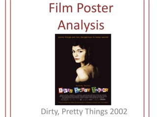
- 2. Purpose The poster doesn’t give too much but just the title and the other production information. The image is the centre point which takes a majority of the poster, this is an important indicator as the female is looking rather secretive with the fading into black effect gives a mysterious look wanting the audience to watch more Key Image The main image is of the female who is placed in the middle of the poster, she is clearly the main attraction as the size of her is quite large. She appears to be looking towards us with not a lot of emotions in her face; she does however look seductive as she is not wearing any clothing. Her black hair seems to blend with the black background whilst her torso fades into the background making her come across very mysterious.
- 3. Background The background has literally nothing to it but just a black background; this simply tells the audience of the genre of the film as black is usually seen as sophisticated and conservative. No use of bright colours or any forms of patterns or effects can show the seriousness of the film Colour The colour pallete of the poster is very basic except for the title. The black background gives a darkness feel to it but there is a pop of colour in the text especially the title. The tagline, subline and actresses name are all in a tan-orange colour whilst the title has a variety of bright and bold colours for each letter. There seems to be no colour scheme for the title as the colours are all very different and random (e.g. blue, yellow, green and purple). The title is a major contrast to the rest of the poster as it’s very loud and bubbly, this could’ve been used to ease the tension of the females’ strong facial expression and just give the overall poster more of a likeable look
- 4. Text Font The sans serif of the text is very basic but is very easy to read and the condensed production section in the white is a common style used in most film posters. However, the title is much exaggerated, mimicking the use of cut out pieces of letters found in magazines/newspapers to create the name of film. This could be seen as a unique and eye-catching method to portray but can have a dark side to it as this methods is commonly used by individuals to conceal their identity (by withdrawing their handwriting and fingerprints), adding more to the mystery and the unknown Tag Line “Some things are too dangerous to keep a secret” is the tagline of the poster. This explains the female as she looks to be hiding something. The tagline also suggests that something violent may occur within the movie as there may be a circumstance to those who do not keep the secret. I think the poster needed a tag line as the image doesn’t give too much away, the tagline helps the audience understand the concept more
- 5. Layout The layout if the poster has a very eerie and mysterious look to it as mentioned. There isn’t really a lot going on within the poster but the poster is proportioned evenly with the text and image in suitable places. The darkness of the background takes up the whole poster making it very dominant; this makes the other content stand out a lot more such as the image of the female who appears to be clearly acknowledged, the fact that she is solely by herself indicates she’s the main character and the tagline may have something to do with an issue she will do. She seems to take a lot of the space within the poster leaving the lower half for the text to be slightly compact together again showing that she is the main attraction in the poster Target Audience I would suppose the target audience would be for women due to the main character revolving around a female, but, the tagline shows that the film may include violence and action which will attract male viewers
- 6. Overall Opinion The poster design is rather plain for me, but the mysteriousness caught my eye. The poster design does live up to sophisticated and conservative look which some will find appealing. The image of the female makes me eager to watch the film as I’m intrigued into what is going through her mind and why she may be looking in such a manner. The title makes the poster a bit more edgy but stylish in a funky way, I like how the artist didn’t just stick to the conformist look so went in with the unique title