Commentary: Ethno-demographic change in English local authorities, 1991-2011
•
1 gostou•456 visualizações

A commentary on a graphic submitted to the journal Environment and Planning A as one of its featured graphics. That graphic aims to capture various dimensions of population change within English local authorities from 1991 to 2011: the proportional increase in the Asian population, the decrease in the White British population, generally decreasing Asian - White British segregation within authorities on average but with that average concealing some increases in spatial heterogeneity: increased differences between some neighbouring small areas (and also increased differences between local authorities). To see the graph, please visit http://www.social-statistics.org/?p=1064

Recomendados
Recomendados
Mais conteúdo relacionado
Semelhante a Commentary: Ethno-demographic change in English local authorities, 1991-2011
Semelhante a Commentary: Ethno-demographic change in English local authorities, 1991-2011 (20)
Mais de Rich Harris
Mais de Rich Harris (20)
Último
Último (20)
Commentary: Ethno-demographic change in English local authorities, 1991-2011
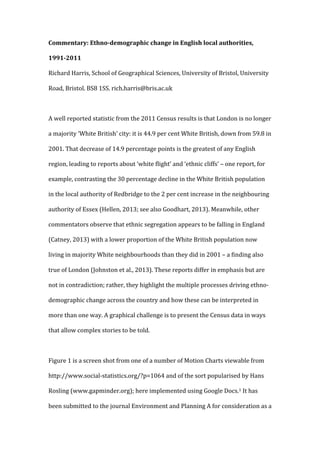
- 1. Commentary: Ethno-‐demographic change in English local authorities, 1991-‐2011 Richard Harris, School of Geographical Sciences, University of Bristol, University Road, Bristol. BS8 1SS. rich.harris@bris.ac.uk A well reported statistic from the 2011 Census results is that London is no longer a majority ‘White British’ city: it is 44.9 per cent White British, down from 59.8 in 2001. That decrease of 14.9 percentage points is the greatest of any English region, leading to reports about ‘white flight’ and ‘ethnic cliffs’ – one report, for example, contrasting the 30 percentage decline in the White British population in the local authority of Redbridge to the 2 per cent increase in the neighbouring authority of Essex (Hellen, 2013; see also Goodhart, 2013). Meanwhile, other commentators observe that ethnic segregation appears to be falling in England (Catney, 2013) with a lower proportion of the White British population now living in majority White neighbourhoods than they did in 2001 – a finding also true of London (Johnston et al., 2013). These reports differ in emphasis but are not in contradiction; rather, they highlight the multiple processes driving ethno-‐ demographic change across the country and how these can be interpreted in more than one way. A graphical challenge is to present the Census data in ways that allow complex stories to be told. Figure 1 is a screen shot from one of a number of Motion Charts viewable from http://www.social-‐statistics.org/?p=1064 and of the sort popularised by Hans Rosling (www.gapminder.org); here implemented using Google Docs.1 It has been submitted to the journal Environment and Planning A for consideration as a
- 2. ‘featured graphic’ (see http://www.envplan.com/graphics_a.html for other interesting examples). On the chart, each circle represents a local authority where at least three per cent of the residential population classified itself as Asian in the 1991, 2001 or 2011 Census (specifically: as Bangladeshi, Indian or Pakistani).2 The increase in their number – 177 (of 326) authorities in 1991, 206 in 2001 and 236 in 2011 – is itself revealing: it suggests a process of migration out from more traditional centres such as Tower Hamlets and neighbouring Newham (Dench et al., 2006) towards the edges of the Greater London conurbation including Epping Forest, Dartford, Medway and beyond. The horizontal axis of the graph indicates the residential separation of the Asian from the White British population within each authority at the time of each census.3 Its measure is the widely used dissimilarity index (Duncan & Duncan, 1955) where the areal units for the calculations are the census small area statistics for each of the local authorities.4 At each census the distributions of the Asian and White British populations are most dissimilar within Oldham but by 2011 Burnley – which saw the rate of decrease in its White British population accelerate from 2001 – had a level of segregation increased to nearly match Oldham’s. Both were amongst the cities exhibiting ethnic tension and civil disturbances in 2001 (Cantle, 2001). At each time period the circle is shaded according to the proportion of the resident population that is Asian. In 2011 the highest proportions are in places
- 3. including Tower Hamlets, Newham, Slough, Redbridge, Leicester and Harrow. From 2001 onwards the size of the circles indicate the intercensal rate of change in the White British population. Both Newham and Tower Hamlets appear to have less White British residents in 2001 than they do in 1991 and their number falls again by 2011. The rate of loss slows in Tower Hamlets whereas in Newham it increases. The latter is also true of Leicester. However, in Leicester the net effect of White British losses and a growing Asian population is that the dissimilarity index rises. In Newham (and Tower Hamlets) it decreases. The fifth and final dimension of the graph is the spatial discontinuity score given on the vertical axis. That score is calculated in regard to the Asian – White British populations by finding the greatest dissimilarities between neighbouring small areas within local authorities and then averaging over the top ten per cent.5 The greater the value, the greater the Asian – White British contrast between (some) neighbouring zones within each authority. Whilst the dissimilarity index suggests that Asian-‐White British segregation is falling on average within local authorities, that average conceals internal heterogeneity and a rise in the differences between some neighbouring zones over the decade from 2001 to 2011.6
- 4. Figure 1. An example of using a Motion Chart to explore ethno-‐demographic change in English local authorities, 1991-‐2011. Software used The maptools and spdep libraries in R (Bivand & Lewin-‐Koh, 2013; Bivand et. al., 2013), and Google Docs Motion Charts Gadget. Acknowledgments
- 5. Census output is Crown copyright and is reproduced with the permission of the Controller of HMSO and the Queen's Printer for Scotland. I am also grateful to David Manley for comments on earlier versions of the charts. References Bivand, R. with contributions by Altman, M., Anselin, L., Assunção, R., Berke, O., Bernat, A., Blanchet, G., Blankmeyer, E., Carvalho, M., Christensen, B., Chun, Y., Dormann, C., Dray, S., Halbersma, R., Krainski, E., Legendre, P., Lewin-‐Koh, N., Li, H., Ma, J., Millo, G., Mueller, W., Ono, H., Peres-‐Neto, P., Piras, G., Reder, M., Tiefelsdorf, M., & Yu., D. (2013) spdep: Spatial dependence: weighting schemes, statistics and models. R package version 0.5-‐56. http://CRAN.R-‐ project.org/package=spdep Bivand, R. & Lewin-‐Koh, N. (2013) maptools: Tools for reading and handling spatial objects. R package version 0.8-‐23. http://CRAN.R-‐ project.org/package=maptools Cantle, T. (2001) The Cantle Report -‐ Community Cohesion: a report of the Independent Review. London: The Home Office. Catney, G. (2013) Has Neighbourhood Ethnic Segregation Decreased? The Dynamics of Diversity: evidence from the 2011 Census Briefing. Manchester: Centre on Dynamics of Ethnicity (CoDE). Dench G., Gavron K. & Young, M. (2006) The New East End. Kinship, Race and Conflict. London: Profile Books. Duncan O. D. & Duncan, B. (1955) Occupational stratification and residential distribution. American Journal of Sociology, 60 (5), 493 – 503.
- 6. Goodhart, D. (2013) White flight? Britain’s new problem – segregation. Prospect, February 2013, pp. 30 – 31. Hellen, N. (2013) Britons ‘self-‐segregate’ as white flight soars. The Sunday Times, January 27, 2013, p. 15 Johnston, R., Poulsen, M. & Forrest, J. (2013) Multiethnic residential areas in a multiethnic country? A decade of major change in England and Wales. Environment and Planning A, 45 (4), 753 – 759. 1 See http://www.gapminder.org/upload-‐data/motion-‐chart/ for a simple tutorial. 2 For consistency the boundaries and names of the local authorities as of 2011 are used for all years even though the change between years generally is slight. 3 White British was not used as an ethnic category in 1991 although it was in the 2001 and 2011 Censuses when interest in immigration from other parts of Europe increased. For 1991 the White British population is estimated as those who classified themselves as White minus those born in Ireland. It will be an over-‐estimate of the White British group. 4 The index will reach zero if the share of the authority’s Asian population in each small area is equal to the share of the White British population. It will reach one if all of the areas within the authority contain either an Asian or White British population but not a mixture of both. 5 The index will reach one if, in the ten percent most extreme cases, one zone contains no White British residents whilst its neighbor contains no Asian residents. 6 The differences between local authorities also appear to be rising: a dissimilarity score of 0.30 in 1991, 0.34 in 2001 and 0.39 in 2011. Only authorities where the percentage of the population that is Asian is at least three per cent are included in these calculations.