The combination of the author's three products effectively creates a unified brand by linking the products together through common elements like genre, style, and appeal, while differentiating the products' focus on different characters. Using screenshots and similar design elements like fonts, colors, and effects across the products provides familiarity and consistency that promotes synergy greater than individual effects. The goal was to capture the suspense and mystery of the film in each product to consistently convey the intended feelings to the target audience.
1. How effective is the combination of your main product and ancillary texts?
The combination of my three products have elements which effectively create
one brand and successfully link together. In the construction of my ancillary task
I aimed to make the two a successful combination but for them respectively to
compliment each other, through taking on different aspects if the film but
having common factors such as genre, style, and appeal running through out. I
did this through having my poster focusing on the antagonist and the double
page spread focusing on the protagonist, covering the two main characters the
audience will see different angels of the film when looking at each product;
which in turn should result in them wanting to watch the film. This is a form of
synergy which is the working together of two or more elements to produce a
result greater than the sum of their individual effects.
The use of images which where screen shoots from my main product creates an
underlying point of identification which audiences who see one product will
already be familiar with if seeing another, this is a common code used in other
media products. Similarly both ancillaries with the use of Photoshop have
similar ghostly effects which although are different derive from the main
features of my main product, these being its mysterious and sinister nature.
Typically elements such as typography, colour scheme, and style make for an
effective combination of the three products but as the link between the two is
to promote the film I did not have to create an in house brand rather I focused To create a successful combination I aimed to try and convey the feelings associated when
on developing a mini brand after the film name “The imposition” with its own watching the film into each ancillary. Through audience feedback I identified that suspense
distinct look. and mystery as the main feelings the audience felt, I then tried to incorporate and capture
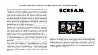
By using one typeface for the film I was able to create a mini brand one which is this within each ancillary. I did this by the type of image the effect and filter of theses. The
similar to the “Scream” brand which is a recognisable franchise. The use of one strap line for the poster and double page spread and background colours of each. Through
recognisable font can create a global brand in which builds a audience and doing this I was able to create a reoccurring feeling which the target audience would feel
customer base. This is why chose to add red to the “I”’s as this turned my simple when looking at either or all products.
text into something creative and unique, in which people will think of the film
(poster and article) when seeing the typeface similar to that of the scream
movies.