Responsive Web Design - One Website for 6500 Devices
•Transferir como PPTX, PDF•
11 gostaram•2,619 visualizações

Responsive web design lets you create a single website that detects the screen size of the device viewing it and fluidly adapts site content, layout and functionality in response to fit that device. Responsive design is more than just mobile website design. This resource introduces the responsive web design approach, shows examples, discusses 10 direct business benefits, and can be used to help marketers present the concept of responsive design to their team. Learn more at rwd.quarry.com

Recomendados
Recomendados
Mais conteúdo relacionado
Mais de Quarry
Mais de Quarry (8)
Último
Último (20)
Responsive Web Design - One Website for 6500 Devices
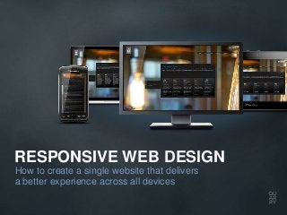
- 1. RESPONSIVE WEB DESIGN How to create a single website that delivers a better experience across all devices
- 2. IN THE EARLY DAYS THE WEB WAS A SIMPLER PLACE
- 3. NOT ANYMORE
- 4. MOBILE BROWSING WILL SOON OVERTAKE DESKTOP BROWSING
- 6. 70% OF COMPANIES SAID THEY HAD YET TO LAUNCH A MOBILE SITE Source: Econsultancy
- 7. SURPRISE! TODAY, EVERY SITE IS A MOBILE SITE
- 8. THERE ARE OVER 6500 DIFFERENT MODELS OF MOBILE DEVICES Source: MobiThinking
- 9. TRADITIONAL WEB DESIGN FOR MOBILE BROWSING Detect the device and redirect to a unique version of the site specifically for that device
- 10. IS THERE A BETTER WAY?
- 11. RESPONSIVE WEB DESIGN A website that fluidly adapts its layout, content and even functionality in response to the device that is viewing it
- 12. cavoy.com
- 13. us.onsior.com
- 14. lounge.norton.com Copyright © 2012 Symantec Corporation. All rights reserved. Reprinted with permission from Symantec Corporation.
- 15. quarry.com
- 16. THE INGREDIENTS OF RESPONSIVE WEB DESIGN • Media queries (CSS3) • Fluid grids & layouts (and often fixed grids too) • Flexible images & media
- 17. 10 DIRECT BENEFITS FOR YOUR BUSINESS 1. Build brand equity 2. Offer a consistent brand experience 3. Prioritize your messaging 4. Address buyers’ needs 5. Save money and time 6. Increase efficiency 7. Lower complexity 8. Provide clarity 9. Build traffic 10. Prepare your online presence for the future
- 18. HOW COULD WE GET STARTED? 1. Get internal buy-in 2. Determine how mobile our buyers are today 3. Start with a campaign landing page 4. Assess the “responsive-readiness” of current site(s) 5. Investigate “retrofitting” current site(s) to go responsive 6. Dedicate a budget for a responsive pilot
- 19. WANT TO LEARN MORE? Download this free 26-page Guide at to learn what Responsive Web Design is, why you need to know about it and how to get started. See what websites look like on various mobile devices using our testing tool. Or view our video to explore how Responsive Web Design delivers a better customer experience.
- 20. Quarry Integrated Communications 1440 King Street North St. Jacobs, Ontario Canada N0B 2N0 +1 519.664.2999 www.quarry.com responsive@quarry.com
Notas do Editor
- In the early days, the web was a much simpler place. In terms of devices that buyers could use to access it, this was about it.
- Not anymore. Today, there are literally thousands of mobile device models – each with varying screen sizes – capable of visiting a website. This device diversity has created some significant challenges for marketers.
- And in terms of a trend, this one isn’t going away! Internet traffic generated from mobile devices is set to soon overtake traffic from desktops.
- You could say this issue – or opportunity, depending how you look at it – is like a freight train heading marketers way. The problem is, too many are looking the other way…
- In fact, right now, most of them are looking the other way. In a recent survey by Econsultancy, 70% of companies said they had yet to launch a mobile site.
- The thing is, they are 100% wrong. Every website today is a mobile website, whether you know it or not.
- Remember that problem of device diversity? Well up until recently, marketers have handled that by…
- … building sites that detect devices and redirect visitors to unique versions of the site specifically for that device. That’s a lot of sites to build and maintain!
- While device detection will still play an important role in delivering great experiences for the mobile environment, there is now another tool in your toolkit.
- It’s called Responsive Web Design, and it’s an approach to designing and developing websites that allow them to fluidly adapt their layout, content and even functionality in response to the screen size of the device that is viewing it, all from a single code base.
- Here are a few examples of some great responsive websites. Notice how the layout, functionality and content in these websites adapt in response to the different browser sizes when viewed on different devices – while maintaining consistency in brand experience, user experience and the marketing messages conveyed.
- Technically speaking, the practice of building a responsive website (as originally discussed by Nathan Marcotte) draws on a couple of key ingredients: namely, fluid grids and layouts (with flexible images and media) that use media queries within Cascading Style Sheets.Media queries, a relatively new enhancement of CSS3, are the real secret behind making a site responsive. These are the magic bits of code that inform the browser, on load, which styles it should or should not apply to the page, based on information about the device such as its screen size, orientation, pixel density and so on. The same website can then be visually rendered as different layouts for different situations to appropriately optimize the user experience.
- Here are 10 reasons to consider Responsive Web Design:1. Build brand equity. We’ll delight buyers, and build greater equity into our brand when we deliver the right user experience for the right screen size at the right time.2. Offer a consistent brand experience. We’ll offer a consistent (note: not “identical”) brand experience across devices for your potential buyers.3. Prioritize your messaging. We can maintain prioritization and flow of your messaging regardless of device.4. Address buyers’ needs. We can use context-inspired content strategy and information architecture to address buyers’ needs.5. Save money and time. We can build and manage a single site with a single code base for long-term cost savings and easier maintenance.6. Increase efficiency. We can consolidate content management for greater efficiency and consistency.7. Lower complexity. We can lower complexity in some respects, with no special technology required to sniff browsers and redirect.8. Provide clarity. Marketing tactics can promote one URL to buyers and prospects.9. Build traffic. We can enable better SEO, with all traffic building visibility for the same site.10. Prepare your online presence for the future. In terms of mobile devices, there’s always a next big thing on the horizon. A responsive approach to web design and development will help us get ready for it today.
- Here are 6 ways to get started:1. Get internal buy-in: Kick-start the conversation by challenging ourselves to answer these questions:“How mobile-friendly is our website today, really?”“Are the experiences we deliver in line with our brand promise?”“In what ways could we make those experiences better for mobile visitors?”2. Determine how mobile our buyers are today:Strengthen our evidence-based business case for a responsive website by putting in place the measurement tools you’ll need to answer this key question: “To what extent are our buyers using mobile devices to engage with us today?”.3. Start with a campaign landing page: Pick some campaign landing pages to experiment with responsive – they’re a natural place to start. 4. Assess the “responsive-readiness” of current site(s):To understand whether or not your site is a good candidate for a responsive retrofit, have our digital marketing team or agency conduct a responsive-readiness audit.5. Investigate “retrofitting” current site(s) to go responsive: It may be possible to recalibrate your existing websites with media queries that enable them to become “responsive” too. Think of this approach as a “responsive retrofit” without a full site redesign and rebuild.6. Dedicate a budget for a responsive pilot: Pilot a responsive initiative on a small scale before rolling it out in full.