
Recomendados
Mais conteúdo relacionado
Mais procurados
Mais procurados (20)
Destaque
Destaque (20)
Semelhante a Poster textual analysis
Semelhante a Poster textual analysis (20)
Mais de PatrickColl99
Mais de PatrickColl99 (20)
Último
Último (20)
Poster textual analysis
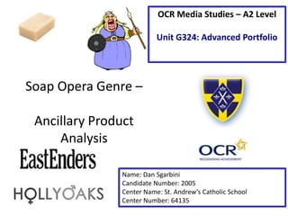
- 1. Soap Opera Genre – Ancillary Product Analysis Name: Dan Sgarbini Candidate Number: 2005 Center Name: St. Andrew’s Catholic School Center Number: 64135 OCR Media Studies – A2 Level Unit G324: Advanced Portfolio
- 2. Tagline- The tagline is effective at engaging the audience as it is hinting at the upcoming events in the series. The use of punctuation acts as dramatic pauses to let the content sink in. The verbal code of ‘Forever’ could connote how things will never be the same again, which is a big statement for a Soap Opera. Walford is an iconic place in the EastEnders show, so the inclusion of this in the poster could be an incentive for the fans that are more involved in the show and for people who are new to the Soap. Image – The main image within this poster is very simplistic, not giving a way too much of what is going to happen. The use of the character could hint at their involvement in the next series and the London background could express the brand identity of EastEnders even more. Synergy with social media- Social Media has been successfully used within this poster to generate ‘hype’ for the events the poster is promoting. By including a generic social media hash tag, users are able to interact with each other and the producers to discuss their views towards what has, and what is going to happen. This engages the audiences and makes them more likely to carry on watching the series. Institution Logo- The institution logo has been successfully used to reinstate the BBC brand identity, giving the audience the security that this is the real brand.
- 3. Image – The image has been manipulated so the characters look like they are on fire by changing colours and applying smoke effects around the characters. This connotes how the events of Hollyoaks are “Heating Up” and it could be potentially dangerous for the characters. Alternatively, it could hint towards the plot, where there may be a house on fire or someone getting injured by fire. Institution Logo- The institution logo has been successfully used to reinstate the Channel 4 brand identity, giving the audience the security that this is the real brand. Tagline The verbal code of ‘forever’ used in the tagline for Hollyoaks is successfully used to highlight the importance of the series, imparting how if you miss this series you are not going to be able to follow future episodes.
- 4. Student Exemplar Work – Textual Analysis Title- For a new Soap it is important that the name of the Soap is visible on the page as it isn’t a previously established brand. The bold, white title stretching the width of the page is effective as it stands out and doesn't obstruct the characters. Personally I would have had it smaller on the page as this might make it look more professional. Social Media- The inclusion of Social Media on the page is effective as viewers are then able to interact with each other and the producers of the Soap Opera outside of the programme timings. The hash tag means this can be achieved on a wide variety of platforms, giving the audience different ways to interact with the content. Institution- inclusion of the institution logo is effective as it allows the reader to have a sense of security that the Soap Opera has been professionally produced by a brand they are familiar with. Main Image- The main image is effective as the low opacity flames in the background hint towards the “heat” of the events in the series while also looking aesthetically pleasing. The alignment of the character is also effective as they are all looking directly at the camera intimidating the audience. Their personalities have also coming across in these photos with the three men and one woman looking like dominant males and one woman looking more innocent. Tagline- The tagine “It’s time to turn up the heat” coincides with the low opacity fire effect in the background hinting towards the events of the series metaphorically ‘heating up’. This is additionally effective as it coincides with their trailer where they put everything in an oven to be heated up, therefore producing the Soap ‘Walton Hill’. Critical Praise- The use of critical praise gives the audience the security that what they are about to watch is of good quality and it makes other viewers more inclined to watch it. The lack of 5 star reviews is modest, which shows that the Soap is honest and understands that it may not appeal directly to everyone.
- 5. In my Soap Opera promotional poster I would ideally like to ‘repeat’ (Steve Neale) the use of social media as this primarily gives the audiences a universal way of reacting with the content and creates free advertising for the Soap Opera. Furthermore, I would also like to repeat the subtle institution logo in the bottom left hand corner to give the audience the idea that this is a professional Soap produced by a professional institution. I also like the idea of the inclusion of fire as this does make the poster look more engaging and aesthetically pleasing. It is also important that I include a tagline for the Soap as this hints towards the plot of the series and gives the audience a clear idea of what they are about to consume. Moreover, the inclusion of critical praise is effective as you are able to show that your content has been viewed and appreciated by big name brands in the respective industry. Conclusion