SlideShare uma empresa Scribd logo
1 de 2
We chose this font for the text as it was very clear as well as adding that older look to
the recipe cards. This was also used as a title on one of the numerous cards made.
(Baskerville Old Face)
This was the font that we decided would be best for the title as it provided
professionalism to the set of cards. There was a lot of disagreement and eventually
we came to a compromise where we would make three sets of cards with different
fonts and colours to please everyone involved. This font was chosen as it also had a
touch of Italy in and would relate to our theme throughout the cards. This would also
psychologically make the person reading it feel like it was an Italian recipe. (Brush
Script Std)
In the planning stage this font was brought to our attention and considered when producing
the cards. However after experimenting the font next to the images we took, it did not suit
the theme and looked too simplistic for what we were looking for. As the brief wanted
something that stood out and caught the attention of the potential buyer, we felt this did
not. (Calibri Body)
When asking for feedback on the cards, it was suggested to us that using a common
font would be a good way to stay with our targeted market (Mass Market). When
looking at research collected from vegetarians, it was brought to our attention that
people wanted quick and easy meals. Having a hard to read text would not be
suitable to the theme selected. The original suggestion was to look at the font
Helvetica which was popular in the 90’s, however Arial was a good substitute. (Arial)
Another font that came up in conversation was this; we believed that it would
bring the text out more and make it stand out. This was because of the method
overlapping the silhouette on the back of the recipe card. We didn’t want the
font to compromise the composition of the cards. The best way was to make it
bolder without increasing the size of the text. (Comic sans MS)
Fonts!

Mais conteúdo relacionado

Mais procurados

Mais procurados (18)

Magazine Stylesheet
Magazine StylesheetMagazine Stylesheet
Magazine Stylesheet
 
Testing fonts
Testing fontsTesting fonts
Testing fonts
 
Testing fonts
Testing fontsTesting fonts
Testing fonts
 
Billboards research pdf
Billboards research pdfBillboards research pdf
Billboards research pdf
 
Magazine research
Magazine researchMagazine research
Magazine research
 
Magazine research
Magazine researchMagazine research
Magazine research
 
Front cover in depth mock up
Front cover in depth mock upFront cover in depth mock up
Front cover in depth mock up
 
Fonts and colours
Fonts and coloursFonts and colours
Fonts and colours
 
Fonts analysis
Fonts analysisFonts analysis
Fonts analysis
 
Masthead Designs
Masthead Designs Masthead Designs
Masthead Designs
 
Front cover analysed
Front cover analysedFront cover analysed
Front cover analysed
 
Music magazine fonts
Music magazine fontsMusic magazine fonts
Music magazine fonts
 
Task 8 research
Task 8 researchTask 8 research
Task 8 research
 
Masthead designs
Masthead designsMasthead designs
Masthead designs
 
Masthead font styles
Masthead font stylesMasthead font styles
Masthead font styles
 
FMP Week 11 Feedback
FMP Week 11 FeedbackFMP Week 11 Feedback
FMP Week 11 Feedback
 
Choosing Font for my CD Cover:
Choosing Font for my CD Cover:Choosing Font for my CD Cover:
Choosing Font for my CD Cover:
 
Evaluation pro forma!!
Evaluation pro forma!!Evaluation pro forma!!
Evaluation pro forma!!
 

Semelhante a Fonts!

Text analysis for Cd cover and advert
Text analysis for Cd cover and advertText analysis for Cd cover and advert
Text analysis for Cd cover and advertLukeBrazierMedia
 
Planning for print
Planning for printPlanning for print
Planning for printGreenshaw
 
creating my masthead
creating my mastheadcreating my masthead
creating my mastheadtheresakuhn4
 
How effective is the combination of your main product and ancillary texts?
How effective is the combination of your main product and ancillary texts?How effective is the combination of your main product and ancillary texts?
How effective is the combination of your main product and ancillary texts?mirandaroberts19
 
Masthead and Subheading fonts.docx
Masthead and Subheading fonts.docxMasthead and Subheading fonts.docx
Masthead and Subheading fonts.docxFarihah Khan
 
My suitable masthead fonts
My suitable masthead fonts My suitable masthead fonts
My suitable masthead fonts Asuka Young
 
My suitable masthead fonts
My suitable masthead fonts My suitable masthead fonts
My suitable masthead fonts Asuka Young
 
Production Phase[1]
Production Phase[1]Production Phase[1]
Production Phase[1]MFJ
 
Factual writing example analysis
Factual writing example analysisFactual writing example analysis
Factual writing example analysisalisrose1
 
How to make an awesome presentation
How to make an awesome presentationHow to make an awesome presentation
How to make an awesome presentationjltmac
 
Typographic Design
Typographic DesignTypographic Design
Typographic DesignMatt Keliher
 

Semelhante a Fonts! (20)

House style
House styleHouse style
House style
 
Fonts and colours
Fonts and coloursFonts and colours
Fonts and colours
 
Text analysis for Cd cover and advert
Text analysis for Cd cover and advertText analysis for Cd cover and advert
Text analysis for Cd cover and advert
 
Planning for print
Planning for printPlanning for print
Planning for print
 
Our magazine
Our magazineOur magazine
Our magazine
 
creating my masthead
creating my mastheadcreating my masthead
creating my masthead
 
How effective is the combination of your main product and ancillary texts?
How effective is the combination of your main product and ancillary texts?How effective is the combination of your main product and ancillary texts?
How effective is the combination of your main product and ancillary texts?
 
Masthead and Subheading fonts.docx
Masthead and Subheading fonts.docxMasthead and Subheading fonts.docx
Masthead and Subheading fonts.docx
 
Final cards
Final cardsFinal cards
Final cards
 
Final cards
Final cardsFinal cards
Final cards
 
Peer feedback
Peer feedbackPeer feedback
Peer feedback
 
Peer feedback(1)
Peer feedback(1)Peer feedback(1)
Peer feedback(1)
 
My suitable masthead fonts
My suitable masthead fonts My suitable masthead fonts
My suitable masthead fonts
 
My suitable masthead fonts
My suitable masthead fonts My suitable masthead fonts
My suitable masthead fonts
 
Production Phase[1]
Production Phase[1]Production Phase[1]
Production Phase[1]
 
Factual writing example analysis
Factual writing example analysisFactual writing example analysis
Factual writing example analysis
 
How to make an awesome presentation
How to make an awesome presentationHow to make an awesome presentation
How to make an awesome presentation
 
Typographic Design
Typographic DesignTypographic Design
Typographic Design
 
Evaluation q4
Evaluation q4Evaluation q4
Evaluation q4
 
Kerrang!
Kerrang!Kerrang!
Kerrang!
 

Mais de PJG123

Pitch
Pitch Pitch
Pitch PJG123
 
Pitch
Pitch Pitch
Pitch PJG123
 
Evaluation (task 9)
Evaluation (task 9)Evaluation (task 9)
Evaluation (task 9)PJG123
 
Research template
Research templateResearch template
Research templatePJG123
 
Research template
Research templateResearch template
Research templatePJG123
 
Evaluation (task 9)
Evaluation (task 9)Evaluation (task 9)
Evaluation (task 9)PJG123
 
Final products
Final productsFinal products
Final productsPJG123
 
Outline of final idea
Outline of final ideaOutline of final idea
Outline of final ideaPJG123
 
Campaign Poster Development
Campaign Poster Development Campaign Poster Development
Campaign Poster Development PJG123
 
Mood board (surf merchandise)
Mood board (surf merchandise)Mood board (surf merchandise)
Mood board (surf merchandise)PJG123
 
Flat plans
Flat plansFlat plans
Flat plansPJG123
 
Presentation1
Presentation1Presentation1
Presentation1PJG123
 
Task 5
Task 5Task 5
Task 5PJG123
 
Task 6
Task 6Task 6
Task 6PJG123
 
Task 5
Task 5Task 5
Task 5PJG123
 
Task 3
Task 3Task 3
Task 3PJG123
 
Research template
Research templateResearch template
Research templatePJG123
 
Task 6
Task 6Task 6
Task 6PJG123
 
Task 6
Task 6Task 6
Task 6PJG123
 
Task 5
Task 5Task 5
Task 5PJG123
 

Mais de PJG123 (20)

Pitch
Pitch Pitch
Pitch
 
Pitch
Pitch Pitch
Pitch
 
Evaluation (task 9)
Evaluation (task 9)Evaluation (task 9)
Evaluation (task 9)
 
Research template
Research templateResearch template
Research template
 
Research template
Research templateResearch template
Research template
 
Evaluation (task 9)
Evaluation (task 9)Evaluation (task 9)
Evaluation (task 9)
 
Final products
Final productsFinal products
Final products
 
Outline of final idea
Outline of final ideaOutline of final idea
Outline of final idea
 
Campaign Poster Development
Campaign Poster Development Campaign Poster Development
Campaign Poster Development
 
Mood board (surf merchandise)
Mood board (surf merchandise)Mood board (surf merchandise)
Mood board (surf merchandise)
 
Flat plans
Flat plansFlat plans
Flat plans
 
Presentation1
Presentation1Presentation1
Presentation1
 
Task 5
Task 5Task 5
Task 5
 
Task 6
Task 6Task 6
Task 6
 
Task 5
Task 5Task 5
Task 5
 
Task 3
Task 3Task 3
Task 3
 
Research template
Research templateResearch template
Research template
 
Task 6
Task 6Task 6
Task 6
 
Task 6
Task 6Task 6
Task 6
 
Task 5
Task 5Task 5
Task 5
 

Fonts!

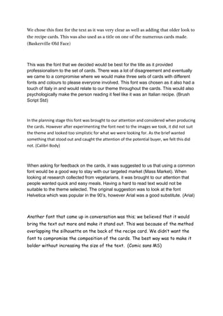
  • 1. We chose this font for the text as it was very clear as well as adding that older look to the recipe cards. This was also used as a title on one of the numerous cards made. (Baskerville Old Face) This was the font that we decided would be best for the title as it provided professionalism to the set of cards. There was a lot of disagreement and eventually we came to a compromise where we would make three sets of cards with different fonts and colours to please everyone involved. This font was chosen as it also had a touch of Italy in and would relate to our theme throughout the cards. This would also psychologically make the person reading it feel like it was an Italian recipe. (Brush Script Std) In the planning stage this font was brought to our attention and considered when producing the cards. However after experimenting the font next to the images we took, it did not suit the theme and looked too simplistic for what we were looking for. As the brief wanted something that stood out and caught the attention of the potential buyer, we felt this did not. (Calibri Body) When asking for feedback on the cards, it was suggested to us that using a common font would be a good way to stay with our targeted market (Mass Market). When looking at research collected from vegetarians, it was brought to our attention that people wanted quick and easy meals. Having a hard to read text would not be suitable to the theme selected. The original suggestion was to look at the font Helvetica which was popular in the 90’s, however Arial was a good substitute. (Arial) Another font that came up in conversation was this; we believed that it would bring the text out more and make it stand out. This was because of the method overlapping the silhouette on the back of the recipe card. We didn’t want the font to compromise the composition of the cards. The best way was to make it bolder without increasing the size of the text. (Comic sans MS)