

Recomendados
Mais conteúdo relacionado
Mais procurados
Mais procurados (19)
Destaque
Destaque (11)
Mais de Olga Shurakova
Mais de Olga Shurakova (13)
Dps analysis checked
- 1. Layout and content: On a standard double page spread (DPS) the readership expects to see a big main image filling almost a half of the DPS, accompanied by, maybe, some other smaller, relevant images. They also expect to be presented with some sort of information related to the title and the main image and it should definitely reflect the target audience and the genre of music it is based around. On this DPS the first thing that we see is the image of the band this DPS focuses on, which meets the criteria of a standard DPS. On the left hand side there body copy, an interview which takes up around 35% of the DPS and it is also written in columns, as standard. This is a very common way of arranging text, as it makes the DPS more organised and easier to read. The headline of this DPS also follows the conventions of a standard DPS due to being placed in the top left hand corner, where it becomes one of the first things the audience sees; headlines tend to be positioned top left or right depending on the location of the main image. This is heightened by the fact that it is written in big, bold, capital letters, which grabs the readers‟ attention. On the left hand side, where all the text and titles are placed, the reader can see another common feature of the DPS, which is boxed text. On this specific DPS the boxed text provides a reader with a short opening story to the main interview. The left hand positioning will mean that, again, it will be one of the first things the audience sees. This is a good thing, as, in this case, Text: The main body of this DPS, or in other words the body copy, is presented in two columns making it it is the opening of the article and the choice of look neat and easy to read and access. The questions which the journalist is asking are written in capital layout could help draw the audience it. This letters and are written in a different font; this is quite a common technique used to allow the audience to particular DPS does look similar to other DPS from quickly differentiate between question and answer. The body copy consists of an interview with the the same magazine. For example, most of the members of Metallica and the name of each band member is placed before their response, so that the Kerrang! front covers have their titles of DPS put in reader knows who is answering the question, making this a simple and easy to follow layout. The mode of quotation mark, meaning that they were quoted by someone who this DPS is about. Again, the address used throughout the interview consists of language which the target audience would be able to audience can be drawn in by this, as it makes them understand and relate to, for example, “...what bugs me” or “...is such a mindf*ck”. The language used feel interested in what the rest of the article will throughout the text reflects the TA, showing that they are carefree, young, slightly out to rebel and in full be about and desperate to find out more. However, control of their lives. On this DPS there are no pull quotes. Used (apart from the headline itself, of course). in every edition of Kerrang there is a slightly However, they are not really needed as the questions which the journalist asks will interest and draw in the different layout each time i.e. the text may be reader, just like the headline and standfirst will. placed on a different side, or there might be a bigger image which takes up more space and less text.
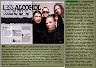
- 2. Image: The main image is located on the right side of the DPS, and it looks like it is taking up a good half of it. This is a very effective way of arranging the DPS as the target audience will see straight away who the article is about. As the image is on the right, it will be the first thing the audience see when they flick through the magazine, drawing attention to it. On the image we can see a rock band called Metallica, with its band name written on the top of the image. This happens in order to promote the band and so that the reader would recognise them next time. It looks like the main image was taken in a studio specifically for this DPS. The first thing that catches our eyes is the lead singer, as he is the only one who is giving the reader the look, almost as if saying “You wanna know, right, bro?”, thus encouraging the reader to read the interview with Metallica members. This look goes well with the title “Less alcohol, less drugs and less dodgy women‟, as the reader would want to know how exactly their live their life and how they break from the stereotype, which claims that all rock stars drink lots of alcohol, take drugs and have low respect for and sleep with lots of women. The other three members of the band also have the same look, though not as blatantly as the lead singer. This may have been done in order to add emphasis on the lead singer and to suggest that he is the main authority on what goes on in the band. Additionally, this is also a way of saying that the Smaller Related Images: There are also some Image: Underneath the main image, there is a lead singer is the leader of the band, so he gets to smaller photos present on the DPS, which are the small quotation which states “If this was a pub express himself more and do the things differently. photos of the band members. I believe that they are quiz we‟d totally win a pint...” thus showing that It may also show his personality that he likes to act the members of Metallica took the time to think differently and live a rebellious life. Furthermore, members of a different band as one of the images about each single question they were asked and to he likes to express himself; showing that he is presents one of the members of Slipknot. Therefore, answer them properly. It could also suggest a different. There is also some genre specific i think the other musicians are giving their opinion certain amount of arrogance. Although this iconography, though not as much as you would on the band, which will interest the readership as quotation is not visible at first, it is there for a expect to see. Most of the band members have long they are likely to be fans of the band. The photos purpose. Most of the reader take time to look hair, which is often associated with rock or heavy are placed next to their reply to a certain question, through the main image, trying to capture every metal music. Furthermore, one member of a band which they have been asked. It is and effective way single detail on it, so seeing this quote would has piercing and a chain bracelet, which makes him make them think about the interview a bit more. look violent and uncontrollable, which is also often of structuring the interview as the reader will be This quote almost gives reassurance that members associated with this type of genre of music. The able to see visually who is answering the questions of Metallica exposed honest feelings and responses dark glasses he wears makes him look cool, tough asked. in respond to the questions. and not to be messed with.
- 3. The Title: The headline used on this page is presented in large uppercase font, which would be more appealing to males, therefore reflecting the magazine‟s target audience. The words „alcohol‟, „drugs‟ and „dodgy women‟ are also written in bold font, which adds emphasis on to the them and draw‟s the readership‟s attention to them. Those kinds of words are the ones which would encourage the readership to respond to this DPS with more interest. The fact that the title is written in quotation marks shows that those are the word said by one of the band who feature in this DPS. This is very effective as it builds up anticipation of what they are about to read; it certainly gives a hint as to what kinds of things are going to be revealed in the DPS. Furthermore, the readers of Kerrang don‟t intend to read formal articles with formal titles, they want to see articles and interviews which can get under their skin and are about their favourite artist and their lifestyles and this is exactly what can be seen on this DPS. Colours: The colours which dominate this DPS are black and pale, muted brown, which are very masculine Text features: There are a lot of text features present on this DPS and probably the most eye catching text feature is colours, thus reflecting male target the headline. Unlike the grey background, the headline is black which makes is stand out a lot and grab attention. It audience. Furthermore, the colour gives some basic information what this DPS is about, although it doesn‟t reveal too much in order to make the reader scheme of this DPS corresponds with what to find out what the main body copy is about. The article also features a standfirst, which is presented in what the band is wearing, thus making uppercase on a distressed black strip (adding a grungy look to the design of the page).The words „Metallica‟ and „How do the DPS more professional-looking and they do it?‟ are written in bold and different colours in order to make them stand out even further from the rest of the coordinated. By using colours which text. Another reason why these words are written particularly in bold is in order to grab the reader‟s attention and to put across the band which this article is about. The use of a question mark makes the reader stop and wonder, thus complement each other on this DPS, it drawing them in and making them more interested in the article. Furthermore, the use of ellipsis makes it look as if the becomes easier for the reader to read text is not finished forcing the audience to read on. Another text feature which can be seen on this DPS is text boxes. it, as well as making the page more The text box on the left hand side outlines the story of the life of Metallica and how the journalist was able to talk to visually appealing. The muted colour of them. This information is placed in a box as it is extra information not really related to an interview, thus giving a the background could also be said to reader an option to read it or not. Because it is boxed and short, however, and placed on the left hand side the symbolise the fact that the band are readership will be quite likely to read it and become engaged with the article as a whole. The language used inside the text box is a little bit different comparing to the body copy. It uses words such as „Cheerful, chipper and high spirit...‟ toning down their wild rock and roll and „league of its own...who inspire and command respect...‟, which shows just how much the journalist praises the behaviour, as suggested by the band also revealing how a typical fan, of this type of music, would feel. headline.