

Recomendados
Mais conteúdo relacionado
Mais procurados
Mais procurados (20)
Semelhante a Dps 2nd analysis (draft 1)
Semelhante a Dps 2nd analysis (draft 1) (20)
Mais de Olga Shurakova
Mais de Olga Shurakova (13)
Dps 2nd analysis (draft 1)
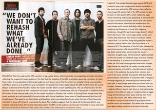
- 1. Layout: The standard double page spread (DPS) will contain a large main image which should be related to the main story which this DPS features. Normally the main image fills almost half of the DPS, which can also be seen on this specific DPS, which makes the page more interesting and visually appealing. A standard DPS can also contain some smaller photos and have some sort of information related to the headline and the main image and it should definitely reflect the target audience and the genre of music this magazine celebrates, though this particular image doesn’t reflect them that much . The main image, which can be seen on this DPS, features a very famous rock band called ‘Linkin Park’. It is the first thing that grabs the reader’s attention, which means that it fits the criteria of a standard DPS. The headline of this DPS also follows the general convention of a standard DPS, as it is written in big, bold, capital letter, which grabs the reader’s attention straight away. On the bottom right hand side corner the reader can see body copy, an article related to the headline. It is written in columns in order to make the DPS look more organised and easier to read. Right below the headline the reader can see another common feature of the DPS, a standfirst which is there to lure in the audience, by giving them a taster, just part of the story. Overall, this specific DPS does follow Headline: The title used on this DPS is written in big capital letters, which would be more appealing to males, therefore general layout convention of a standard DPS of a typical reflecting the magazine’s target audience. The fact that the headline of this DPS is actually a quote by a member of Linkin Kerrang magazine, by presenting the audience with a Park, makes it very appealing to the target audience as it gives a sense that the artists are actually having a conversation clear title, a main image and some sort of text also can with them, which is a very effective way to heighten the excitement of the reader about this DPS. Furthermore, the use of be seen. However, in every edition of Kerrang! there is ellipses at the end of the headline makes the reader wonder what is meant by that quote. The use of dark colour for the a slightly different layout each time i.e. the text may be headline makes it stand out with comparison to creamy background. Furthermore, the use of quotation as headline of this placed on the different side, or it might contain a bigger DPS makes it look informal and easier for the reader to relate to. Besides, the readers of Kerrang! Even though they take image which takes up more space and less text like it music seriously, are not interested in formal articles with formal headlines; those types of headlines would put them off can be seen on this DPS. Most of the time, the straight away. They want to see the articles and headlines which can allow them to get under the skin of their favourite headlines of any DPS are written in quotation marks artist and to know all the latest news about the band. The headline suggests that the band will be discussing their new and this one is no exception. This shows that the words material and what makes it fresh and interesting within this DPS. As the audience are heavily interested in music and what have been said by someone in the band featured. has been produced by their favourite artists, they will be really interested in reading this article.
- 2. Image: It looks like the main image was taken in a studio specifically for this DPS. This photo was taken from a low angle making the band members look bigger and more powerful. However, their soft facial expression shows that although they are famous they are no different from you or me, thus making the reader relate to them more as it shows that they are breaking the stereotype of a typical rock band who put their life above others. This idea that the band is like a group of ‘normal guys’ is heightened by the casual costume that they wear. The first thing that catches our attention is the lead singer. Although all band member have pretty much the same facial expression, the fact that the lead singer is wearing lighter coloured cloths, makes him stand out in comparison to other band members dark outfits. This can be seen a s a way of stereotyping, almost as if saying that the lead singer is the leader of the band, so he gets to wear the cloths he like and express himself more, unlike the other band members who have to stick with the dark cloth. It may also show his personality and his taste in fashion. All of the band members look gown up and mature, showing that they have Image: The main image is located on the right hand side of the DPS stretching across it, taking more than a half of this DPS. moved on in their life, leaving their wild life behind. This is a very effective way of arranging the DPS as the audience will see straight away who the article is about, especially as The headline also complements with the idea they will see the image as soon as they turn the page. On the image we can see a very famous rock band, Linkin Park, a band stating that the band is not prepared to repeat what that is known worldwide. At the top of the image the reader can see the name of the band and a caption stating ‘ready to take they already done in the past. There is also some you on a journey’. Although this caption is not visible at first, it is there for a purpose. Most of the reader take time to look genre specific iconography, though not as much as through the main image, trying to capture every single detail on it, so as they see this caption it would make them wonder what you would expect to see. Most of the band sort of journey it is, thus making this caption a very effective way to lure in the audience. The words within the caption also members have dark clothes which are usually worn suggest that the article will be exciting and that the audience will be entering into unchartered territory with the band when by rock music fans. Furthermore, almost most of reading it. There is a link too with the words presented within the standfirst, which reveals that the band will be taking a ‘leap the band members have a messy haircut and into the unknown’. Furthermore, another reason why the name of the band is written there is in order to promote it and so unshaved beards which is also often associated with that the reader would recognise them next time if seeing them for the first time. Furthermore, apart from the main image people who love rock music. Furthermore, the lead there are no other photos present. This was done in order to keep all of the attention on the band and to keep the look of the singer has, what looks like, ear stretchers, which are DPS simple. It could also reflect the male target audience of this specific DPS, as research shows that men do not like it when also often associated with this type of genre of there is too much going on the page and they prefer information that is straight to the point music and with a more rebellious look.
- 3. Text: The main body of this DPS is an article about Linkin’s Park new album called ‘A Thousand Suns’. It is presented in tree columns, located under the main image, making it look more presentable and easier to follow. Throughout the article, there is a number of quotes can be seen, which were said by the members of the band, thus showing that the article wasn’t all written by a journalist and therefore it can be considered reliable. Furthermore, the use of informal language, such as ‘people check it out’ is the mode of address which the target audience will be able to relate to and understand. Furthermore, the use of quotation gives the reader the feeling that they are spoke by the artist directly, making this DPS more appealing. Furthermore, the reader can also see some quotation which the artist asks himself, such as ‘Have I done a good job in avoiding describing it?’, thus making a direct contact with the reader, making the reader feel that he is a part of this conversation. Colours: The colours which dominate this DPS are black white and red, which when are combined together create a Text features: On this DPS there are a lot of text features present; however, probably the most eye catching text feature on this DPS is the headline. The use of the red background makes it stand out in comparison to the very heavy look, thus reflecting the genre of music this magazine celebrates i.e. rock and heavy metal. Those are other colours present on this DPS. It reveals that this article will give a sneak peak to the reader about how Linkin’s also the colours which will appeal more to a male, thus Park new album would be different comparing to the other two. The words ‘Linkin Park’ and ‘A Thousand Suns’ are reflecting the target audience of this DPS. Furthermore, the written in bold placing emphasis on these words, and making them grab attention. Furthermore, a Thousand Suns colour scheme of this DPS correspond with what the band is is the name of a new Linkin Park album, which is about to be released, so if the fans were to see this DPS they wearing, making the DPS look more presentable and visually would be interested in reading it straight away, thus showing that this is an effective way of luring in the target appealing. One member of the band wears a red shirt, thus audience. Another text feature which can be seen on this DPS is the header with the word ‘News’ almost shouting complimenting the colour of the standfirst and header. Using at the reader. It was place there in order to show that the article on this DPS contains something that was never colours which complement each other on this DPS makes it mentioned before. However, underneath the word ‘News’ there is a reference to the Kerrang website, stating that the reader can find more news there. This is a very effective way of promoting the Kerrang ‘empire’. easier for the reader to read and digest the material.