
Recomendados
Mais conteúdo relacionado
Mais procurados
Mais procurados (18)
Destaque
Destaque (16)
Semelhante a Conventions Evaluation
Semelhante a Conventions Evaluation (20)
Último
Último (20)
Conventions Evaluation
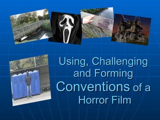
- 1. Using, Challenging and Forming Conventions of a Horror Film
- 2. TRAILER In the trailer, the characters themselves are significant in representing the stereotypical struggle of good against evil. The murderer is portrayed as the evil killer whereas the victims are innocent people who are good. However in our trailer in the last shot we create a twist by having an unknown second man come into the shot to meet the murderer. This creates enigmas as to his involvement to the murders.
- 3. We included many gory shots which involved the use of fake blood. We had shots where blood was splattered up the wall and where blood was smeared round the dog walker’s head. Blood is commonly used in horror films to display the violent and gory element to the film. The murderer was shown throughout parts in the trailer to carry a signature weapon of garden shears. This is similar to horror characters such as Jason Voorhees, who is known for killing his victims with a machete wearing a hockey mask.
- 4. Location: Our location suited well with the horror genre. We chose to shoot in isolated areas which were realistic for a murderer to kill without being seen. The train station went against conventions of a horror as it’s unusual to have someone killed at a station. However we chose this location because it showed that the murderer could strike anyone, anywhere. Overall this builds the enigma of why the murderer is killing these people.
- 5. MAGAZINE FRONT COVER We followed conventions by having the biggest sub-title linking to the picture. In this instance our magazine reads ‘Jack is here’. Also there is noticeably text above the Empire title therefore we copied this idea and linked it to the promotion of ‘Who’s Jack?’ by stating ‘World exclusive of Who’s Jack inside’.
- 6. We used ideas from an existing poster from Empire Magazine, where we used the design of the title to instantly create recognition as a film magazine. Also following on from this, most of the iconography on the magazine obscures part of the film title. Similarly on our magazine cover we put part of the head underneath the title.
- 7. However We chose to advertise that we had interviews with well known actors to get the audience to want to read it for that aspect as well as the endorsement for ‘Who’s Jack?’. We also limited the colour palette to three colours to create a more unique and classic look.
- 8. POSTER Conventionally many horror film posters have a black background to represent the darkness or evil of a character. Similarly we followed this notion by choosing to have a black background. The red writing is also commonly used in posters as it can symbolise blood, evil and good.
- 9. However Unlike most conventional horror film posters we chose to include a variety of the characters including the murderer and his victims, instead of the focus being solely on the killer. Also we chose to have our poster landscape instead of horizontal like conventional posters are. We did this so we could represent that are victims are vulnerable therefore small in size, in comparison to the murderer in the centre.