
Recomendados
Mais conteúdo relacionado
Mais procurados
Mais procurados (20)
The History and Impact of the Iconic Helvetica Typeface
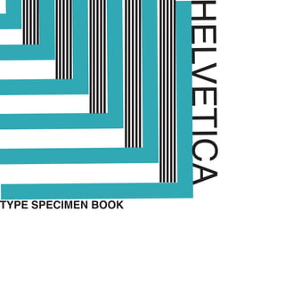
- 1. HELVETICA TYPE SPECIMEN BOOK
- 2. HISTORY HISTORY HISTORY HISTORY HISTORY HISTORY HISTORY HISTORY HISTORY HISTORY HISTORY HISTORY HISTORY HISTORY HISTORY HISTORY HISTORY HISTORY HISTORY HISTORY HISTORY HISTORY HISTORY HISTORY Helvetica was invented in 1957 by Eduard Hoffmann, director of Haas Type Foundry in Münchenstein, Switzerland, with the help of Max Miedinger. The original typography was called Neue Haas Grotesk and it aimed to embody a no-frills style. Hoffmann wanted Neue Haas Grotesk to form a contemporary version of an older typeface known as Akzidenz Grotesk. This new design would allow the typeface to be featured in a variety of situations without ever seeming inappropriate. When Haas Type Foundry’s parent company, Mergenthaler Linotype, decided to market Neue Haas Grotesk in foreign markets, it changed the name to Helvetica in an effort to make it more appealing and easier to pronounce for international customers. Helvetica was received positively, and has grown into several common forms, such as Helvetica Light, Helvetica Bold, and Helvetica Black, that appear on billboards, postcards, business cards, magazine ads, and websites. HISTORY
- 3. HISTORY postcards, Associated with companies including Panasonic, Motorola, Staples, BMW, and many others, Helvetica has swept the globe as one of the most commonly used fonts for designers and corporations, thanks to its simplicity. This sans-serif font is a smooth, straight font with no more lines or markings than necessary. Helvetica came as a breath of fresh air for the United States in an era of overly complicated fonts. Once it took the stage, it pulled the focus away from flowery fonts to clean, crisp designs that got the message across in seconds. Today Helvetica faces competition from similar fonts that mirror its minimalist style. Yet these fonts still have a long way to go to unseat the current king of fonts. THE MOST WIDELY USED TYPE
- 4. helvetica helvetica helvetica helvetica helvetica helvetica helvetica helvetica helvetica helvetica helvetica helvetica helvetica helvetica helvetica helvetica helvetica helvetica helvetica helvetica helvetica helvetica helvetica helvetica helvetica helvetica helvetica helvetica helvetica helvetica
- 5. helveticahelvetica A B C D E F G H I J K L M N O P Q R S T U V W X Y Z a b c d e f g h i j k l m n o p q r s t u v w x y z 1 2 3 4 5 6 7 8 9 0 !¡+*?[]()/&%$#@<> A B C D E F G H I J K L M N O P Q R S T U V W X Y Z a b c d e f g h i j k l m n o p q r s t u v w x y z 1 2 3 4 5 6 7 8 9 0 !¡+*?[]()/&%$#@<> A B C D E F G H I J K L M N O P Q R S T U V W X Y Z a b c d e f g h i j k l m n o p q r s t u v w x y z 1 2 3 4 5 6 7 8 9 0 !¡+*?[]()/&%$#@<> A B C D E F G H I J K L M N O P Q R S T U V W X Y Z a b c d e f g h i j k l m n o p q r s t u v w x y z 1 2 3 4 5 6 7 8 9 0 !¡+*?[]()/&%$#@<> A B C D E F G H I J K L M N O P Q R S T U V W X Y Z a b c d e f g h i j k l m n o p q r s t u v w x y z 1 2 3 4 5 6 7 8 9 0 !¡+*?[]()/&%$#@<> A B C D E F G H I J K L M N O P Q R S T U V W X Y Z a b c d e f g h i j k l m n o p q r s t u v w x y z 1 2 3 4 5 6 7 8 9 0 !¡+*?[]()/&%$#@<>
- 7. Helvetica’s characters always have vertical or horizontal terminations on their strokes, never diagonal. Helvetica is as much about the negative space surrounding the letters than about the lines that make up the characters themselves. The negative space contained within the lowercase “a” closely resembles a teardrop. It has monotone stroke weights. It remains legible when in motion, one reason it’s popular for signage and automaker and airline logos.
- 8. Anatomy BASELINE X-LINE ASCENDER of Helvetica BASELINE X-LINE ASCENDER
- 9. Anatomy DESCENDER X-HEIGHT Helvetica X-HEIGHT