Magazine evaluation question 1 (done)
•Transferir como DOCX, PDF•
0 gostou•132 visualizações

This document summarizes how the media product challenges conventions of real magazines in its design choices. The masthead uses a messy, painted font rather than a crisp one to represent the rebellious target audience. The main cover image is in black and white rather than color to look more serious and classic, appealing to an older demographic focused on heavy, rebellious music. Instead of a traditional right third, it has a left third to emphasize the rebellious genre. While the contents page and double page spread follow conventions, the predominant use of black and white images makes the magazine feel more serious.

Recomendados
Mais conteúdo relacionado
Mais procurados
Mais procurados (20)
Destaque
Destaque (20)
Semelhante a Magazine evaluation question 1 (done)
Semelhante a Magazine evaluation question 1 (done) (20)
Mais de Lynley Sykes
Mais de Lynley Sykes (20)
Último
Último (20)
Magazine evaluation question 1 (done)
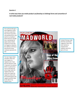
- 1. Question 1 In what ways does you media product use/develop or challenge forms and convention of real media products? The masthead although in most magazines is quite crisp and a simple font I have chosen to go with a more painted and un-neat look for my masthead. I did this because I thought that is represented my target audience better. The genre of music that this magazine is based on this rebellious and heavy, I think that the messy masthead represents this well. The main image is black and white unlike most main images on a magazine cover I have done this because I think it represents my audience better it is quite serious music so the black and white image makes the magazine look more serious also it gives the magazine a classic look this would be good as the magazine would be liked by the older of my audience more. Instead of having a right third like conventional magazines I have a left third I did this to emphasize the rebellious side of the genre of music.
- 2. The contents page follows the conventions of a magazine other than the fact that the images are predominantly black and white this as I have said before is to give the magazine a more serious feel and to appeal to an older audience as well.
- 3. The double page spread also follows conventions as I have said before the black and white image might be the only un-conventional thing about this page.