2. Contents
The Reasons for Brand Standards.................................... 1
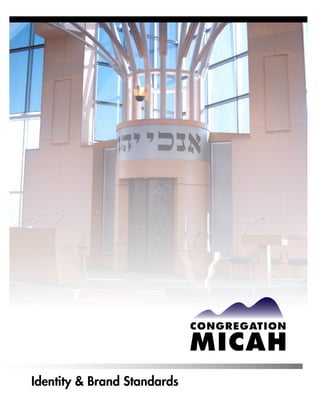
The Congregation Micah Brand....................................... 2
The Congregation Micah Logo......................................... 3
The Congregation Micah Colors....................................... 4
Allowable Uses of Colors and Elements............................. 5
Clear Space and Design.................................................. 6
Unacceptable Uses of the Logo......................................... 7
Stationery Items.............................................................. 8
Advertising..................................................................... 9
Revised July 2010
3. The Reasons for Graphic Standards
The goal of any institution is to create the concept of its “brand” in the mind of the public,
making the institution instantly recognizable, with an implied personality that is consistent
with its stated mission.
The cornerstone of any “branding” effort is the consistent use of its identity (sometimes
referred to as its “logo”) in all applications in which it appears, without alteration or
variation from the standards set forth by the institution. Because it often takes years of
consistent and frequent use of an identity to fix it in the mind of the public, it is imperative
to conform to the institution’s standards on all occasions.
Definition of Terms
Logo The entire identity, including the symbol (the hills) and the logotype
(Congregation Micah). Together, the symbol and the logotype, arranged
in exactly the configuration and colors set forth in these guidelines,
are referred to as “the logo.”
Symbol
Logotype
Brand The distinctive image and personality of Congregation Micah, including
its logo, imagery style, copy tone and color palette, is supported by all its
marketing and public relations efforts.
1
4. The Congregation Micah Brand
The “brand” of the Congregation Micah extends beyond the consistent use of
a logo, tagline, etc. It includes elements of style and personality that reflect the
values embodied in its guiding principle:
Do justly, love mercy, walk humbly with thy God.
~Micah 6:8
This quote from the prophet Micah should be used wherever appropriate.
There is no other tagline.
The following elements should appear in all communications related to Congregation
Micah, whether in print or online:
Imagery should be straightforward photography (rather than clip art), in color when
allowed by budget and technical considerations. Imagery should illustrate the beauty
of its setting and facilities, its diversity, and its welcoming nature.
Copy should be warm, inviting, and professional, reflecting the inclusiveness and
spiritual air of Congregation Micah.
Content should include (as appropriate) a balance of congregant focus, institutional news,
and Reform Jewish principles.
Fonts: The preferred font is Futura or Intrepid; where not available (such as HTML fonts),
Tahoma or Arial may be substituted.
2
5. The Congregation Micah Logo
The Logo
The proper and only acceptable usages of the Congregation Micah logo (symbol and
logotype) are set forth in these guidelines.
Use of the logo is based on the following assumptions:
The logo must only be reproduced in its entirety; no element of the logotype should be left out,
and the symbol must not be left out or used alone.
Symbol
Logotype
The logo must ALWAYS be reproduced from digital files or press-ready art furnished by
Congregation Micah. No one should ever re-create the logo, for any reason.
The logo should only be used by people or institutions specifically authorized to do so by
Congregation Micah.
The logo should NEVER be stretched horizontally or vertically, which would unacceptably
alter its overall proportions.
If there is ever a question about how the logo should be used or by whom, please contact
Congregation Micah.
3
6. The Congregation Micah Color Palette
Colors Used in Printing
The elements of the Congregation Micah logo are to be printed in the specific PMS
(Pantone Matching System) colors listed below. These numbers are used by commercial
printers to match printed colors exactly. The PMS ink color numbers for Congregation
Micah are the same whether printed on coated or uncoated stock.
When it is not possible or practical to reproduce the logo using Pantone spot colors,
CMYK (4-color process colors may be substituted. The closest CMYK color is listed
with each Pantone color below.
PMS 276 Black
C=91, M=90, Y=44, K=52 | R=33, G=28, B=61 C=0, M=0, Y=0, K=100 | no RGB equivalent
Online Reproduction
Internet and other screen viewing use the RGB (rather than CMYK) color model.
See color formulas above.
Other Forms of Reproduction
Even though commercial printers use a specific numbering system for matching ink colors,
other forms of reproduction may not be accurate, such as quick-printers, laser printers,
ink-jet printers, digital presses, silkscreeners, dye-sublimation printing, and so on.
When using these forms of reproduction, PMS colors will be the default colors to match;
a commercial printer can supply swatches if the color models above do not apply. Do not
substitute just any color combination; use a black or white logo instead, depending on
the situation.
The appearance of color may vary widely when viewed on computer screens, or when
produced as silkscreen or other forms of reproduction such as inkjet, die sublimation,
etc. It is recommended to use the Pantone colors as the visual guide, and to use the
correct RGB formula on screen.
4
7. Allowable Uses of Colors and Elements
Option 1: Logo with shaded hills
Pantone, CMYK, or (screen) RGB
Option 2: Logo with solid hills
Pantone, CMYK or (screen) RGB
Option 3: Reversed white on black
background
Option 4: Reversed white on color
background
Option 5: Color on photographic
background
Option 6: Reversed white on
photographic background
No other color or element combinations are allowed.
5
8. Clear Space and Design
Clear Space
The logo, in relation to other elements in any form of communication, should be given
adequate clear space.
Clear space around logo
should equal 1/3 of the
width of the logo.
Design
In order to maintain the integrity of the Congregation Micah brand, it is preferable
that all forms of communication be created by they synagogue, its agencies and
designated designers.
6
9. Unacceptable Uses of the Logo
Logo stretched horizontally Logo stretched vertically
(not acceptable) (not acceptable)
All one color other than black and white Re-typeset logo
or solid white (not acceptable)
(not acceptable)
Correct logo but inappropriate
use of clear space.
7
11. Advertising
Come worship with us.
Sing, pray, study, and join in a vibrant,
diverse, welcoming community.
www.congregationmicah.org
a Reform Jewish synagogue
9