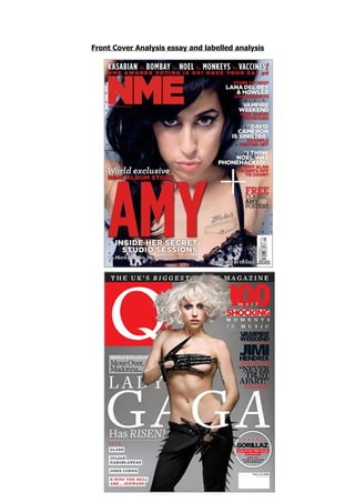
2. The NME magazine has a specific target audience. The audience age would be
between 15 and 30 and the magazine targets both men and women. The music
genre of this magazine which is Indie/Rock is enjoyed by both genders. The colours
are also neutral. The main colours used on this cover are red, black and white. The
uses of plain colours like black and white make the red font stand out even more.
The colour red is used as it has connations of drama, and power. This gives the
audience the idea that the magazines content will be interesting to read, and stand
out.
The red also has connations of anger, and danger, the artist Amy Whinehouse is
used on the front of this cover, this relates to some of her music but also how she is
perceived as an artist. The outfit she is wearing is shown slightly on the cover even
though it is a close up image, and we see animal print on her clothes, this again
suggests the artist has a wild background and links into the lively colour of red.
The Guttenberg Design Principle is used on the front cover. This is done to
put the main features of the magazine where the audience will naturally look first.
The title of the magazine and the eyes of the artist, which are using direct eye
contact with the audience, are in the primary optical area. This will catch the
audience’s attention and make it stand out against other magazines. The barcode
and a website related to the magazine are placed in the terminal area. This is
because these are not as important and do not need to be seen by the audience.
All of the cover lines are placed in the strong fallow area. This is done so the
audience can see what articles and stories are going to be in the magazine, main
quotes and artist’s names are put in white to make these stand out against the rest
of the font so the audience can take in all the key information first.
The main article on the cover artist has been put in the weak fallow area. To make
up for being in the weaker area the name of the artist is the biggest font on the
cover, even bigger than the title, and the font is bright red. This will draw the
audience’s attention here even though it is a weaker fallow area.
The main image shows Amy Whinehouse staring out directly into the camera. She
isn’t smiling she is giving the audience an intense look, she looks powerful and
dangerous. The shot is very close up, giving a personal feel, this suggests that the
main article in the magazine will be very revealing about the artist, tempting readers
to buy the magazine more. A lot of dark colours are used with the main image,
whites and blacks are the main colours, and this is done so the red font of the cover
lines and masthead will stand out more.
The masthead for this magazine “NME” is an abbreviation of “New Musical Express”.
The abbreviated version of the phrase said out loud sounds like the word “enemy”,
this gives the magazine its rock and roll feel and this will attract readers that are into
this genre of music. The font used for the masthead is an example of sans-serif. The
font is very informal; it is just bold, and simple. The colour used is red, this is the
3. colour the human eye will go too first subliminally so this is used to help the
masthead and name of the magazine stay in peoples minds.
Q magazine does not really have a specific type of target audience. It covers a lot of
different music genres so can appeal to a lot of people who prefer different music
styles. Q is targeted at both men and women and has a target audience of probably
18-30. I think the magazine appeals more to older readers because of the simple
design on the front cover; it comes across as more mature.
Red, white and black are the three main colours used on the cover. The background
is extremely minimal, just a silver backdrop which makes the main image, the
masthead, and the cover lines all stand out and easier too read. Q magazine involves
a lot of genres inside the magazine, but major pop star Lady Gaga has being used
for the main image on this cover. She has a huge fan following which will
automatically result in sales for the magazine, but she is also an abstract and
interesting artist, which will catch non fans attention. Her unique style is emphasised
with the outfit she is wearing, its very minimal, just pants and gloves. In contrast to
her genre of music being pop, the outfit is very rock and roll. The black pants with
spikes and the long leather gloves have connataions of rock stars, this costume could
have been picked to attract readers who are more into the rock genre of music.
The Guttenberg Design Principle is used on the front cover. This is done to put the
main features of the magazine where the audience will naturally look first. The
masthead and the face of the main image artist are both in the primary optical area.
Both of these things will be seen first by anyone looking at the magazine. The
barcode and one of the cover lines are in the terminal area; this is because neither
of these is necessary to be seen first by the audience looking at the magazine. Most
of the cover lines have being put in the strong fallow area of the cover; this means
the audience will read these and be interested in the articles inside the magazine.
The main article is in the weaker fallow area, but this has been made up for by
making the font some of the largest on the page, and also white to stand out against
the background.
The main image shows a full body shot of the artist Lady Gaga looking directly out
into the camera. The costume she is wearing is very eye catching to the audience
because of its unusual style. The costume being interesting will make the audience
think that the artist, and the main article about the artist, is also going to be an
interesting thing to read. Some of the main image is covering the cover line for the
main article. This gives the impression that the artist has a bold personality, and also
that she stands out. The artists hair looks untamed and dishevelled giving the
impression of a wild character, again attracting readers that may not even enjoy her
genre of music.
The masthead for the magazine “Q” is a pun. The letter Q could refer to when an
artist takes their “cue” to start singing, or when fans “queue” to get into a gig. The
4. play on words is involved in the lexical field of music. The masthead is made up of a
red box, containing the white letter Q. The Q used is of a serif font, making the
magazine come across as more mature and formal. The red colour could be linked
with the glamorous side of the music industry, such as the red carpet in Hollywood.
The white is modern and elegant; the kind of vibe the magazine is trying to get
across. The use of the white against the red also makes the Q stand out.
The two magazines have quite different target audiences and focus more on
different types of music genres, but the layout of both these covers are extremely
similar. The three main colours used on both covers are red, white and black, but
even though the colours are similar this does not mean that they have being used
for the same purpose. For example the red used on the “NME” cover has being used
to represent anger and danger, where as on the Q magazines front cover the red
represents the glamour of the artists lives that are shown in the magazine.
The way the two covers are set out are also very similar, using Guttenberg’s design
principle the mastheads, cover lines and main images are all set out in the same
place. This is because even though the two magazines are involved in different types
of music, the audience will still look to the same places subliminally when looking at
the covers, so the most important features on the cover are placed in the primary
and stronger optical areas.
One of the differences between the covers is that the cover of Q magazine is slightly
more minimal than NME’s. This is because Q has an older and more mature audience
than NME, and NME’s design on the cover may appeal more to younger readers.
In conclusion, both magazines have very similar covers, but there are slight
differences that make it obvious that the magazines cover different genres of music
and have different target audiences.