
Recomendados
Mais conteúdo relacionado
Mais procurados
Mais procurados (19)
Destaque
Destaque (20)
Semelhante a Front Cover Layouts
Semelhante a Front Cover Layouts (20)
Mais de Biddulph High School
Mais de Biddulph High School (20)
Último
Último (20)
Front Cover Layouts
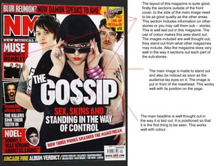
- 1. The layout of this magazine is quite good, firstly the sections outside of the front cover, to the side of the main image need to be as good quality as the other areas. This section includes information on other stories or you may call them sub – stories. This is well laid out in this magazine. The use of colour makes this area stand out. The images included are well thought out, they stand out from what other magazines may include. Also the magazine does very well in the way it sections out each part of the sub-stories. The main headline is well thought out in the way it is laid out. It is positioned so that it is the first thing to be seen. This works well with colour. The main image is made to stand out and also be noticed as soon as the audience lay eyes on it. The image is put in front of the masthead. This works well with its position on the page.
- 2. This magazine does not do the same as NME. The image has been placed behind the masthead. In a way this works as the masthead will stand out. The use of colour is not as wild as other magazines but it is different from others. This colour still stands out with its position.- The image taken is great, its position on page will work together with the layout. It stands out when it works with the other areas of the front cover. Other areas of the page like this are what keep the audience on the page. If the magazine just had a masthead and headline it would be boring. More stories will mean that the audience will see the magazine as exciting as it covers a range of areas in music.
- 3. The image is placed in the best place possible, covering a section of the masthead showing the characters faces. The headline is placed in a great position as it does not cover the faces of the characters. Also the dark colour of the shirt with the bright colour of the headline makes it stand out. The sub – stories on this magazine are laid out well. The don not cover any important areas of the image. This may be the faces. Also, it can be read easily. There are no problems with reading this information.
- 4. The masthead of the magazine is well placed it is the first thing we may see. This position will mean that the audience will be drawn in by the name. The position of the image is great as the faces are shown. We can see the expressions which will drawn the audience in even more. The sub-stories in this magazine are well placed as it does not cover anything important on the images but can easily be read. The colours used on the white of the guys t-shirt work well.