Comparison of Charlottesville Tomorrow's newsletter changes
•Transferir como PPTX, PDF•
0 gostou•129 visualizações

After sending out two reader surveys, Charlottesville Tomorrow's engagement editor found that newsletter readability was an issue for its audience. Based on survey feedback, the newsletter was redesigned, with favorable changes in metrics. This slideshow was assembled by the Charlottesville Tomorrow team and shows a side-by-side comparison of those differences and their results.

Recomendados
Mais conteúdo relacionado
Destaque
Destaque (11)
Mais de KDMC
Mais de KDMC (20)
Último
Último (20)
Comparison of Charlottesville Tomorrow's newsletter changes
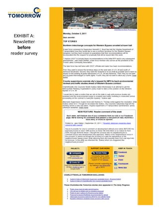
- 1. EXHIBIT A: Newsletter before reader survey
- 2. The feedback from our readers on the newsletter broke out into two main categories. AESTHETIC • Include maps, diagrams, and pictures as much as possible. • Modernize the look & feel. • New template • Less cluttered • Less dense • More images • Too busy. Cleaner look would be more inviting to read. CONTENT • Let us get to know the people who contribute more. • Shorter, more concise. • The emails are walls of text I don’t understand.
- 3. EXHIBIT B: Newsletter after reader survey • Intro paragraph summarizes content and provides a personal touch • More use of images • Staff photo shares who we are with our readers • Reader comment is prominently featured • Cleaned up the template, modern ized the look & feel • Shortened the article summaries
- 4. Since the Redesign: • Our open rate has increased 25%; the average is 28% • Our click- through rate has increased 32%; the average is 10%