
Recomendados
Mais conteúdo relacionado
Mais procurados
Mais procurados (19)
Destaque
Destaque (20)
Semelhante a Runway Report Magazine Design Analysis
Semelhante a Runway Report Magazine Design Analysis (20)
Último
Último (20)
Runway Report Magazine Design Analysis
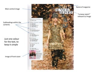
- 1. Name of magazine Main central image “runway report” relevant to image Subheadings within the contents Just one colour for the text, to keep it simple Image of front cover
- 2. Image of front cover Subheadings Many images of what's inside, All contents Colours clash, but it information is attracts attention capital letters
- 3. Uses very few colours, and colours work well together One main image, but image does not fill most of the page Small font, and a lot of Capital letters for the information, to show title of pages, and that the magazine then lower case for contains a lot of things extra information inside Smaller image below
- 4. Three very different Image of front cover, images, this could be to works like a show the different “reminder” of what genres that this magazine it is magazine contains VIP contents’ subheadings are in bold, to initiate that it is Not much in contents the VIP area page, showing its quality rather than quantity on specific topic Headings are in red, to make it stand out.