Call Girls In Gorakhpur Escorts ☎️8617370543 🔝 💃 Enjoy 24/7 Escort Service En...
Saw movie poster analysis
1. Saw Movie Poster Analysis
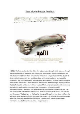
Fonts: The font used on the title of the film is distorted and rough which is shown through
the unsmooth sides of the letters, the varying size of the letters and the uneven lines and
dots that surround them; this is conventional in nature to a psychological thriller. Due to its
abnormality, this sans serif font would stand out to the target audience who would be
intrigued. It also looks deliberately unprofessional which allows it to blend in with the scene
of the poster and creates a more immersive atmosphere. The film’s slogan directly contrasts
the title font as it is written in a bold and neat serif font, which alienates the title even more
and helps the audience to remember it; the inconsistency in fonts is probably
unconventional for a poster but this helps reflect the controversial nature of the film. The
font of the credits is traditional and similar to most credit fonts which make it conventional
as a film poster. The bold font on the logo for Lionsgate Films allows it to stand out from the
rest of the small print and possibly encourage the audience to view the film due to it being a
major film company, this relates to the form of a poster which aims to reveal all key
information about a film’s release unlike a magazine cover.
2. Colour: There is very little use of colour on the poster but this helps to add to the bare
and intimidating feel of it and makes it seem less like a traditional movie poster so it grabs
the attention of its audience. The plain white background however, contrasts the dark grey
colours used on the severed leg which gives the graphic nature of the poster an in-your-face
effect. The use of black and red to represent the mud and blood on the leg is precisely
placed and defined which adds to the realism of the shot and helps to horrify its audience
which is conventional for the psychological thriller genre. The colour of the title font also
stands out against the plain white background which shows how the colour is used to bring
across the key information more to its audience. The colour of the title font also matches
that of the blood which makes the poster seem more synchronised.
Image:There is one image on the poster, which adds to the effect that the audience are
immersed in a scene from the film. This is usualfor a poster, which very rarely depicts
multiple images. The violence depicted in the image is unconventional even for a horror
genre poster, which would enable it to stand out and be more memorable than other
posters. The graphic nature of the severed leg would unsettle and horrify a large amount of
the audience in a conventional way for a psychological thriller however. The image would
also address the target audience who would be intrigued by the extreme nature of it and
therefore be encouraged to see the film. Because the image feels like part of a scene from
the movie it tempts the audience even more to watch the film and find out what set off this
event and also what it leads to which is an effect that all successful posters should have. The
sense of suspense is increased further by the saw which is made to look menacing through
the emphasis of the jagged edges and the rust on it; this also reveals more about the
severed leg and ties in with the title of the film which should also cause the audience to
remember the poster.
Layout:The poster follows the traditional route of the eye formula which is conventional
of many successful posters. This begins with the eye line following the saw across the top of
the poster before moving down towards the image of the severed leg. It would then move
to the film title and finally to the credits at the bottom of the screen; they are placed
conventionally at the bottom of the poster as they are the least eye grabbing and least
essential factor in promoting the movie to the audience. The film title however, is placed
less conventionally in a relatively small font near the bottom of the page. Usually the film
title would be larger and placed in a more eye catching position so that it would be more
memorable for the audience. However this positioning does put more emphasis on the
image and immerses the audience more in the film. The empty space between the saw and
the leg could also be seen as unconventional and the absence of cluttered text etc. would
make the poster stand out more. The saw being placed at the top of the poster connotes it
as menacing and deadly.