SlideShare uma empresa Scribd logo
1 de 3
This is a double page spread for Kerrang magazine. As you can see the colours used are red, white and black,
colours that suggest Rock and Roll. It isn't Kerrang’s house style, in fact it is more like NME’s house style, but
the colours used relate to the band My Chemical Romance, which is the band that the article is talking
about. As you can see the page is filled with more pictures than text, this will appeal to the readers as they
might prefer having less text than pictures. Sometimes pictures can say more than words. These pictures of
My Chemical Romance show what the band has been doing in the recording studio.                     The column in
 This is the first                                                                                 the right hand
 double page I                                                                                     side of the
 have analysed                                                                                     page tells you
 where the                                                                                         information
 image and font                                                                                    about the new
 both go over                                                                                      My Chemical
 to the second                                                                                     Romance
 page, this                                                                                        songs. If the
 means that the                                                                                    audience
 picture is                                                                                        didn’t want to
 slightly bigger
                                                                                                   read the text,
 than the other
                                                                                                   as they may
 double page
 spread                                                                                            think it is too
 pictures as                                                                                       time
 well as the                                                                                       consuming,
 font.                                                                                             the can read a
                                                                                                   brief opinion
 The pictures and the colours used have the connotation of Rock and Roll, of                       from Kerrang
 passion and of effort. Some pictures show you the real effort the band has put about the new
                                                                                                   MCR songs
 into its new album in the recording studio.
This is a double page spread of Q magazine. I know it’s Q magazine as the typically have the first letter of
the artists name in the background of the text. For instance, here is an article on Cheryl Cole that’s why
there is the giant red ‘C’ in the background of the text. The ‘C’ fits in with Q’s logo, which is simply a
white Q in a red background. This is a red C in a white background. So, the colours used fit with the Q
house style
                                                                                              In the
They use one of
the two pages                                                                                 lengthy
In this double                                                                                piece of
page spread, to                                                                               text the C’s
have a picture
of Cheryl Cole
                                                                                              stand out
filling up one of                                                                             which is
the pages. Next                                                                               done
to the smaller                                                                                purposely
picture in the
bottom left                                                                                   as if it
corner of the                                                                                 stands for
first page is a                                                                               Cheryl Cole.
quote. This
quote will draw
                       At the top of the page is a title saying ‘Cheryl Cole’. The title is the only thing on
readers into the
                       the double page spread written in a gold font, this makes it stand out. It also has
article instead
                       the connotation of glamour, as there is a nice gold shine in the font. I also noticed
of just flicking       that ‘Cole’ is written all in capitals, this may suggest that in the article is
over the page          information on Cheryl and Ashley Cole, as they were still together when this
                       magazine was published.
This is a double page spread from the magazine The source, which is a rap magazine. There is a lot of text upon this
 double page spread yet it is spread across the two pages, unlike the Q magazine which had a picture filling up the
 whole of one page and text and a small picture filling up the other. This magazine however, has text and pictures
 mixed up between the two pages. You could argue that this magazine is cluttered though because of this.

                                                                                       The only things that
                                                                                       could catch the readers
                                                                                       eye on these pages are,
                                                                                       the images and the
                                                                                       Headings. They will
                                                                                       make the reader want
                                                                                       to read the article if It
                                                                                       is a subject the reader
                                                                                       is interested in. The
                                                                                       text highlights key
                                                                                       words in bold, this way
                                                                                       the reader can skim
                                                                                       across the words to get
                                                                                       sort of a summary of
                                                                                       the article, as the
                                                                                       words highlighted are
                                                                                       key words.
The colours used one these two pages don’t represent the house colours, even though The Source changes it font
colour every issue, it is usually red, yet it has also been coloured green and gold. The colours used here are in my
opinion very dull, as it consists of black font and white background. The images are the only things with a bit more
colours that may attract the readers eye. However, I feel this double page spread wont really appeal to people.

Mais conteúdo relacionado

Mais de GregLatham96

Mais de GregLatham96 (20)

Which of these
Which of theseWhich of these
Which of these
 
What is your gender
What is your genderWhat is your gender
What is your gender
 
How old are you
How old are youHow old are you
How old are you
 
Laura mul..
Laura mul..Laura mul..
Laura mul..
 
Music video industry
Music video industryMusic video industry
Music video industry
 
Folk music audience
Folk music audienceFolk music audience
Folk music audience
 
Music videos folk
Music videos folkMusic videos folk
Music videos folk
 
Evaluation
EvaluationEvaluation
Evaluation
 
Evaluation 1
Evaluation 1Evaluation 1
Evaluation 1
 
Evaluation
EvaluationEvaluation
Evaluation
 
Image editing
Image editingImage editing
Image editing
 
Image editing
Image editingImage editing
Image editing
 
Image planning
Image planningImage planning
Image planning
 
Double page spread
Double page spreadDouble page spread
Double page spread
 
Contents page layouts
Contents page layoutsContents page layouts
Contents page layouts
 
Colour palette
Colour paletteColour palette
Colour palette
 
Evaluation
EvaluationEvaluation
Evaluation
 
Mixed magazine front cover
Mixed magazine front coverMixed magazine front cover
Mixed magazine front cover
 
Mixed magazine front cover
Mixed magazine front coverMixed magazine front cover
Mixed magazine front cover
 
Music magazine contents page.
Music magazine contents page.Music magazine contents page.
Music magazine contents page.
 

Music mag double page spread

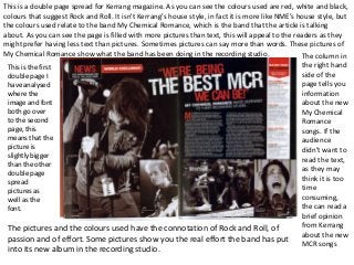
  • 1. This is a double page spread for Kerrang magazine. As you can see the colours used are red, white and black, colours that suggest Rock and Roll. It isn't Kerrang’s house style, in fact it is more like NME’s house style, but the colours used relate to the band My Chemical Romance, which is the band that the article is talking about. As you can see the page is filled with more pictures than text, this will appeal to the readers as they might prefer having less text than pictures. Sometimes pictures can say more than words. These pictures of My Chemical Romance show what the band has been doing in the recording studio. The column in This is the first the right hand double page I side of the have analysed page tells you where the information image and font about the new both go over My Chemical to the second Romance page, this songs. If the means that the audience picture is didn’t want to slightly bigger read the text, than the other as they may double page spread think it is too pictures as time well as the consuming, font. the can read a brief opinion The pictures and the colours used have the connotation of Rock and Roll, of from Kerrang passion and of effort. Some pictures show you the real effort the band has put about the new MCR songs into its new album in the recording studio.
  • 2. This is a double page spread of Q magazine. I know it’s Q magazine as the typically have the first letter of the artists name in the background of the text. For instance, here is an article on Cheryl Cole that’s why there is the giant red ‘C’ in the background of the text. The ‘C’ fits in with Q’s logo, which is simply a white Q in a red background. This is a red C in a white background. So, the colours used fit with the Q house style In the They use one of the two pages lengthy In this double piece of page spread, to text the C’s have a picture of Cheryl Cole stand out filling up one of which is the pages. Next done to the smaller purposely picture in the bottom left as if it corner of the stands for first page is a Cheryl Cole. quote. This quote will draw At the top of the page is a title saying ‘Cheryl Cole’. The title is the only thing on readers into the the double page spread written in a gold font, this makes it stand out. It also has article instead the connotation of glamour, as there is a nice gold shine in the font. I also noticed of just flicking that ‘Cole’ is written all in capitals, this may suggest that in the article is over the page information on Cheryl and Ashley Cole, as they were still together when this magazine was published.
  • 3. This is a double page spread from the magazine The source, which is a rap magazine. There is a lot of text upon this double page spread yet it is spread across the two pages, unlike the Q magazine which had a picture filling up the whole of one page and text and a small picture filling up the other. This magazine however, has text and pictures mixed up between the two pages. You could argue that this magazine is cluttered though because of this. The only things that could catch the readers eye on these pages are, the images and the Headings. They will make the reader want to read the article if It is a subject the reader is interested in. The text highlights key words in bold, this way the reader can skim across the words to get sort of a summary of the article, as the words highlighted are key words. The colours used one these two pages don’t represent the house colours, even though The Source changes it font colour every issue, it is usually red, yet it has also been coloured green and gold. The colours used here are in my opinion very dull, as it consists of black font and white background. The images are the only things with a bit more colours that may attract the readers eye. However, I feel this double page spread wont really appeal to people.

Notas do Editor

  1. Kerrang magazine
  2. Q
  3. The source rap