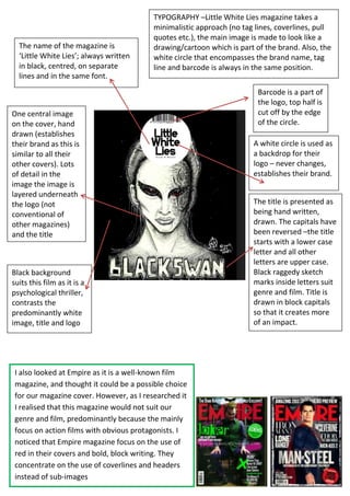
1. The name of the magazine is
‘Little White Lies’; always written
in black, centred, on separate
lines and in the same font.
TYPOGRAPHY –Little White Lies magazine takes a
minimalistic approach (no tag lines, coverlines, pull
quotes etc.), the main image is made to look like a
drawing/cartoon which is part of the brand. Also, the
white circle that encompasses the brand name, tag
line and barcode is always in the same position.
One central image
on the cover, hand
drawn (establishes
their brand as this is
similar to all their
other covers). Lots
of detail in the
image the image is
layered underneath
the logo (not
conventional of
other magazines)
and the title
Black background
suits this film as it is a
psychological thriller,
contrasts the
predominantly white
image, title and logo
I also looked at Empire as it is a well-known film
magazine, and thought it could be a possible choice
for our magazine cover. However, as I researched it
I realised that this magazine would not suit our
genre and film, predominantly because the mainly
focus on action films with obvious protagonists. I
noticed that Empire magazine focus on the use of
red in their covers and bold, block writing. They
concentrate on the use of coverlines and headers
instead of sub-images
Barcode is a part of
the logo, top half is
cut off by the edge
of the circle.
A white circle is used as
a backdrop for their
logo – never changes,
establishes their brand.
The title is presented as
being hand written,
drawn. The capitals have
been reversed –the title
starts with a lower case
letter and all other
letters are upper case.
Black raggedy sketch
marks inside letters suit
genre and film. Title is
drawn in block capitals
so that it creates more
of an impact.