Responsive Web Design, our 2 year journey of discovery
•Transferir como PPTX, PDF•
1 gostou•1,265 visualizações

A digital agency gives a candid history of its development experience with responsive web design, outlining the problems and solutions it's developers faced and how it changed it's approach

Recomendados
Mais conteúdo relacionado
Mais procurados
Mais procurados (20)
Semelhante a Responsive Web Design, our 2 year journey of discovery
Semelhante a Responsive Web Design, our 2 year journey of discovery (20)
Último
Último (20)
Responsive Web Design, our 2 year journey of discovery
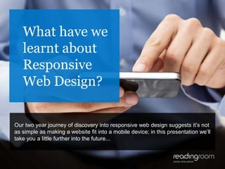
- 1. 1 What have we learnt about Responsive Web Design? Our two year journey of discovery into responsive web design suggests it’s not as simple as making a website fit into a mobile device; in this presentation we’ll take you a little further into the future...
- 2. We don’t want an app, We want a responsive web site! Clients have realised they don’t need an app to be visible in the mobile space - but they are now being bombarded by new phrases, buzzwords and terminology
- 3. Responsive / Adaptive / Mobile first /Mobile optimised With so many new terms, it’s no wonder people are confused After much research, we were convinced that a responsive site required all aspects of the design to fit into a browser, whatever its size or shape Therefore we would adjust the browser width to set new CSS rules every time the design broke
- 4. We were starting to understand this So: make the website fit various sizes, make the images and videos scale proportionally, adjust the behaviour of some plug-ins - and away we go! Our initial aim was to make a responsive site for IE6 with the help of a few additional plug-ins
- 5. Developer test tools, client test tools We even built a breakpoint analyser to help our developers set media query values We rolled it out to clients so they could use it in lieu of having a range of test devices
- 6. It even works in IE6 This culminated in us building the most complex responsive site we’ve ever built It has a responsive mega menu, responsive layout, images, video, accordions, EVERYTHING is responsive Surely THIS was responsive?
- 7. It even works in IE6 As we discovered, there is more to this than meets the eye...
- 8. Massive overheads for testing We discovered that maintenance and development took a lot of testing time
- 9. It took too long, and cost too much A five minute amend was taking over an hour, which we estimated was a 30% impact to costs and timelines... This wasn’t what we saw for the future of mobile web We decided to rethink our position and fundamentally re-evaluate what responsive web design was
- 10. Responsive analysed We analysed what responsive meant and narrowed it down to two factors that defined the core user experience: - mobile hardware, software and its supporting infrastructure - user needs for content delivery within a contextual environment We realised that a true responsive user experience is almost impossible to deliver with the current network infrastructure and mobile device software, both in terms of OS and browsers
- 11. Standard v Retina We chose images to illustrate why we think true responsive is not currently possible Images are usually the largest page asset Developers detect device capability and show images based on that Can’t detect 2/3/4G Wifi of LAN Can’t assess quality of bandwidth
- 12. Standard v Retina Do we show retina and punish data caps / ignore retina displays? Apple cache limit is 100k, used to be 25k, this makes a bad situation worse Alternative solution: deliver basic then enhanced site depending on data rate Internet history tells us that poor experience leads to loss of conversion
- 13. Does your website know i’m late? Contextual awareness illustrates the ability of the website to interact with the device and its surroundings Does the website interact with the calendar, GPS and time to show a customised view of the webpage? Will you get to your interview on time? To accomplish this requires several apps to be open at the same time. A responsive page would auto configure to your time and situation and display a call button for the person you are to meet overlaid on a map showing directions and approximate time of arrival
- 14. “It is dangerous to be right in matters on which the established authorities are wrong” - Voltaire Understanding what responsive should be, we realised that we and the industry had been doing adaptive all along However, most developers, competitors and online tutorials show a website in the obligatory desktop, tablet and phone mock-up and call this responsive...
- 15. “It is dangerous to be right in matters on which the established authorities are wrong” - Voltaire ...we believe this is an industry mistake
- 16. So what did we do about it? Knowing that delivering responsive images was fraught with difficulty we decided to stick with standard def images; it’s easier on people’s data caps. A website that changes its appearance based on screen size isn’t responding to anything other than size, which is a faulty way to deliver a mobile experience as the screen resolution and pixel density of nearly every modern mobile device is equal if not better than most desktop systems
- 17. Desktop = Tablet Overwhelming industry research states that tablets are primarily used at home and have comparable screen resolutions to desktops We decided that a tablet specific design held no additional value and decided that a tablet should show the exact same website as the desktop, regardless of orientation
- 18. Desktop = Phone Our own user research indicates that the primary mobile orientation for website usage is portrait Taking into account screen sizes and pixel sizes it became clear that the only consideration we needed to make after the primary design was that of mobile in portrait
- 19. What we stopped doing Stretching a browser width backwards and forwards and gaping in awe as the layout changes is not something a user does, it's what developers do This is not a mobile experience, mobile browsers are full screen, you can't stretch them
- 20. What we stopped doing If clients wanted to see things stretch and fit into a variable sized window on our desktop we would have been using fluid layouts for the last decade The fact that we have almost exclusively used fixed layouts tells us that if a window is too small for the website, the user will adjust the window
- 21. Test on real devices Allowing the client to adjust the width of the desktop browser to see the mobile site is a false belief in the mobile solution... ...they are still sat down, using a low density very large monitor with a mouse and keyboard, everything you don't do or use with a mobile
- 22. Test on real devices We stopped showing mobile solutions on a desktop and persuaded our clients to test the mobile solution on a mobile device This allowed them to answer questions such as: • is the menu button too small? • does it take too long to scroll the page with a thumb/finger? • is the text the right size? • is the mobile menu correct? None of these can be answered correctly on a desktop
- 23. So what have we learnt about Responsive Web Design? • True responsive is currently impossible under current infrastructure and software constraints • A picture of a website in 3 device formats is not a mobile solution • Fluid layouts activated at certain screen widths does not accurately give a true representation of the mobile solution
- 24. So what have we learnt about Responsive Web Design? • Retina images can be costly to user experience and the financial limits on users data allowance • Adaptive solutions ARE more complex, requiring additional development & testing, however the impact can be minimised with an approach based on user research and experienced processes
- 25. So what have we learnt about Responsive Web Design? • Performing mobile testing on mobile devices will accurately judge if the solution is fit for purpose • Tablet design is the same as desktop design • Mobile is primarily held in portrait orientation and mobile solutions should accommodate this
- 26. And finally... Mobile solutions are still evolving, and as a result of our thorough due diligence and project processes, we have discounted many of them. We continue to analyse research the latest innovations to ensure the best solutions for our clients.