call girls in Vaishali (Ghaziabad) 🔝 >༒8448380779 🔝 genuine Escort Service 🔝✔️✔️
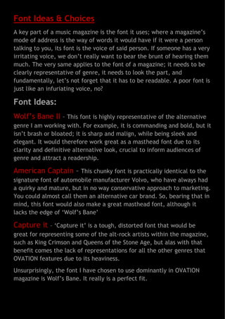
Font Ideas & Choices
1. Font Ideas & Choices
A key part of a music magazine is the font it uses; where a magazine’s
mode of address is the way of words it would have if it were a person
talking to you, its font is the voice of said person. If someone has a very
irritating voice, we don’t really want to bear the brunt of hearing them
much. The very same applies to the font of a magazine; it needs to be
clearly representative of genre, it needs to look the part, and
fundamentally, let’s not forget that it has to be readable. A poor font is
just like an infuriating voice, no?
Font Ideas:
Wolf’s Bane II – This font is highly representative of the alternative
genre I am working with. For example, it is commanding and bold, but it
isn’t brash or bloated; it is sharp and malign, while being sleek and
elegant. It would therefore work great as a masthead font due to its
clarity and definitive alternative look, crucial to inform audiences of
genre and attract a readership.
American Captain – This chunky font is practically identical to the
signature font of automobile manufacturer Volvo, who have always had
a quirky and mature, but in no way conservative approach to marketing.
You could almost call them an alternative car brand. So, bearing that in
mind, this font would also make a great masthead font, although it
lacks the edge of ‘Wolf’s Bane’
Capture it
– ‘Capture it’ is a tough, distorted font that would be
great for representing some of the alt-rock artists within the magazine,
such as King Crimson and Queens of the Stone Age, but alas with that
benefit comes the lack of representations for all the other genres that
OVATION features due to its heaviness.
Unsurprisingly, the font I have chosen to use dominantly in OVATION
magazine is Wolf’s Bane. It really is a perfect fit.