SlideShare uma empresa Scribd logo
1 de 2
Band Logo Annotation
                                        Arcade Fire’s logo is slightly different than the
                                        conventional band logo, instead of being
                                        simply text; they have included a variety in
                                        shape and have also tried to meld the E and F
                                        together to make almost an optical illusion.
                                        But the main purpose behind it is to make the
                                        title flow. Rather than a space in the middle
                                        they have made it much more interesting.


  Cage the Elephant has a very bold
  and clear logo. They have stylised it
  to look like a hand carved print block
  and their trademark of it all is the
  “A”’s don’t include the bridge.


                                                Coldplay’s logo is a very basic text
                                                based logo. The hole less letters
                                                are obviously stylised by Art-Deco.


Gorillaz logo is very similar to tags
left by graffiti artists and vandals.
This logo in particular is that
unique it is difficult to replicate
and is personal to that band.
The Heavy have taken after a style
                                               used heavily in western films. This
                                               font is remarkably like shop signs in
                                               the early 1800s.


Imagine Dragons have a very
modern and clean looking logo.
It’s a strange mix of odd angles
and semi completed letters. This
overall style allows the simple
text to become interesting and
varied.

                                         Kasabian’s logo is very blocky and basic.
                                         The only things that add anything
                                         interesting is the paint splatter added
                                         around the side. This little detail makes
                                         it look like a stencilled spray painting.


 Little Green Cars is incredibly simple.
 The text that forms their logo is childlike
 which reflects the band name.


                                               Snow patrols Logo is the only logo to
                                               have a separate symbol which they
                                               use in place of the band name.

                                               The snowflake is used on CD covers,
                                               posters and all of their merchandise
                                               and promotional material because it
                                               is easily relatable to the band.

Mais conteúdo relacionado

Mais de Chris_m3c2

Assignment 2 unit_4_task_2c _moodboard
Assignment 2 unit_4_task_2c _moodboardAssignment 2 unit_4_task_2c _moodboard
Assignment 2 unit_4_task_2c _moodboardChris_m3c2
 
Assingment 2 unit 4 task 1c risk assessment
Assingment 2 unit 4 task 1c risk assessmentAssingment 2 unit 4 task 1c risk assessment
Assingment 2 unit 4 task 1c risk assessmentChris_m3c2
 
Assignment 1 unit 4 task 1
Assignment 1 unit 4 task 1Assignment 1 unit 4 task 1
Assignment 1 unit 4 task 1Chris_m3c2
 
Assignment 1 unit 4 task 3a complete
Assignment 1 unit 4 task 3a completeAssignment 1 unit 4 task 3a complete
Assignment 1 unit 4 task 3a completeChris_m3c2
 
Assignment 1 unit 4 task 2
Assignment 1 unit 4 task 2Assignment 1 unit 4 task 2
Assignment 1 unit 4 task 2Chris_m3c2
 
Assignment 1 unit 4 task 1
Assignment 1 unit 4 task 1Assignment 1 unit 4 task 1
Assignment 1 unit 4 task 1Chris_m3c2
 
Assignment 2 task 3 resources
Assignment 2 task 3 resourcesAssignment 2 task 3 resources
Assignment 2 task 3 resourcesChris_m3c2
 
Assignment 2 task 2 proposal
Assignment 2 task 2 proposalAssignment 2 task 2 proposal
Assignment 2 task 2 proposalChris_m3c2
 
Assignment 2 task 1b website analysis 2
Assignment 2 task 1b website analysis 2Assignment 2 task 1b website analysis 2
Assignment 2 task 1b website analysis 2Chris_m3c2
 
Assignment 2 task 1b website analysis 1
Assignment 2 task 1b website analysis 1Assignment 2 task 1b website analysis 1
Assignment 2 task 1b website analysis 1Chris_m3c2
 
Assignment 2 task 1a diary
Assignment 2 task 1a diaryAssignment 2 task 1a diary
Assignment 2 task 1a diaryChris_m3c2
 
Pre production report
Pre production reportPre production report
Pre production reportChris_m3c2
 

Mais de Chris_m3c2 (16)

Assignment 2 unit_4_task_2c _moodboard
Assignment 2 unit_4_task_2c _moodboardAssignment 2 unit_4_task_2c _moodboard
Assignment 2 unit_4_task_2c _moodboard
 
Project1
Project1Project1
Project1
 
Assingment 2 unit 4 task 1c risk assessment
Assingment 2 unit 4 task 1c risk assessmentAssingment 2 unit 4 task 1c risk assessment
Assingment 2 unit 4 task 1c risk assessment
 
Storyboard
StoryboardStoryboard
Storyboard
 
Assignment 1 unit 4 task 1
Assignment 1 unit 4 task 1Assignment 1 unit 4 task 1
Assignment 1 unit 4 task 1
 
Assignment 1 unit 4 task 3a complete
Assignment 1 unit 4 task 3a completeAssignment 1 unit 4 task 3a complete
Assignment 1 unit 4 task 3a complete
 
Assignment 1 unit 4 task 2
Assignment 1 unit 4 task 2Assignment 1 unit 4 task 2
Assignment 1 unit 4 task 2
 
Assignment 1 unit 4 task 1
Assignment 1 unit 4 task 1Assignment 1 unit 4 task 1
Assignment 1 unit 4 task 1
 
Assignment 2 task 3 resources
Assignment 2 task 3 resourcesAssignment 2 task 3 resources
Assignment 2 task 3 resources
 
Assignment 2 task 2 proposal
Assignment 2 task 2 proposalAssignment 2 task 2 proposal
Assignment 2 task 2 proposal
 
Assignment 2 task 1b website analysis 2
Assignment 2 task 1b website analysis 2Assignment 2 task 1b website analysis 2
Assignment 2 task 1b website analysis 2
 
Assignment 2 task 1b website analysis 1
Assignment 2 task 1b website analysis 1Assignment 2 task 1b website analysis 1
Assignment 2 task 1b website analysis 1
 
Assignment 2 task 1a diary
Assignment 2 task 1a diaryAssignment 2 task 1a diary
Assignment 2 task 1a diary
 
Task 1
Task 1Task 1
Task 1
 
Task 3
Task 3Task 3
Task 3
 
Pre production report
Pre production reportPre production report
Pre production report
 

Assignment 2 task1_band_logos_and_proposal

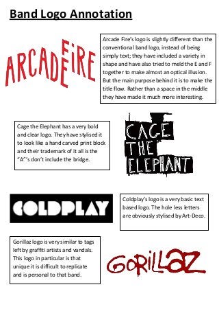
  • 1. Band Logo Annotation Arcade Fire’s logo is slightly different than the conventional band logo, instead of being simply text; they have included a variety in shape and have also tried to meld the E and F together to make almost an optical illusion. But the main purpose behind it is to make the title flow. Rather than a space in the middle they have made it much more interesting. Cage the Elephant has a very bold and clear logo. They have stylised it to look like a hand carved print block and their trademark of it all is the “A”’s don’t include the bridge. Coldplay’s logo is a very basic text based logo. The hole less letters are obviously stylised by Art-Deco. Gorillaz logo is very similar to tags left by graffiti artists and vandals. This logo in particular is that unique it is difficult to replicate and is personal to that band.
  • 2. The Heavy have taken after a style used heavily in western films. This font is remarkably like shop signs in the early 1800s. Imagine Dragons have a very modern and clean looking logo. It’s a strange mix of odd angles and semi completed letters. This overall style allows the simple text to become interesting and varied. Kasabian’s logo is very blocky and basic. The only things that add anything interesting is the paint splatter added around the side. This little detail makes it look like a stencilled spray painting. Little Green Cars is incredibly simple. The text that forms their logo is childlike which reflects the band name. Snow patrols Logo is the only logo to have a separate symbol which they use in place of the band name. The snowflake is used on CD covers, posters and all of their merchandise and promotional material because it is easily relatable to the band.