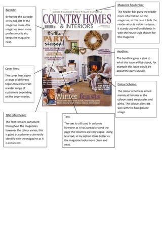
1. Magazine header bar:
Barcode:
The header bar gives the reader
more information on the
magazine; in this case it tells the
reader what is inside the issue.
It stands out well and blends in
with the house style chosen for
this magazine
By having the barcode
in the top left of the
magazine makes the
magazine seem more
professional it also
keeps the magazine
neat.
Headline:
The headline gives a clue to
what this issue will be about, for
example this issue would be
about the party season.
Cover lines:
The cover lines cover
a range of different
topics this will attract
a wider range of
customers depending
on the cover stories.
Title (Masthead):
The font remains consistent
throughout the magazines
however the colour varies, this
is good as customers can easily
identify with the magazine as it
is consistent.
Colour Scheme:
The colour scheme is aimed
mainly at females as the
colours used are purples and
pinks. The colours contrast
well with the background
image.
Text:
The text is still used in columns
however as it has spread around the
page the columns are very vague. Using
less text, in my option looks better as
the magazine looks more clean and
neat.