
Recomendados
Mais conteúdo relacionado
Mais procurados
Mais procurados (20)
Destaque
Destaque (14)
Semelhante a George contents page analysis
Semelhante a George contents page analysis (20)
Mais de Charis Creber
Mais de Charis Creber (20)
George contents page analysis
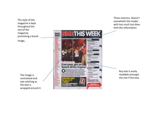
- 1. The style of the magazine is kept throughout the rest of the magazine, promoting a brand image. Three columns. Doesn’t overwhelm the reader with too much but does limit the information. The Image is centralised and eye-catching as the text is wrapped around it. Key text is easily readable amongst the rest if the text.
- 2. Good colour scheme, keeps in tone with house style. The picture seems to over-power the text. The page has only one picture, so it could give the impression the magazine is limited. Three columns keep the page clear and easily readable without overwhelming the reader.
- 3. The style of the magazine is kept as the logo shown here, promoting brand loyalty. The text is clear in presentation, well laid out and easily readable. The picture catches the readers eye as its big enough to be seen but not overwhelm readers. Three columns balance information and the images well.