

Recomendados
Mais conteúdo relacionado
Mais procurados
Mais procurados (20)
Destaque
Destaque (20)
Semelhante a TASK 5
Semelhante a TASK 5 (20)
Último
Último (20)
TASK 5
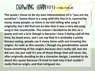
- 1. The quote I chose to do my own interpretation of is “you are my sunshine”, I know there is a song with this line in it, covered by many, many people, so there is no real telling who sung it originally, but I did find out on-line that it was a very old song, sung in the countryside. The reason I decided to do this as a quote and not a lyric though is because I hear it being said all the time, by loved ones, and I can say that it is probably a pretty famous saying, people say it many times with out knowing the origins. As rude as this sounds, I though my grandmother would know something of the origins because she’s really old, but she did not, she just said it’s one of those things that will never die, after originally deciding to do a character design, I wanted to do about this quote because I’d tried to look into it but couldn’t really find an origin, and that intrigued me.
- 2. . My drawing came from a life drawing I did in a field by Knowle Primary school which is a school I used to attend, I saw a couple on a bench laying there, enjoying the view on a bench so I did a very quick sketch of them. When I chose to use the quote: “You are my sun-shine”, I decided to base it off of that sketch, two people, secluded in a field, though it’s winter and the leaves are dead, I decided to make the bench a blanket and remove the trees, the style I went for was going to be summer colours, simple and cute. I wanted to add some ‘Typography‘ to it too, so I added some over the clouds along with a comic book style cloud to make it fit in with the picture. Since I put it into flash to make it a vector style, I made major changes to the initial idea.
- 3. I did a very quick and very simple sketch because I did not want to intrude on a couples ‘moment’ and soon left them to it. But I liked the idea of a couple secluded on a hill. The second slide with all the different variations of the idea, was my thought train on how I would actually depict this image. I finally went with the boy glowing because the others weren’t realistic and I wanted it to not be too silly.
- 6. Strengths and weaknesses. Strengths: I think the strengths in my development is that I have explored different ways of depicting the quote. I think that the strengths are how bold it is and how I have also included the quote in my drawing. I also like how it was exactly how I was imagine it would turn out. I like that I painted my image first and chose certain things to move around later on in Photoshop and Adobe Flash. Weaknesses: I feel like I should have developed the characters in my quote design a bit more. I should have picked a style that would be more pleasing, not many people are a fan of simplicity. I think I should have devoted more time into developing this piece. I think next time I should try and create characters that look more realistic, I feel people may understand it better this way.
- 7. What I wish to develop further. I wish to develop the characters further and possibly explore in a digital medium, the different ways I could depict the quote because the sketches in my book seem like they are just doodles and may come across as not really explored enough. I also wish I had more time to work into it more and maybe develop it into a more realistic style as I prefer realism, but I wanted to explore doing it in a simpler style as I haven’t really done this before, also I found it pretty difficult to keep it simple because I kept trying to add more tedious details like shading. I wish that maybe I could have created a series of images like the ones I sketched to create a somewhat compilation of images so I was able to choose from ones that worked and ones that did not.
- 8. What has changed through exploring different methods of mark making? I’d say that the style of my design has changed due to the different methods, I wanted to create a simplistic style to emulate the slight limitations to detail that comes with screen printing and using Lino and plastic to print. I guess what sparked the idea to make the design simple was Printing using block shapes with paper and ink, I experimented with blending the colours in that lesson and my image came out pretty nicely. Though I liked the style that come of printing, I’m not the biggest fan of the style I explored in my final Quote design and will probably not explore it further in the future unless it is to do printing work.
- 9. This is my final design. Thank you for listening.