SlideShare uma empresa Scribd logo
1 de 2
Baixar para ler offline
Assignment #1
For this project, I decided to review the
websites of Carnegie Museums of Pittsburgh,
and Pérez Art Museum Miami. After carefully
reviewing both websites, I would like to report
that Carnegie Museums of Pittsburgh’s donate
button/link was easy to find on the homepage,
while it was not easy to find the donate
button/link on Pérez Art Museum Miami’s
homepage.
When I first visited Carnegie Museums of
Pittsburgh’s website, I noticed it was a busy
web page, and thought to myself; it won’t be
easy to find the donate button. But despite all the content on the page, I was quickly drawn to the
top three green buttons – and could easily identify the donate button, which is in all caps in a
bold white font that is easy to read. The green buttons make them pop on the all black header of
the page and have a larger font than the navigation bar, helping them stand out.
I visited the rest of the pages of the website and found the donate button in the same spot
throughout all of the subpages. This is a good practice to keep the users happy while surfing
through the website. Happy users tend to make a purchase, if not now, later.
In my opinion, I like that they made the donate button last after the “visit” and “join” buttons. I
think it takes away from feeling like a donation is the only thing the museum wants from my
visit to the website. This encourages site visitors to make a donation. I think the design works
and should capture most visitors willing to donate.
Now for Pérez Art Museum Miami. I visited the website and found it busy, scattered and makes
use of the wrong color combinations. It was not easy to find the donate button/link. I had to
search for it, and use logic to find it. I always look for the main navigation on a website, and can
usually find a link to the donation page from it. So I scoured the navigation and found Join &
Support.
I thought to myself; this is where I will find the donate button. So I hovered over the link and the
drop-down menu unveiled the donate button at the bottom of the list, but I found it labeled “give
to PAMM” instead of “donate.” In my opinion, this is a terrible example of a donate button and
left me feeling frustrated with their process.
I would have to say the overall experience on their website was unsatisfactory. The color
combinations are not appropriate, and it’s not easy to read the text in the header images or the
navigation text. A visitor can access the donate button from every web page through the same
navigation. The navigation font is too small and white on images without anything to make the
words pop. This design can frustrate most website visitors, and might discourage making
donations.
I do not have any recommendations for Carnegie Museums of Pittsburgh’s website and was
overall pleased with the experience of finding how to make a donation. I do have many
recommendations for Pérez Art Museum Miami’s website and was unsatisfied with the overall
experience of finding out how to make a donation.
I make the following recommendations:
 Make the donation button stationary in the header area.
 Use a font color that makes it pop to the reader and a size that is easy to discover and
read.
 Rename the button donate.
 Change the font colors in the header images to be easier to read. A better UX can increase
the chances of a conversion.
Of course, this is just a surface review of both websites. The utilization of some great online
tools can help us get a deeper and clearer picture of how visitors are behaving on these websites.
But that is for a later assignment.

Mais conteúdo relacionado

Destaque

How to Prepare For a Successful Job Search for 2024
How to Prepare For a Successful Job Search for 2024How to Prepare For a Successful Job Search for 2024
How to Prepare For a Successful Job Search for 2024Albert Qian
 
Social Media Marketing Trends 2024 // The Global Indie Insights
Social Media Marketing Trends 2024 // The Global Indie InsightsSocial Media Marketing Trends 2024 // The Global Indie Insights
Social Media Marketing Trends 2024 // The Global Indie InsightsKurio // The Social Media Age(ncy)
 
Trends In Paid Search: Navigating The Digital Landscape In 2024
Trends In Paid Search: Navigating The Digital Landscape In 2024Trends In Paid Search: Navigating The Digital Landscape In 2024
Trends In Paid Search: Navigating The Digital Landscape In 2024Search Engine Journal
 
5 Public speaking tips from TED - Visualized summary
5 Public speaking tips from TED - Visualized summary5 Public speaking tips from TED - Visualized summary
5 Public speaking tips from TED - Visualized summarySpeakerHub
 
ChatGPT and the Future of Work - Clark Boyd
ChatGPT and the Future of Work - Clark Boyd ChatGPT and the Future of Work - Clark Boyd
ChatGPT and the Future of Work - Clark Boyd Clark Boyd
 
Getting into the tech field. what next
Getting into the tech field. what next Getting into the tech field. what next
Getting into the tech field. what next Tessa Mero
 
Google's Just Not That Into You: Understanding Core Updates & Search Intent
Google's Just Not That Into You: Understanding Core Updates & Search IntentGoogle's Just Not That Into You: Understanding Core Updates & Search Intent
Google's Just Not That Into You: Understanding Core Updates & Search IntentLily Ray
 
Time Management & Productivity - Best Practices
Time Management & Productivity -  Best PracticesTime Management & Productivity -  Best Practices
Time Management & Productivity - Best PracticesVit Horky
 
The six step guide to practical project management
The six step guide to practical project managementThe six step guide to practical project management
The six step guide to practical project managementMindGenius
 
Beginners Guide to TikTok for Search - Rachel Pearson - We are Tilt __ Bright...
Beginners Guide to TikTok for Search - Rachel Pearson - We are Tilt __ Bright...Beginners Guide to TikTok for Search - Rachel Pearson - We are Tilt __ Bright...
Beginners Guide to TikTok for Search - Rachel Pearson - We are Tilt __ Bright...RachelPearson36
 
Unlocking the Power of ChatGPT and AI in Testing - A Real-World Look, present...
Unlocking the Power of ChatGPT and AI in Testing - A Real-World Look, present...Unlocking the Power of ChatGPT and AI in Testing - A Real-World Look, present...
Unlocking the Power of ChatGPT and AI in Testing - A Real-World Look, present...Applitools
 
12 Ways to Increase Your Influence at Work
12 Ways to Increase Your Influence at Work12 Ways to Increase Your Influence at Work
12 Ways to Increase Your Influence at WorkGetSmarter
 
Ride the Storm: Navigating Through Unstable Periods / Katerina Rudko (Belka G...
Ride the Storm: Navigating Through Unstable Periods / Katerina Rudko (Belka G...Ride the Storm: Navigating Through Unstable Periods / Katerina Rudko (Belka G...
Ride the Storm: Navigating Through Unstable Periods / Katerina Rudko (Belka G...DevGAMM Conference
 
Barbie - Brand Strategy Presentation
Barbie - Brand Strategy PresentationBarbie - Brand Strategy Presentation
Barbie - Brand Strategy PresentationErica Santiago
 
Good Stuff Happens in 1:1 Meetings: Why you need them and how to do them well
Good Stuff Happens in 1:1 Meetings: Why you need them and how to do them wellGood Stuff Happens in 1:1 Meetings: Why you need them and how to do them well
Good Stuff Happens in 1:1 Meetings: Why you need them and how to do them wellSaba Software
 
Introduction to C Programming Language
Introduction to C Programming LanguageIntroduction to C Programming Language
Introduction to C Programming LanguageSimplilearn
 

Destaque (20)

How to Prepare For a Successful Job Search for 2024
How to Prepare For a Successful Job Search for 2024How to Prepare For a Successful Job Search for 2024
How to Prepare For a Successful Job Search for 2024
 
Social Media Marketing Trends 2024 // The Global Indie Insights
Social Media Marketing Trends 2024 // The Global Indie InsightsSocial Media Marketing Trends 2024 // The Global Indie Insights
Social Media Marketing Trends 2024 // The Global Indie Insights
 
Trends In Paid Search: Navigating The Digital Landscape In 2024
Trends In Paid Search: Navigating The Digital Landscape In 2024Trends In Paid Search: Navigating The Digital Landscape In 2024
Trends In Paid Search: Navigating The Digital Landscape In 2024
 
5 Public speaking tips from TED - Visualized summary
5 Public speaking tips from TED - Visualized summary5 Public speaking tips from TED - Visualized summary
5 Public speaking tips from TED - Visualized summary
 
ChatGPT and the Future of Work - Clark Boyd
ChatGPT and the Future of Work - Clark Boyd ChatGPT and the Future of Work - Clark Boyd
ChatGPT and the Future of Work - Clark Boyd
 
Getting into the tech field. what next
Getting into the tech field. what next Getting into the tech field. what next
Getting into the tech field. what next
 
Google's Just Not That Into You: Understanding Core Updates & Search Intent
Google's Just Not That Into You: Understanding Core Updates & Search IntentGoogle's Just Not That Into You: Understanding Core Updates & Search Intent
Google's Just Not That Into You: Understanding Core Updates & Search Intent
 
How to have difficult conversations
How to have difficult conversations How to have difficult conversations
How to have difficult conversations
 
Introduction to Data Science
Introduction to Data ScienceIntroduction to Data Science
Introduction to Data Science
 
Time Management & Productivity - Best Practices
Time Management & Productivity -  Best PracticesTime Management & Productivity -  Best Practices
Time Management & Productivity - Best Practices
 
The six step guide to practical project management
The six step guide to practical project managementThe six step guide to practical project management
The six step guide to practical project management
 
Beginners Guide to TikTok for Search - Rachel Pearson - We are Tilt __ Bright...
Beginners Guide to TikTok for Search - Rachel Pearson - We are Tilt __ Bright...Beginners Guide to TikTok for Search - Rachel Pearson - We are Tilt __ Bright...
Beginners Guide to TikTok for Search - Rachel Pearson - We are Tilt __ Bright...
 
Unlocking the Power of ChatGPT and AI in Testing - A Real-World Look, present...
Unlocking the Power of ChatGPT and AI in Testing - A Real-World Look, present...Unlocking the Power of ChatGPT and AI in Testing - A Real-World Look, present...
Unlocking the Power of ChatGPT and AI in Testing - A Real-World Look, present...
 
12 Ways to Increase Your Influence at Work
12 Ways to Increase Your Influence at Work12 Ways to Increase Your Influence at Work
12 Ways to Increase Your Influence at Work
 
ChatGPT webinar slides
ChatGPT webinar slidesChatGPT webinar slides
ChatGPT webinar slides
 
More than Just Lines on a Map: Best Practices for U.S Bike Routes
More than Just Lines on a Map: Best Practices for U.S Bike RoutesMore than Just Lines on a Map: Best Practices for U.S Bike Routes
More than Just Lines on a Map: Best Practices for U.S Bike Routes
 
Ride the Storm: Navigating Through Unstable Periods / Katerina Rudko (Belka G...
Ride the Storm: Navigating Through Unstable Periods / Katerina Rudko (Belka G...Ride the Storm: Navigating Through Unstable Periods / Katerina Rudko (Belka G...
Ride the Storm: Navigating Through Unstable Periods / Katerina Rudko (Belka G...
 
Barbie - Brand Strategy Presentation
Barbie - Brand Strategy PresentationBarbie - Brand Strategy Presentation
Barbie - Brand Strategy Presentation
 
Good Stuff Happens in 1:1 Meetings: Why you need them and how to do them well
Good Stuff Happens in 1:1 Meetings: Why you need them and how to do them wellGood Stuff Happens in 1:1 Meetings: Why you need them and how to do them well
Good Stuff Happens in 1:1 Meetings: Why you need them and how to do them well
 
Introduction to C Programming Language
Introduction to C Programming LanguageIntroduction to C Programming Language
Introduction to C Programming Language
 

Brian Hughes Assignment 1

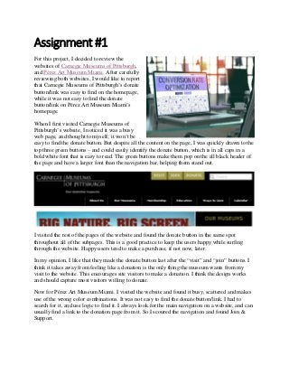
  • 1. Assignment #1 For this project, I decided to review the websites of Carnegie Museums of Pittsburgh, and Pérez Art Museum Miami. After carefully reviewing both websites, I would like to report that Carnegie Museums of Pittsburgh’s donate button/link was easy to find on the homepage, while it was not easy to find the donate button/link on Pérez Art Museum Miami’s homepage. When I first visited Carnegie Museums of Pittsburgh’s website, I noticed it was a busy web page, and thought to myself; it won’t be easy to find the donate button. But despite all the content on the page, I was quickly drawn to the top three green buttons – and could easily identify the donate button, which is in all caps in a bold white font that is easy to read. The green buttons make them pop on the all black header of the page and have a larger font than the navigation bar, helping them stand out. I visited the rest of the pages of the website and found the donate button in the same spot throughout all of the subpages. This is a good practice to keep the users happy while surfing through the website. Happy users tend to make a purchase, if not now, later. In my opinion, I like that they made the donate button last after the “visit” and “join” buttons. I think it takes away from feeling like a donation is the only thing the museum wants from my visit to the website. This encourages site visitors to make a donation. I think the design works and should capture most visitors willing to donate. Now for Pérez Art Museum Miami. I visited the website and found it busy, scattered and makes use of the wrong color combinations. It was not easy to find the donate button/link. I had to search for it, and use logic to find it. I always look for the main navigation on a website, and can usually find a link to the donation page from it. So I scoured the navigation and found Join & Support.
  • 2. I thought to myself; this is where I will find the donate button. So I hovered over the link and the drop-down menu unveiled the donate button at the bottom of the list, but I found it labeled “give to PAMM” instead of “donate.” In my opinion, this is a terrible example of a donate button and left me feeling frustrated with their process. I would have to say the overall experience on their website was unsatisfactory. The color combinations are not appropriate, and it’s not easy to read the text in the header images or the navigation text. A visitor can access the donate button from every web page through the same navigation. The navigation font is too small and white on images without anything to make the words pop. This design can frustrate most website visitors, and might discourage making donations. I do not have any recommendations for Carnegie Museums of Pittsburgh’s website and was overall pleased with the experience of finding how to make a donation. I do have many recommendations for Pérez Art Museum Miami’s website and was unsatisfied with the overall experience of finding out how to make a donation. I make the following recommendations:  Make the donation button stationary in the header area.  Use a font color that makes it pop to the reader and a size that is easy to discover and read.  Rename the button donate.  Change the font colors in the header images to be easier to read. A better UX can increase the chances of a conversion. Of course, this is just a surface review of both websites. The utilization of some great online tools can help us get a deeper and clearer picture of how visitors are behaving on these websites. But that is for a later assignment.