Call girls Service in Deira 0507330913 Deira Call girls
Double page spread analysis
1. Double page spread analysis
Q
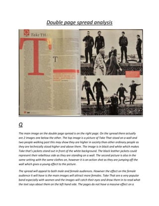
The main image on the double page spread is on the right page. On the spread there actually
are 2 images one below the other. The top image is a picture of Take That stood on a wall and
two people walking past this may show they are higher in society than other ordinary people as
they are technically stood higher and above them. The image is in black and white which makes
Take that’s jackets stand out in front of the white background. The black leather jackets could
represent their rebellious side as they are standing on a wall. The second picture is also in the
same setting with the same clothes on, however it is an action shot as they are jumping off the
wall which gives a young effect to the picture.
The spread will appeal to both male and female audiences. However the effect on the female
audience it will have is the main images will attract more females. Take That are a very popular
band especially with women and the images will catch their eyes and draw them in to read what
the text says about them on the left hand side. The pages do not have a massive effect on a
2. male audience apart from the fact it is a stereotypical magazine spread with images and a story
relevant to the images.
The article is about Take That who are a boy band who have been around for years. There are 5
male singers in the band including main singer Gary Barlow. The article consists of how they
believe there aren’t enough music events anymore. In the column on the right there is an article
by Gary Barlow the main singer in Take That and his opinion on this. The main images could also
back up their statement of not having enough events in music as they are jumping of the wall
which is some sort of action. At music events action is always something that goes on.
In this issue of the Q magazine the font used is not very stereotypical. The double page spread
consists of serif fonts showing the mature side to the magazine and the formality. The spread
has a very similar if not the same house style as the contents page which consists of very dull
black and white colours with orange occasionally used. The obvious text boxes are used in the
text article its self but a small orange text box between the two images is eye catching to the
audience as it is going to be read by most people if the images appeal to them. There use of
image has been thought about well as they have made the images very big and eye catching,
they have used a full side of the double page spread on images so the audience know exactly
who the article is about.
The article tempts the audience to read by using the very large main images on the right. The
audience will notice who it is about and Take That being as popular as they are, will attract
most readers. The image its self can represent a rhetorical question as it can make the audience
think ‘why are they jumping off a wall?’ The images may interest a lot of people who will then
read the article to find out more.
3. Kerrang
The main image of this double page spread in Kerrang is an image of the band, Raging Bull. The
image is placed in the center of the pages but then going across to the right. The image uses
very dull colours to show their genre well and they also use the rule of thirds and symmetry
rather well to show the structure of the band. The image suggests to the audience that they are
a rock/metal band due to the dull and dark colours but also their appearance on the image.
The article can appeal to both men and women. This is because this genre is very popular with
both genders. The article will have a very similar effect on male and females as it will consist of
the reader asking themselves if they would like to read the article after seeing the main image.
The main image is what catches the reader’s eye and if both males and females like them, they
will then read on about them.
The double page spread is about the band ‘Raging Bull’. Raging Bull come across as a
rock/metal band which consists of 5 male artists. The article talks about a few different things
as there are individual text boxes with different headlines. The articles come across to be about
them and one head line ‘You love us!’ can show the confidence in the band.
4. The font being used is again sans-serif showing the informality of the magazine which can
reflect the genre of the band. The colours mainly used are black red and white. The background
colour being black can represent the genre of rock well as stereotypically rock and heavy metal
genres are symbolised by black. Also text boxes are used very freely and in different shapes and
sizes which can again represent the informality of the mag. On this double page spread there is
only one image being the main image of a rock genre band. This tells the reader that the band
will play a big part in this issue of Kerrang.
The impact of the mast head can make an audience read the article as they come across as
unique. They come across as unique as not many mast heads are vertically layout. However the
size of the masthead and the colour can contribute as it gives an even bigger impact. Also one of
the members quoting ‘The emotional aspects cause me to climb rafters and fight security…’
From reading this quote the audience wouldn’t really know what it means, so the only way to
find out is to read the article its self.
Conclusion
Both NME and Kerrang’s approach of their double page spreads are similar but have
differences. An example of a difference is the use of images as Kerrang use one main image
whereas NME use two, too represent the movement and action going on in their double page
spread article. Also NME use serif fonts to show the formal approach they have took and the
masthead shows this as it is a small formal masthead. However in Kerrang they use sans-serif
fonts to explore the informality of the magazine with the masthead being an example. Also the
masthead is wrote vertically rather than horizontally to be unique and catch the readers eye.