SlideShare uma empresa Scribd logo
1 de 21
MAKING MY LOGO
STEP BY STEP


               By Beth Rowling
MY SKETCH


This was my first idea which came from the ‘DreamWorks’ logo. I liked the
idea of everything being surreal, I liked the clouds which gave me the
idea of the thought bubble, and ‘the only way is up’. In this sketch I have
made the thought bubble blue, but I am thinking about making a plain
black logo, to see if I like this better.
This is my first finished logo, I am going to discuss how I made this, and
why I chose to make a logo like this. I will be making more than one
logo, so that when it comes to having my animation lesson, I can
choose my favourite logo to animate.
STEP ONE


First I used the ‘shapes’ tool on PowerPoint, to create a basic thought
bubble. I wanted to use a thought bubble because it resembles a
cloud, which fits in with he idea of ‘UP’ which is the slogan for my
productions. If I was to animate this logo, I would make the 3 smaller
bubble appear one after the other.
STEP TWO


Then I changed the colours and the thickness of the lines, to make the
shape suitable to what I wanted it to look like. I want to keep my colour
palette simple so I have just used two different shades of blue and my
logo will consist of black writing. Looking at professional logos, their colour
palette is very simple, which is the reason I want to keep mine simple.
To resemble a real logo.
STEP THREE


I then saved the shape as a JPEG which I then opened up in Photoshop.
Where I Added my basic text. I chose a font that I think is suitable for a
company logo. I had to ensure that my ‘U’ and ‘P’ were on different
layers so I could carry out the next part.
STEP FOUR


I ensured that both the ‘U’ and the ‘P’ were on separate layers so I could
join them together (as shown above) I did this to create a more
eye-catching and unique logo. I know that film companies often have a less
detailed version of their logo on the credits, which I could use the ‘UP’ for.
STEP FIVE


This is the final product, this is the logo which I would use at the start of
the trailer. All I have done here is added the company name
underneath in capital & bold letters, to ensure that people read the
company name. This logo will only be on screen for a few seconds,
which is why I didn’t want it to be too detailed.
CREDITS LOGO
                                                       I like this logo better
                                                          than the original
                                                           version because
                                                        although it is not as
                                                            eye catching, I
                                                         think it looks more
                                                        professional, mayb
                                                            e if I made the
                                                       thought bubble just
                                                       a black outline, the
                                                          other would look
                                                             professional.


I decided to make a different version of the same logo, to go at the end
of my trailer, if I decided to put credits on. I have taken the ‘UP 'and just
simplified the logo by taking away the cloud. I mentioned earlier that I
Would use the ‘UP’. I think it looks very effective.
MY SKETCH


I based this idea around animation. I was thinking of ways in which I could
animate my logo. I thought of using a train because the movement and
animation is obvious. I don’t think this logo relates directly to any one
professional logo, but I wanted to keep it simple and small like many
professional logos.
This is the second logo which I decided to make, I will now discuss how
 I made this logo and why I chose this logo. I don’t think that this is the logo
That I will choose to animate, but at least I know I have a few to choose
From.
STEP ONE


I found an image on Google of an animated train which I liked, I then
opened this up in Photoshop, ready to add my production title. I did try using
A few different pictures of trains, but I think this one is the best, it has a space
Perfect for the text to fit in.
STEP TWO


I then simply just added in some text, in a font which I liked, and think
looks professional and suitable for a logo. I decided to just stick with plain
Black, mainly because when I created my first logo, I used colour but then
Preferred the simplified version, which was all black.
MY SKETCH – PARADISE PRODUCTIONS


I got the idea for my paradise productions logo from the ‘Columbia’
logo. I liked this logo because I like the way it is a full screen logo, I like
the sunset, which is what I searched when I was looking for my logo. This
logo has a centre piece which is obviously the woman, I chose a picture
with a centre piece also, which in my case is the boat.
This is my final logo idea, this is the most detailed logo. I have based this
idea on the idea of the ‘Columbia’ logo, which is a whole screen picture.
I like the colours of this logo and think that an animation would look really
effective.
STEP ONE


I found this picture of a sunset on Google, I then opened it up in
Photoshop and resized it to the correct size for my logo. I like this picture
because, as it is coming up to my animation lesson I think it would be a
good idea to animate the water, a ripple effect or even to move the
boat. I think this logo would be the most effective.
STEP TWO


I did try black writing on this logo, but I decided that the white stands out
a lot more and makes the logo a lot more bright and clean cut. I am
using a large ‘P’ and am going to fit the other text in, for this reason I
have ensured that each piece of text is on a different layer.
STEP THREE


I added the work ‘Paradise’ I chose to put this in capital letters to
emphasise to quality of my ‘productions’ I think the white looks very
effective.
STEP FOUR


This is the final logo, this is my favourite logo, I think this is the logo I am
going to animate. I did try to cut out the water on this picture, to add a
ripple effect when it comes to my animation lesson, however this was too
hard. I think that when it gets to my lesson I may have to select a different
picture, but of a similar nature.
ANIMATION
CREDITS LOGO


Since this is the logo I have decided I am going to use and is the logo I
chose to animate – I have made a credits logo, I have just simply take the
orange colour of the sunset glow and made a very simplistic logo.

Mais conteúdo relacionado

Mais procurados

Poster production
Poster productionPoster production
Poster production
necizzle
 
Film Review Production Log
Film Review Production LogFilm Review Production Log
Film Review Production Log
thomasm2612
 
Question4
Question4Question4
Question4
ap2
 
Media Evaluation - Question 4
Media Evaluation - Question 4Media Evaluation - Question 4
Media Evaluation - Question 4
Loz_94
 
Evaluation - Q4
Evaluation - Q4Evaluation - Q4
Evaluation - Q4
Loz_94
 
Evaluationquezzie7
Evaluationquezzie7Evaluationquezzie7
Evaluationquezzie7
heatherrat
 
Media eveluation a2
Media eveluation a2Media eveluation a2
Media eveluation a2
rebeccac24
 
Film Review Production Log
Film Review Production LogFilm Review Production Log
Film Review Production Log
tesfah
 
Evaluation - Question 4
Evaluation - Question 4Evaluation - Question 4
Evaluation - Question 4
jake_gosling
 
Evaluation2 presentation
Evaluation2 presentationEvaluation2 presentation
Evaluation2 presentation
ktristramchs
 

Mais procurados (17)

Poster production
Poster productionPoster production
Poster production
 
4. production experiments
4. production experiments4. production experiments
4. production experiments
 
Film Review Production Log
Film Review Production LogFilm Review Production Log
Film Review Production Log
 
Photoshop
PhotoshopPhotoshop
Photoshop
 
Question4
Question4Question4
Question4
 
Media Evaluation - Question 4
Media Evaluation - Question 4Media Evaluation - Question 4
Media Evaluation - Question 4
 
Evaluation - Q4
Evaluation - Q4Evaluation - Q4
Evaluation - Q4
 
Question 4 media evalua tion
Question 4 media evalua tionQuestion 4 media evalua tion
Question 4 media evalua tion
 
Evaluationquezzie7
Evaluationquezzie7Evaluationquezzie7
Evaluationquezzie7
 
Media eveluation a2
Media eveluation a2Media eveluation a2
Media eveluation a2
 
Evaluation task 6
Evaluation task 6 Evaluation task 6
Evaluation task 6
 
Film Review Production Log
Film Review Production LogFilm Review Production Log
Film Review Production Log
 
Evaluation - Question 4
Evaluation - Question 4Evaluation - Question 4
Evaluation - Question 4
 
Question 4 media evaluation
Question 4 media evaluationQuestion 4 media evaluation
Question 4 media evaluation
 
Evaluation2 presentation
Evaluation2 presentationEvaluation2 presentation
Evaluation2 presentation
 
A2 media evaluation scary film
A2 media evaluation scary filmA2 media evaluation scary film
A2 media evaluation scary film
 
Graphics design
Graphics designGraphics design
Graphics design
 

Semelhante a Powerpoint logos (20)

Logo Creation.pptx
Logo Creation.pptxLogo Creation.pptx
Logo Creation.pptx
 
Evaluation
EvaluationEvaluation
Evaluation
 
Question 7 media evaluation
Question 7   media evaluationQuestion 7   media evaluation
Question 7 media evaluation
 
Logo development
Logo developmentLogo development
Logo development
 
Drafts of website final
Drafts of website finalDrafts of website final
Drafts of website final
 
Logo Designs
Logo DesignsLogo Designs
Logo Designs
 
PRODUCTION OF LOGO
PRODUCTION OF LOGOPRODUCTION OF LOGO
PRODUCTION OF LOGO
 
Process of logo and shirt
Process of logo and shirtProcess of logo and shirt
Process of logo and shirt
 
Games: Production Reflection
Games: Production ReflectionGames: Production Reflection
Games: Production Reflection
 
Progression powerpoint
Progression powerpoint Progression powerpoint
Progression powerpoint
 
Draft evaluation
Draft evaluationDraft evaluation
Draft evaluation
 
Ancillary Task – Creating My Film Poster
Ancillary Task – Creating My Film PosterAncillary Task – Creating My Film Poster
Ancillary Task – Creating My Film Poster
 
Logo development
Logo developmentLogo development
Logo development
 
Logo development
Logo developmentLogo development
Logo development
 
Development Of Halfwit Productions Logo
Development Of Halfwit Productions LogoDevelopment Of Halfwit Productions Logo
Development Of Halfwit Productions Logo
 
Evaluation Question 6
Evaluation Question 6Evaluation Question 6
Evaluation Question 6
 
Making my movie poster
Making my movie posterMaking my movie poster
Making my movie poster
 
Designing a logo.pptx
Designing a logo.pptxDesigning a logo.pptx
Designing a logo.pptx
 
Logo development
Logo developmentLogo development
Logo development
 
Logo development
Logo developmentLogo development
Logo development
 

Último

Cloud Frontiers: A Deep Dive into Serverless Spatial Data and FME
Cloud Frontiers:  A Deep Dive into Serverless Spatial Data and FMECloud Frontiers:  A Deep Dive into Serverless Spatial Data and FME
Cloud Frontiers: A Deep Dive into Serverless Spatial Data and FME
Safe Software
 
Modular Monolith - a Practical Alternative to Microservices @ Devoxx UK 2024
Modular Monolith - a Practical Alternative to Microservices @ Devoxx UK 2024Modular Monolith - a Practical Alternative to Microservices @ Devoxx UK 2024
Modular Monolith - a Practical Alternative to Microservices @ Devoxx UK 2024
Victor Rentea
 

Último (20)

Apidays New York 2024 - The value of a flexible API Management solution for O...
Apidays New York 2024 - The value of a flexible API Management solution for O...Apidays New York 2024 - The value of a flexible API Management solution for O...
Apidays New York 2024 - The value of a flexible API Management solution for O...
 
Artificial Intelligence Chap.5 : Uncertainty
Artificial Intelligence Chap.5 : UncertaintyArtificial Intelligence Chap.5 : Uncertainty
Artificial Intelligence Chap.5 : Uncertainty
 
Apidays New York 2024 - The Good, the Bad and the Governed by David O'Neill, ...
Apidays New York 2024 - The Good, the Bad and the Governed by David O'Neill, ...Apidays New York 2024 - The Good, the Bad and the Governed by David O'Neill, ...
Apidays New York 2024 - The Good, the Bad and the Governed by David O'Neill, ...
 
Emergent Methods: Multi-lingual narrative tracking in the news - real-time ex...
Emergent Methods: Multi-lingual narrative tracking in the news - real-time ex...Emergent Methods: Multi-lingual narrative tracking in the news - real-time ex...
Emergent Methods: Multi-lingual narrative tracking in the news - real-time ex...
 
Navigating the Deluge_ Dubai Floods and the Resilience of Dubai International...
Navigating the Deluge_ Dubai Floods and the Resilience of Dubai International...Navigating the Deluge_ Dubai Floods and the Resilience of Dubai International...
Navigating the Deluge_ Dubai Floods and the Resilience of Dubai International...
 
Cyberprint. Dark Pink Apt Group [EN].pdf
Cyberprint. Dark Pink Apt Group [EN].pdfCyberprint. Dark Pink Apt Group [EN].pdf
Cyberprint. Dark Pink Apt Group [EN].pdf
 
Cloud Frontiers: A Deep Dive into Serverless Spatial Data and FME
Cloud Frontiers:  A Deep Dive into Serverless Spatial Data and FMECloud Frontiers:  A Deep Dive into Serverless Spatial Data and FME
Cloud Frontiers: A Deep Dive into Serverless Spatial Data and FME
 
Apidays New York 2024 - Scaling API-first by Ian Reasor and Radu Cotescu, Adobe
Apidays New York 2024 - Scaling API-first by Ian Reasor and Radu Cotescu, AdobeApidays New York 2024 - Scaling API-first by Ian Reasor and Radu Cotescu, Adobe
Apidays New York 2024 - Scaling API-first by Ian Reasor and Radu Cotescu, Adobe
 
Spring Boot vs Quarkus the ultimate battle - DevoxxUK
Spring Boot vs Quarkus the ultimate battle - DevoxxUKSpring Boot vs Quarkus the ultimate battle - DevoxxUK
Spring Boot vs Quarkus the ultimate battle - DevoxxUK
 
DBX First Quarter 2024 Investor Presentation
DBX First Quarter 2024 Investor PresentationDBX First Quarter 2024 Investor Presentation
DBX First Quarter 2024 Investor Presentation
 
CNIC Information System with Pakdata Cf In Pakistan
CNIC Information System with Pakdata Cf In PakistanCNIC Information System with Pakdata Cf In Pakistan
CNIC Information System with Pakdata Cf In Pakistan
 
Strategize a Smooth Tenant-to-tenant Migration and Copilot Takeoff
Strategize a Smooth Tenant-to-tenant Migration and Copilot TakeoffStrategize a Smooth Tenant-to-tenant Migration and Copilot Takeoff
Strategize a Smooth Tenant-to-tenant Migration and Copilot Takeoff
 
2024: Domino Containers - The Next Step. News from the Domino Container commu...
2024: Domino Containers - The Next Step. News from the Domino Container commu...2024: Domino Containers - The Next Step. News from the Domino Container commu...
2024: Domino Containers - The Next Step. News from the Domino Container commu...
 
MINDCTI Revenue Release Quarter One 2024
MINDCTI Revenue Release Quarter One 2024MINDCTI Revenue Release Quarter One 2024
MINDCTI Revenue Release Quarter One 2024
 
How to Troubleshoot Apps for the Modern Connected Worker
How to Troubleshoot Apps for the Modern Connected WorkerHow to Troubleshoot Apps for the Modern Connected Worker
How to Troubleshoot Apps for the Modern Connected Worker
 
ICT role in 21st century education and its challenges
ICT role in 21st century education and its challengesICT role in 21st century education and its challenges
ICT role in 21st century education and its challenges
 
AXA XL - Insurer Innovation Award Americas 2024
AXA XL - Insurer Innovation Award Americas 2024AXA XL - Insurer Innovation Award Americas 2024
AXA XL - Insurer Innovation Award Americas 2024
 
ProductAnonymous-April2024-WinProductDiscovery-MelissaKlemke
ProductAnonymous-April2024-WinProductDiscovery-MelissaKlemkeProductAnonymous-April2024-WinProductDiscovery-MelissaKlemke
ProductAnonymous-April2024-WinProductDiscovery-MelissaKlemke
 
Rising Above_ Dubai Floods and the Fortitude of Dubai International Airport.pdf
Rising Above_ Dubai Floods and the Fortitude of Dubai International Airport.pdfRising Above_ Dubai Floods and the Fortitude of Dubai International Airport.pdf
Rising Above_ Dubai Floods and the Fortitude of Dubai International Airport.pdf
 
Modular Monolith - a Practical Alternative to Microservices @ Devoxx UK 2024
Modular Monolith - a Practical Alternative to Microservices @ Devoxx UK 2024Modular Monolith - a Practical Alternative to Microservices @ Devoxx UK 2024
Modular Monolith - a Practical Alternative to Microservices @ Devoxx UK 2024
 

Powerpoint logos

  • 1. MAKING MY LOGO STEP BY STEP By Beth Rowling
  • 2. MY SKETCH This was my first idea which came from the ‘DreamWorks’ logo. I liked the idea of everything being surreal, I liked the clouds which gave me the idea of the thought bubble, and ‘the only way is up’. In this sketch I have made the thought bubble blue, but I am thinking about making a plain black logo, to see if I like this better.
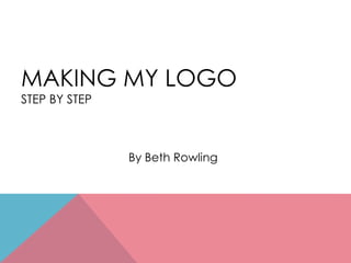
  • 3. This is my first finished logo, I am going to discuss how I made this, and why I chose to make a logo like this. I will be making more than one logo, so that when it comes to having my animation lesson, I can choose my favourite logo to animate.
  • 4. STEP ONE First I used the ‘shapes’ tool on PowerPoint, to create a basic thought bubble. I wanted to use a thought bubble because it resembles a cloud, which fits in with he idea of ‘UP’ which is the slogan for my productions. If I was to animate this logo, I would make the 3 smaller bubble appear one after the other.
  • 5. STEP TWO Then I changed the colours and the thickness of the lines, to make the shape suitable to what I wanted it to look like. I want to keep my colour palette simple so I have just used two different shades of blue and my logo will consist of black writing. Looking at professional logos, their colour palette is very simple, which is the reason I want to keep mine simple. To resemble a real logo.
  • 6. STEP THREE I then saved the shape as a JPEG which I then opened up in Photoshop. Where I Added my basic text. I chose a font that I think is suitable for a company logo. I had to ensure that my ‘U’ and ‘P’ were on different layers so I could carry out the next part.
  • 7. STEP FOUR I ensured that both the ‘U’ and the ‘P’ were on separate layers so I could join them together (as shown above) I did this to create a more eye-catching and unique logo. I know that film companies often have a less detailed version of their logo on the credits, which I could use the ‘UP’ for.
  • 8. STEP FIVE This is the final product, this is the logo which I would use at the start of the trailer. All I have done here is added the company name underneath in capital & bold letters, to ensure that people read the company name. This logo will only be on screen for a few seconds, which is why I didn’t want it to be too detailed.
  • 9. CREDITS LOGO I like this logo better than the original version because although it is not as eye catching, I think it looks more professional, mayb e if I made the thought bubble just a black outline, the other would look professional. I decided to make a different version of the same logo, to go at the end of my trailer, if I decided to put credits on. I have taken the ‘UP 'and just simplified the logo by taking away the cloud. I mentioned earlier that I Would use the ‘UP’. I think it looks very effective.
  • 10. MY SKETCH I based this idea around animation. I was thinking of ways in which I could animate my logo. I thought of using a train because the movement and animation is obvious. I don’t think this logo relates directly to any one professional logo, but I wanted to keep it simple and small like many professional logos.
  • 11. This is the second logo which I decided to make, I will now discuss how I made this logo and why I chose this logo. I don’t think that this is the logo That I will choose to animate, but at least I know I have a few to choose From.
  • 12. STEP ONE I found an image on Google of an animated train which I liked, I then opened this up in Photoshop, ready to add my production title. I did try using A few different pictures of trains, but I think this one is the best, it has a space Perfect for the text to fit in.
  • 13. STEP TWO I then simply just added in some text, in a font which I liked, and think looks professional and suitable for a logo. I decided to just stick with plain Black, mainly because when I created my first logo, I used colour but then Preferred the simplified version, which was all black.
  • 14. MY SKETCH – PARADISE PRODUCTIONS I got the idea for my paradise productions logo from the ‘Columbia’ logo. I liked this logo because I like the way it is a full screen logo, I like the sunset, which is what I searched when I was looking for my logo. This logo has a centre piece which is obviously the woman, I chose a picture with a centre piece also, which in my case is the boat.
  • 15. This is my final logo idea, this is the most detailed logo. I have based this idea on the idea of the ‘Columbia’ logo, which is a whole screen picture. I like the colours of this logo and think that an animation would look really effective.
  • 16. STEP ONE I found this picture of a sunset on Google, I then opened it up in Photoshop and resized it to the correct size for my logo. I like this picture because, as it is coming up to my animation lesson I think it would be a good idea to animate the water, a ripple effect or even to move the boat. I think this logo would be the most effective.
  • 17. STEP TWO I did try black writing on this logo, but I decided that the white stands out a lot more and makes the logo a lot more bright and clean cut. I am using a large ‘P’ and am going to fit the other text in, for this reason I have ensured that each piece of text is on a different layer.
  • 18. STEP THREE I added the work ‘Paradise’ I chose to put this in capital letters to emphasise to quality of my ‘productions’ I think the white looks very effective.
  • 19. STEP FOUR This is the final logo, this is my favourite logo, I think this is the logo I am going to animate. I did try to cut out the water on this picture, to add a ripple effect when it comes to my animation lesson, however this was too hard. I think that when it gets to my lesson I may have to select a different picture, but of a similar nature.
  • 21. CREDITS LOGO Since this is the logo I have decided I am going to use and is the logo I chose to animate – I have made a credits logo, I have just simply take the orange colour of the sunset glow and made a very simplistic logo.