Scream 4 Poster Analysis Breakdown
•Transferir como PPTX, PDF•
1 gostou•1,256 visualizações


Recomendados
Mais conteúdo relacionado
Mais procurados
Mais procurados (20)
Semelhante a Scream 4 Poster Analysis Breakdown
Semelhante a Scream 4 Poster Analysis Breakdown (20)
Mais de Stratford-upon-Avon College
Scream 4 Poster Analysis Breakdown
- 1. Scream 4 Poster Analysis
- 3. Masthead/Title The title on this poster is quite different to others I have analysed in the fact that the font doesn’t look ‘scary’. It’s a bold font, and the only letter that shows any relevance to a Slasher film is the fact that the ‘M’ is jagged and very sharp. The ‘A’ in Scream has also been replaced by the number ‘4’, meaning that they have tied in the number and title of the film together. However, my interpretation of this standard title is; the first four letters are normal, but when you get to the ‘4’ and the ‘M’ panic starts to develop and something terrible happens. This could therefore being an insight into the storyline.
- 4. Tagline I assume that whoever is watching Scream 4 has also watched the other three Scream films – if this is the case then they will already have the basic knowledge of what happens within them. ‘New Decade. New rules.’ This tells us that previous events are going to re-occur, but this time they could be a lot worse. It could also be informing the audience that there is a new villain about because it states that there are ‘new rules’. This makes the audience want to know what is going to happen in this film.
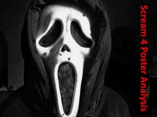
- 5. Image The image used on the poster is extremely clever. There are three characters in the middle of the page, and we assume that these are three protagonists. Behind them is the iconic Scream mask in a smoke effect which works very well under the Slasher genre. It’s as if he is watching over everyone else which yet again gives us a hint into the storyline.
- 6. Colour The colour used within this poster is a perfect example of colours that should be used in the Horror genre. The black and grey represent darkness and all horror elements, the white could signify the innocence of possible teenage victims, whilst the red draws connotations of blood, danger and panic. The four colours work very well together and the fact that they have also used the effect of smoke adds even more to the poster.
- 7. Layout Most of the standard conventions have been applied here – one of the only things that is different to other posters is the fact that the tagline is at the top of the page and not underneath the title. The tagline also fails to explain the image properly. Within the layout, I think the image works the best because of the message it sends out; the Scream villain carefully watching over everyone.
- 8. Release Date This is written is the same font as the title, but it just a bit smaller. However, the fact that it is written in red makes is stand out a lot. The fact that they have written ‘everywhere’ means that everyone that is interested in seeing it can do, with no drawbacks.
- 9. Studio The studio’s associated with this film are: Outerbanks, Entertainment, Dimension Films. They are all placed in their ideal position at the bottom of the poster.
- 10. Director/Actor The director of this film is Wes Craven - the director of all other Scream films and a very notable director within the Slasher genre. This may attract people who are fans of his film. This is written in a fairly big font so it is very noticeable. Just underneath the title is three actors name and as there are three characters on the poster we assume this is them.