Drive the right people to your website: How to use evidence-based psychological techniques to effectively communicate with, and influence, your online audience.

Nathalie Nahai, Founder and Psychology Consultant, We Make Them Click A leading high profile agency exploring the vital role of applied psychology in websites today. This workshop will give you the key principles you need to design an influential and powerful website, creating engaging user journeys. Find out how the big brands use the power of psychology in their web design, online copy and use of colours. Learn how your organisation can apply successful psychological techniques, whatever size or budget Discover the secrets of user journey optimisation and how to use analytics to monitor your success and adapt your approach Understand how to create a website for good search engine optimisation; what the SEO experts would prefer you didn’t know

Recommended
Recommended
More Related Content
More from Aspire Knowledge
More from Aspire Knowledge (7)
Recently uploaded
Recently uploaded (20)
Drive the right people to your website: How to use evidence-based psychological techniques to effectively communicate with, and influence, your online audience.
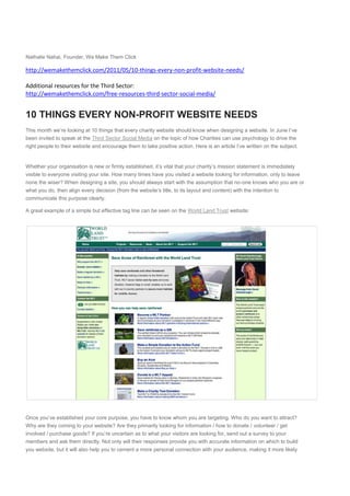
- 1. Nathalie Nahai, Founder, We Make Them Click http://wemakethemclick.com/2011/05/10-things-every-non-profit-website-needs/ Additional resources for the Third Sector: http://wemakethemclick.com/free-resources-third-sector-social-media/ 10 THINGS EVERY NON-PROFIT WEBSITE NEEDS Share This month we’re looking at 10 things that every charity website should know when designing a website. In June I’ve been invited to speak at the Third Sector Social Media on the topic of how Charities can use psychology to drive the right people to their website and encourage them to take positive action. Here is an article I’ve written on the subject. Whether your organisation is new or firmly established, it’s vital that your charity’s mission statement is immediately visible to everyone visiting your site. How many times have you visited a website looking for information, only to leave none the wiser? When designing a site, you should always start with the assumption that no-one knows who you are or what you do, then align every decision (from the website’s title, to its layout and content) with the intention to communicate this purpose clearly. A great example of a simple but effective tag line can be seen on the World Land Trust website: Once you’ve established your core purpose, you have to know whom you are targeting. Who do you want to attract? Why are they coming to your website? Are they primarily looking for information / how to donate / volunteer / get involved / purchase goods? If you’re uncertain as to what your visitors are looking for, send out a survey to your members and ask them directly. Not only will their responses provide you with accurate information on which to build you website, but it will also help you to cement a more personal connection with your audience, making it more likely
- 2. that they will interact with you and support you down the line. One website that shows a clear knowledge of its target audience is Breast Cancer Care: Following on from the previous point, you can see that it’s vital that you find ways to engage with your supporters directly. Not only will this help raise the profile of your organisation, it can also generate attention from journalists and bloggers, and increase the number of donations and membership subscriptions you receive. Besides ensuring that your organisation’s contact information is clearly displayed on every page (the top right hand side is an excellent placement for this, see Traidcraft’s website), you can also include profiles and contact information for your board of directors, founder(s), and key members. Not only will this help create a buzz around your organisation, but by making it easy for the press to contact your key people, you will be more likely to attract good press coverage.
- 3. We tend to select particular charities because we usually have a personal investment in the cause. For instance, someone whose family has been affected by cancer is very likely to want to reciprocate in return for the help they received – and one way they can do this is by supporting a charity like Marie Curie. If you look at their website you’ll see that they have taken this personal connection to the heart of the design by integrating social media channels into a central location on their homepage. This provides visitors with a selection of methods of communication, allowing them to choose their preferred channel and encouraging a two-way conversation.
- 4. As well as making sure your content is clear, succinct and well labelled with appropriate headings, you need to tell your site visitors exactly what you want them to do, by providing a clear ‘call to action’. For an NGO, this action will typically be to donate, join a campaign, or volunteer. To make it easier for your visitors to take the desired action, you can use blocks of ‘hot’ colours (such as bright pink, yellow, orange or red) to highlight the message, and provide clear links and buttons in the margin of every page, in a location where everyone can clearly see them. A great example of good calls to action can be found on Oxfam’s UK website, where these are highlighted in bold-coloured boxes across the centre of the page:
- 5. One of the most powerful ways to convey a message quickly and with impact is to use images. We’re evolutionarily primed to respond strongly to faces and movement, so one of the best ways to communicate with your visitors is by integrating a moving image slider or video into your home page. A great example of this can be found on Avaaz’s website, where the sliding image gallery links through to related articles, and takes pride of place on the page making it instantly interactive and attention-grabbing:
- 6. Before humans were able to write, we told stories. It’s one of the oldest and most powerful forms of communication known to humankind, and we still connect with stories in a visceral way today. Telling a story about the positive impact your organisation has made in someone’s life will convey an intimately personal portrait of who you are and what you can do. It gives your organisation a real voice, and provides a connection between the lives of the people you’ve touched, and the person viewing your website at home. A frequently cited website that deomnstrates this beautifully, is Kiva. If you take a look at their site, the first thing you’ll notice is the mosaic of people whose individual stories appear as you roll over the images across the screen. Not only is this highly interactive, but it’s led by the user, making its impact all the more personal.
- 7. Keeping your vistors up to date with your news and campaigns will encourage them to keep returning to your site, and will communicate how active and engaged you are. If your visitors are already involved, giving them the opportunity to comment on your blog posts, Facebook pages or Twitter feeds will enable your supporters to grow into a strong community, increasing their identity towards your cause and creating a healthy buzz around your organisation. Maintaining an interesting blog will also allow other sites to quote your articles and link back to your site, providing you with a good SEO boost and wider coverage. A good example of a clear, well-presented news feed can be found on the BHA’s website:
- 8. If you’re an NGO, it’s likely that donations are the lifeblood of your organisation. Therefor it’s vital that you make it as easy and desirable as possible for people to donate to your cause. Including a brightly-coloured ‘donate now’ button on your homepage alongside a short story of how your donations have helped someone directly will encourage people to donate. The website for Barnardo’s children’s charity is a good example:
- 9. Keep in mind that the easier it is for people to donate, the more donations you will attract. Donation forms should be kept as simple as possible, and should only require the information needed to successfully complete the donation – forms that are over-complicated will scare people off. A simple one-page ‘thank you’ to confirm the donation also goes a long way to maintaing good relationships with your visitors. To make the confirmation page more gratifying, you can include a smiling photo and thank you message from someone your organisation has helped – this will reinforce the positive impact that your visitor has made by choosing to donate to your charity. It’s imperative that the content on your website is well organised, well labeled, and search engine friendly. This means that all your page headings and page content (images, videos and text) should be labeled appropriately. For example if you’re including an image of a new school that your organisation helped to fund, its title should be ‘New school that we funded’. Avoid excessively long amounts of text (as people simply won’t read it), and make sure that the written content you do have is succinct, brief, and contains the keywords and headings that are most relevant to your cause. An excellent example of good keyword use and concise content is Amnesty International’s website, where you can see the key words ‘human rights’ throughout the content: Linking to other highly-relevant charities, blog posts and online content will also help improve your rankings, but the paramount thing to remember is that well- written, engaging, and correctly labeled content will take you a long, long way.