Call Girls Ludhiana Just Call 98765-12871 Top Class Call Girl Service Available
EVALQ2
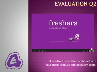
1. How effective is the combination of
your main product and ancillary texts?
2.
3.
4. THE INBETWEENERS
Here, the E4 purple tape and
the logo is used which is what
gave us the idea to do ours.
However, we changed the
show‟s name to capitals to
match our branding of the
word FRESHERS and used a
different E4 logo which looks
like it has been drawn in to
match the education aspect
of our show.
We used a university environment so we didn‟t need
uniforms and a sports hall like this billboard.
However, we took this into consideration as it lets the
audience know the setting of the show without
specifically telling them.
5. In both posters, the same purple tape is
used to show the show‟s brand. However, it
still follows E4 institution’s colour and
design style guide. This is something I had to
take into consideration when making my
billboard posters.
However, the actual skins brand logo is
different to the ones on the billboard but is
still distinctive so the audience can
recognise the name of the brand and the
characters.
Emotion is shows through the billboards as
facial expressions are taking in place here.
E.g. Effy’s smile and Cook and Freddie
looking confused show the way they both
were fighting for her in series 3.
6. Our brand was about
first year university
students and our target
audience were British
teens who were familiar
with British slang.
The best thing to do was
get the definition of
„freshers‟ to show off
Urbandictionary.com –
these were the first 2
definitions shown which
sums up our characters.
We used this as the name
because it was self
explanatory to the
audience who and what
the characters in the
soap are and the setting
of it without even having
to watch it like
Eastenders’ name shows
the characters are
people from the east
ends of London.
7. We used the same style font called
“American Typewriter” to keep the
E4 style on our product.
The name „FRESHERS‟ came from our
storylines being young first year students in
their student lives. It would also relate to our
target audience know what the show is about
as they would be familiar with the term
“freshers”.
The colours of purple
and white represent E4
as they use this colour
scheme within the
majority of the
programmes shown
8. On the actual research we found that the
titles of the shows were in bold writing with
only one upper case letter. To establish our
brand, we had uppercase in the poster but in
my trailer I used lower case. This didn’t
make everything match yet I found that my
ancillary product and trailer still looked
effective and the brand was still
recognisable.
We also broke the conventions by using a
scribbled in effect E4 logo which isn‟t used in
our research posters. We did this to match
the genre of our tv drama and match the
story lines as if someone doodled it whilst
bored in class.
9. Emotions are shown on characters faces
like the Skins posters to represent
character‟s storylines. It makes the
audience clear that the genre would be TV
DRAMA based on young people‟s stories.
The purple E4
tape and white
writing matches
the conventions
of the other
Skins and The
Inbetweeners
posters to create
the institution’s
identity so the
audience know
which channel
to watch it on.
Background images
represent the location/set of
the trailer – university
students are referred to as
„freshers‟ so we used the
posters.
10. Our target audience would have
access to the internet on a daily
basis so we put a twitter hash
tag on and the website to add to
the media platforms for our
show because we knew it would
appeal to them if they wanted to
find out more or tweet about the
show on the trailer.
We made the institution‟s brand consistent
as it would make it clear to the audience
what channel the show would be on. E4 was
the institution I chose because shows with
young cast members such as “Fresh Meat”,
“TOWIE” and “Misfits” would be shown on
there too.
To make it clear to the audience, we
put the name of the show, day and
time it would be broadcasted on.
Using short sentences makes the
audience be able to read it quickly
without getting bored and also
memorise it.
11. A quick magazine
slogan.
What the
magazine is a
supplement for Masthead is distinctive
and the website. and behind the
character‟s head.
Issue no. & date.
Making the brand clear
and “special” shows
this mag is all about
twilight. Big heading
relates to picture
Other features in the (fangs) and genre
magazine. Let‟s of “Twilight”
audience know the
content.
Subheading plays
on words talks
about main
Freebies character.
12. The issue no. And magazine
The masthead “Vision” date make the front cover
shows this is a TV look more professional and
supplement and come with is a convention of a
the News of the World. To magazine front cover.
make vision its own
brand, we added a website The main character is
too. wearing bright colours and
glasses so the audience
We made the magazine a recognise JP the character
“Freshers special” and all (also why the headline has
the subheadings and his name in it) and portray
headings are to do with our his homosexuality.
show just like Fabulous‟
twilight special. The subheading relates to
the storylines of JP
“coming out of the closet”
Instead of adding a freebie, and the gay members of
we added gossip about next the audience could relate
week‟s episode and a to that.
„secret‟ which would make
the audience feel like
they‟re getting an
exclusive.
13. We did not need a
barcode as it was a
supplement
magazine.
Extra images as
one character
would
represent the
whole show.
The institution brand
as this would relate to
exsisting viewers and
Features of other the brand name is
programmes because it established to make it
was a SPECIAL all about clear the show‟s genre
my trailer‟s show. is about young people
in their first year of
student life.