Branding my Soap trailer
•Transferir como PPTX, PDF•
0 gostou•167 visualizações

E4 brands its products with consistent visual elements to build recognizability. It uses a distinctive purple color across all products, the "American Typewriter" font in advertising, and ensures its logo is always present on merchandise. E4 also aims programs at audiences by including advertisements for program Twitter pages at the end of trailers, as Twitter is popular and allows audiences to follow specific shows. The document discusses how studying E4's branding strategies informed the branding of the author's soap trailer, which uses E4's logo, font, colors and hashtag tagging to make it seem like a realistic E4 program.

Recomendados
Mais conteúdo relacionado
Destaque
Semelhante a Branding my Soap trailer
Semelhante a Branding my Soap trailer (20)
Mais de Emma Garner
Mais de Emma Garner (20)
Último
Último (20)
Branding my Soap trailer
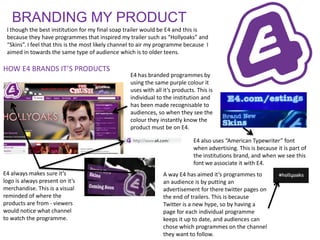
- 1. BRANDING MY PRODUCT I though the best institution for my final soap trailer would be E4 and this is because they have programmes that inspired my trailer such as “Hollyoaks” and “Skins”. I feel that this is the most likely channel to air my programme because I aimed in towards the same type of audience which is to older teens. HOW E4 BRANDS IT’S PRODUCTS E4 has branded programmes by using the same purple colour it uses with all it’s products. This is individual to the institution and has been made recognisable to audiences, so when they see the colour they instantly know the product must be on E4. E4 also uses “American Typewriter” font when advertising. This is because it is part of the institutions brand, and when we see this font we associate it with E4. E4 always makes sure it’s A way E4 has aimed it’s programmes to logo is always present on it’s an audience is by putting an merchandise. This is a visual advertisement for there twitter pages on reminded of where the the end of trailers. This is because products are from - viewers Twitter is a new hype, so by having a would notice what channel page for each individual programme to watch the programme. keeps it up to date, and audiences can chose which programmes on the channel they want to follow.
- 2. My research on E4’s branding helped me to make my trailer realistic. I used the logo on the end title card of my trailer. By putting a #tag on my product it makes it more realistic. This is a common By using the same font and colours thing seen on E4 products. on my product in the title cards it would be recognised as an E4 product.