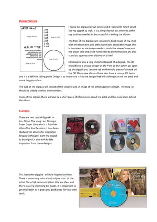
1. Digipak Planning
I found this digipak layout online and it represents how I would
like my digipak to look. It is a simple layout but involves all the
key qualities needed to be successful in selling the album.
The front of the digipak will consist of a bold image of my artist
with the album title and artist name bold above the image. This
is important as the image needs to catch the viewer’s eye, and
the album title and artist name need to be memorable and also
stand out against other albums on a shelf.
CD design is also a very important aspect of a digipak. The CD
should have a unique design on the front so that when you open
up the digipak you can see yet another bold piece of artwork on
the CD. Many new albums these days have a unique CD design
and it is a definite selling point. Design is so important as it is the design that will challenge or sell the artist and
make the genre clear.
The back of the digipak will consist of the song list and an image of the artist again or a design. The song list
should be clearly labelled with numbers.
Inside of the digipak there will also be a short piece of information about the artist and the inspiration behind
the album.
Examples:
These are two typical digipaks for
Joss Stone. The song I am filming is
Super Duper Love which is from her
album The Soul Sessions. I have been
studying her albums for inspiration
because although I want my digipak
to be original, I also wish to take
inspiration from these designs.
This is another digipak I will take inspiration from.
There is some very natural and unique shots of the
artist. The artist name and album title are clear and
there is a very promising CD design. It is important to
get inspiration as it gives you good ideas for your own
work.