
Recomendados
Mais conteúdo relacionado
Último
Último (20)
Destaque
Destaque (20)
Gorezone
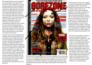
- 1. The masthead for this movie magazine is conventional other a few aspects. The The main image for this movie magazine font colour of the masthead is in red that is centred conventionally in the middle of juxtaposes against the white background the magazine. This is conventional and indicates the genre horror. The font magazine mid-shot portrait of a character is shown in a bold, uppercase font with a or celebrity within a film. As the black showed effect giving the audience a magazine is horror genre specific the view that the masthead is 3D. This is a magazines main image is presented as a clever effect that makes this masthead hyperbole, the girl is presented as a unconventional to other forms of existing victim with blood stained hair and face. magazines. The 2nd unconventional aspect The use of blood immediately impacts on is the 3D shadow effect on the word genre to the audience of a horror. The magazine integrated into the word magazine has no background and has “Gorezone” it is hard to read but been cut against a white background noticeable this matches the way total film giving the image even more of an eye have also done the masthead giving a catching look to the audience. This main creative spin on the masthead itself. The symbolises horror immediately, bringing masthead is spread around the entire top in the target audience straight away. This frame of the magazine is a conventional magazine also draws in other audiences format, giving evidence of not pushing due to the exaggerated photograph used. conventions to there limits The puffs and cover lines throughout this The colours used within the magazine magazine are all in the same font, this is front cover symbolises the genre conventional to use similar fonts but not specified audiences straight away. With the same throughout, I feel this feature relation to the image the use of the may have ruined the full potential of the colours red juxtaposing with light blue magazine. The puffs and sell lines are creates an eye-catching effect to the situated around the edge of the magazine audience as the colours blue and red in a bold font with a mixture of upper and don’t usually go together this creates a lower case. The slugs and cover lines used diversion intriguing the audience into within the magazine are in upper case picking up the magazine. The colour red and in a mixture of colours between blue introduces the horror genre straight and red and white, which I personally feel away, linking to the colours on the blood isn’t clear to the audience what they are stained image and the masthead. The trying to intrigue the audience into. The The layout of the magazine front cover is very conventional with the masthead colours contrast against each other main feature used well within the puffs is at the top of the magazine followed by the main image in the centre. The puffs within the magazine the blue, red and the buzz words are in a separate colour, and slugs are overlapping the image but not enough to now reveal the main white create a evoking impact on the red, which begins in the genre evoking parts. The barcode is situated in the bottom right hand corner along audiences eye as they juxtapose. specification and separated from the rest with the issue date and price. This magazine fully follows conventions of any of the text. magazine