
Recomendados
Mais conteúdo relacionado
Último
Último (20)
Destaque
Destaque (20)
Your Way Advert Analysis
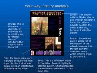
- 1. Your way first try analysis Layout: The albums artist is Master shortie and through research I found that album adverts position the artist at the top, because it sells the album. Image: This is the main character in the video he is pointing up to “Master shortie” signifying the importance of the artist Font: the track names are in purple because the motif is purple, this inclusion of purple gives an intertextual reference to the video. Layout: the release date is displayed at the bottom of the advert, because it is the last part the consumer reads which informs them to purchase it. Font: This is a comment made by Jonathan Ross, it highlights albums quality, which persuades the consumer even more to buy Your Way.
- 2. Your Way Final analysis Layout: The albums artist is Master shortie and through research I found that album adverts position the artist at the top, because it sells the album. Font: the white font on the black background creates an intertextual reference to the video, for example the video contains flashbacks in black and white. Image: This is the main character, he is looking over at the hit singles for Your Way Font: the style of font connotates the R&B genre, because graffiti is associated with the streets which is R&B Colour: the date and the word are highlighted in white, this gives extra emphasise to the words